


Launching Liquid Death-Inspired Health Startup Required "Seasoned Clients", Brave Agency


The Mat Baxter, Mark Britt, and Karima Asaad-founded "punk healthcare" startup, TMRW, wants to revolutionise the category and address the health system's failures. That was a big brief for agency Today The Brave, which worked with the founders to create the identity, packaging, UX, and more for launch.
Here, LBB AUNZ managing editor Brittney Rigby speaks to the indie's head of design, Ethan Hsu, about why the work involved permission to "push things too far and get reined back in (which only works when you’ve got really seasoned clients)".
LBB> Mat and Mark have spoken about why TMRW is so important for them given their own experiences with the health industry. How did TTB come to be involved, and at what stage of TMRW's set up?
Ethan> We joined early, but nowhere near day one. By that point, they’d already built an impressive team of experts: clinicians, engineers, AI specialists, bioinformaticians. They had a good handle on what they were building, and even clearer ideas of what they didn’t want to be.
What struck us all immediately was how personal and universal the issue was. The moment the TMRW team shared their experiences, we opened up our own too and knew that we wanted to be part of the journey. So we were brought in to do what we do best: ask stupid questions, challenge smart assumptions, and help turn a wall of thinking into a brand with clarity and conviction.
LBB> Was the brief 'punk' from the start?
Ethan> No, not exactly. But the energy was there. You could feel the friction -- the dissatisfaction with how health and wellness brands all blur into one soft, pastel smoothie. The TMRW team knew a lot of what they didn’t want, but they hadn’t quite pinned down what they did.
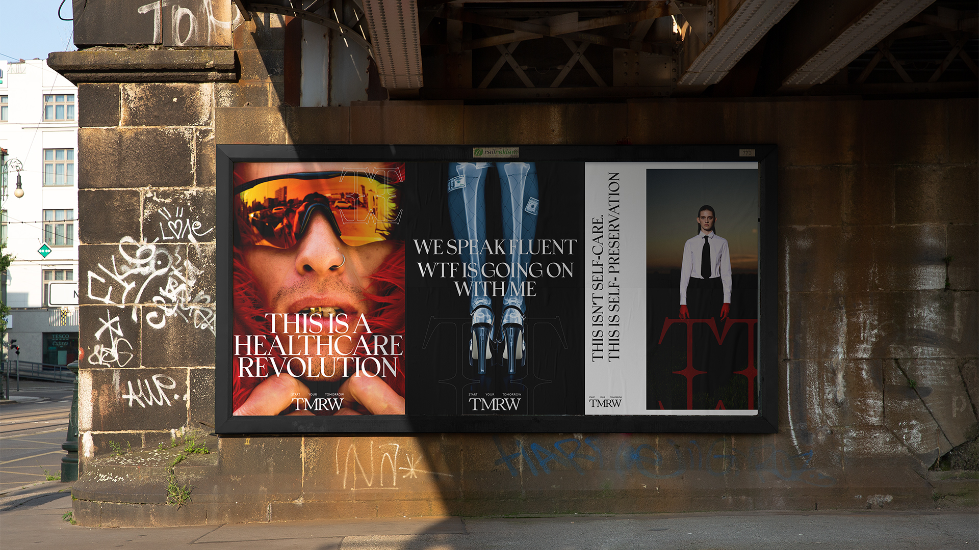
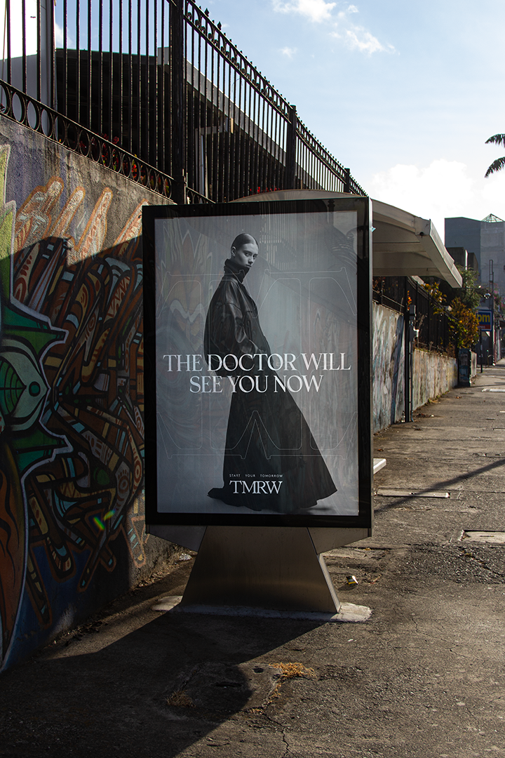
So part of our job was to find the signal in the noise; push things too far and get reined back in (which only works when you’ve got really seasoned clients). Punk wasn’t a style choice -- it was a stance for our design strategy. Rebellion with intent. Not mohawks and nose rings, more like, "What if a blood test felt like checking into a boutique hotel instead of a fluorescent-lit clinic?"
LBB> How did you go about strategising what the brand needed to do/be, and what the insight/s underpinning this first work were?
Ethan> We covered an 8-metre wall in our studio with questions, territories, post-it notes, wild thoughts. Chaos, in the best way. The turning point came when we looked hard at the category. A lot of deepetched people against studio backgrounds fake laughing. Soft, earthy, pastel palettes behind yoga-fluencers quietly bathed in soft light. It’s peaceful, but not real. There was nothing visceral, no reality in the category meant to represent real people.
We wanted to speak to people who actually live. Who drink too many tinnies after work and still want to be sharp the next day. Who play Thursday night netball and don’t want to feel wrecked all weekend. That’s the real version of health: people wanting to get back to their old self where health wasn’t a worry, rather than some fake persona that’s been created for them.
LBB> The work isn't a typical advertising campaign. It spans identity work, packaging, UX, an unboxing experience. How did you land on what the launch work would involve, and what does it say about the type of work TTB wants to do?
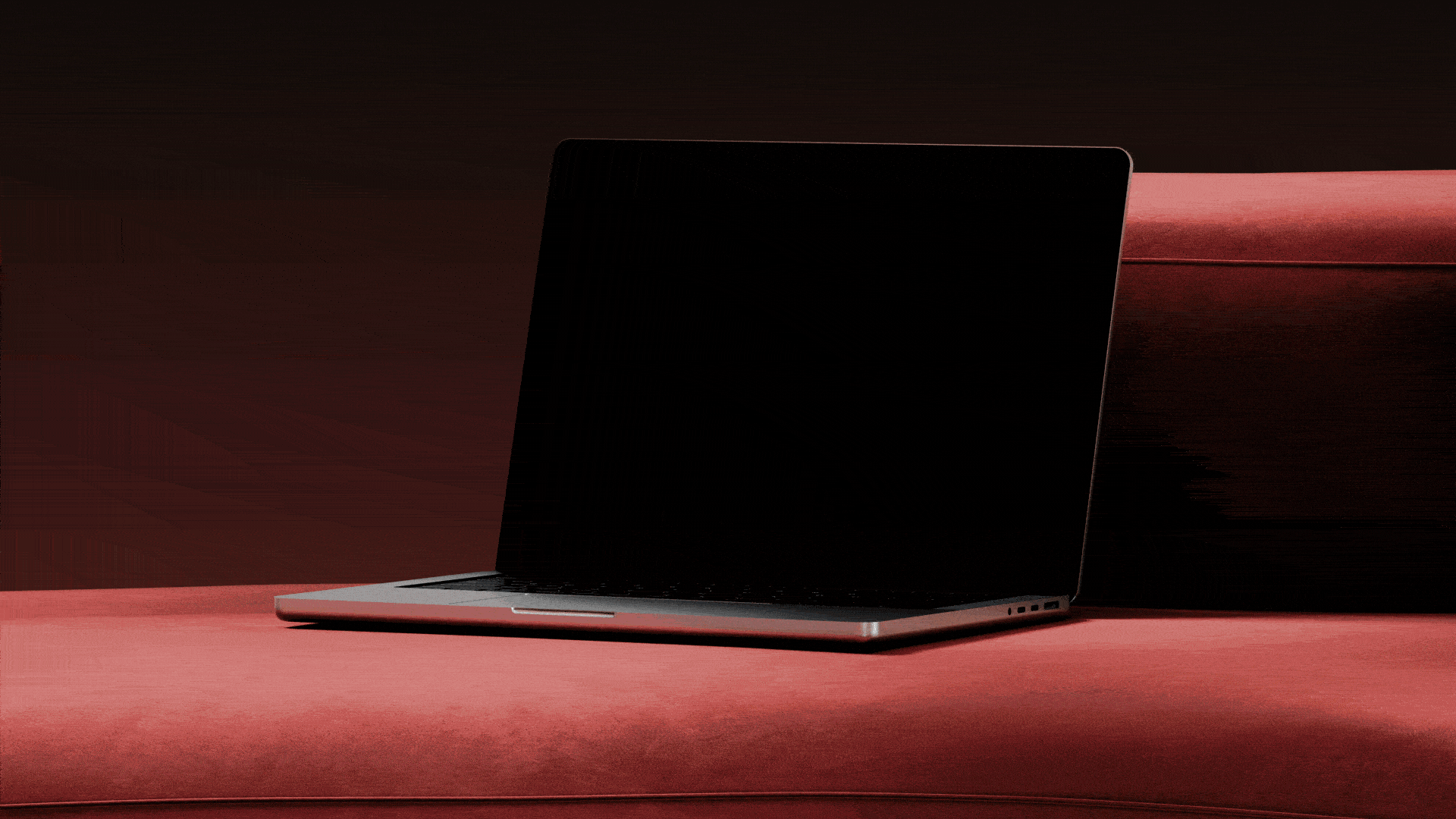
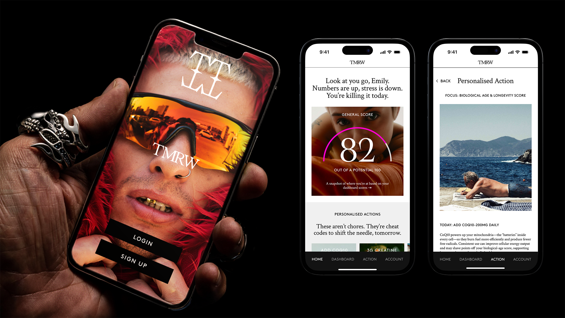
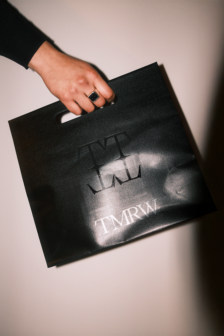
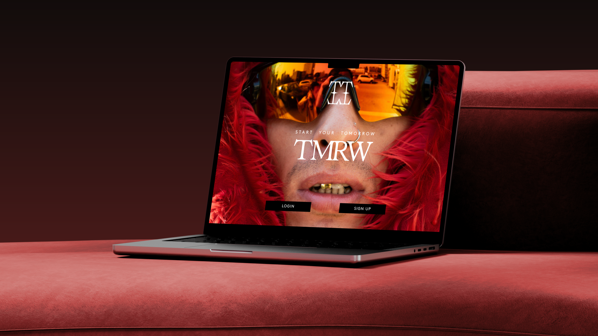
Ethan> It started as a fairly defined scope: strategy, identity, tone of voice. But as we worked deeper into it, the relationship naturally expanded. We ended up shaping everything from the packaging to UX flows to the social content.
It became a true collaboration, one of those rare projects where every part of the ecosystem talked to the next. A line of copy influences a UI decision, how data is surfaced in the app, or the physical texture inside a blood testing kit. The brand isn’t a static asset -- it’s a living system. And when the client relationship is strong, you get to shape that system at every level.
At TTB, design isn’t decoration, it’s the foundation for solving real business problems. Our design team has deep expertise in branding, motion and digital, and they’re naturally wired to think beyond the obvious and find new ways of communicating that connect with people. We’re here to guide clients away from the safe and expected, creating visual identities that demand attention and shift perceptions.
More and more, we’re partnering to create identity systems that plug into our full service offering. Design works to anchor all the moving parts to give brands a clear, distinctive voice everywhere they show up.
LBB> Talk to me about the tension between communicating a new brand, and so needing to connect it to the category, and breaking the category altogether.
Ethan> That tension is the whole point. You have to earn enough credibility to be taken seriously, but challenge enough convention to be remembered.
We borrowed the minimum from the category: just enough to orient people. The rest we threw out. Brands like Satisfy Running or Liquid Death were great reference points for us. They didn’t try to sit politely within their categories, they exploded them and built tribes around their new normal. That’s what we wanted: a brand with a strong voice and the range to talk about a spectrum of topics, always anchored in authenticity.
It’s not about being “edgy” for the sake of it; it’s about building a distinct lexicon and visual world that’s not interchangeable with any other health brand. We didn’t want to look like the 473rd app for breathwork reminders. We wanted to feel alive.
LBB> It's a complicated offering/product -- how do you hint at or speak to what the brand is selling, while not ending up in a 'trying to explain blood tests in the creative execution' space?
Ethan> It’s tempting to try to explain the whole thing -- every feature, every test, every data point -- but that’s a fast track to no one remembering anything.
So we simplified. We led with a focus on outcomes. What does this help you do? What does this unlock for your life? What’s getting in your way? The rest, the science, the sophistication, the nuance, is being layered in through various channels. That way, people engage at the level they want. Some just want the vibe. Others want to dive into the details.
And look, health is a complex space, but people are much smarter and more curious than brands often give them credit for. If something matters, they’ll dig deeper. Your job is to make them care enough to start.
LBB> I imagine there's a fair bit of scepticism or worry to overcome too, particularly post-Theranos. How did you think about balancing the punk aesthetic with empathy and trust-building?
Ethan> It was probably the most delicate part of the brief. Punk without purpose feels flippant -- and that’s dangerous in health. But used intentionally, it can be powerful. It gives you a way to say, “We know this system is broken, and we’re doing something about it.”
We were very clear from the beginning: Punk for us didn’t mean noise for noise’s sake. It meant craft. Precision. A kind of elegant rebellion. Where traditional healthcare is cold and sterile, we made things rich, textured, editorial. Where most med-tech is overly rational, we injected warmth and humanity.
LBB> What was it like making work for a startup backed and co-founded by people who get our world much better than most clients do - photographer and director Karima Asaad, and agency heavyweight Mat Baxter. What was the process like working with them?
Ethan> Honestly? Kind of a dream. From the outset, they were clear: No traditional agency-client stuff. Only show us work you believe in. Scare us a little. Make us feel something. That kind of permission doesn’t come around often.
The pace was quick. We ran a big creative workshop in week one: dozens of references, scraps of paper, scribbled provocations. Four days later we presented two full creative routes. One was polished, modern, very “next-gen health.” The other looked like a cross between a skater magazine, high fashion, and the most un-healthcare brand they’d ever seen. They loved the first. But when they saw the second, they got this wide-eyed, slightly terrified look… and then said, “Let’s fucking do that."
They pushed us. We pushed back. That’s how the best work gets made.
LBB> What does success for this first work launch look like?
Ethan> Our mates asking us if we’ve ever heard of TMRW.
-
The TMRW launch was last week's LBB AUNZ Work of the Week.


