How This Non-Profit Demonstrated the Power of a Simple Pair of Shoes

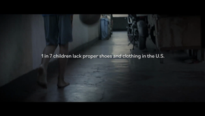
Did you know that in North America, 72% of children report that shoes are their greatest need? It might not be the most surprising statistic on its own - shoes can be pretty expensive after all - but combined with the fact that school attendance increases by 97% when they receive a new pair… it begins to paint an interesting picture.
You see, as it turns out, there is a ‘shoelessness’ problem across North America. When the next generation is struggling to go to school due to lack of footwear, that’s a problem. When basic establishments enforce rules like ‘No shirt. No shoes. No service’, it sends a pretty damning message. And when it turns out that a simple pair of shoes and clothing can help reduce poverty by 33%, well, it’s clear that something needs to be done.
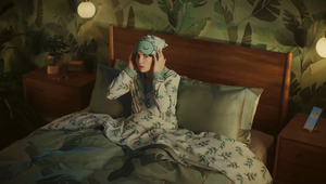
To this end, Non-profit organisation Soles4Souls has been fighting the good fight for years, aiming to increase donations and awareness across the country. While perhaps the system itself can’t be changed immediately, it can still help people get a much fairer shot, which is exactly what it demonstrates in its latest and first-ever North American campaign, created with FUSE Create. Anchored by a 60-second spot titled ‘Doors of Opportunity’, the work explores the idea of ‘No shirt. No shoes. No future’ by telling the story of a financially struggling young girl who is able to turn a no into a yes, all through the power of a new pair of shoes.
So, to learn more about how this came to life, LBB’s Jordan Won Neufeldt sat down with Soles4Souls’ chief marketing officer Rod Arnold, as well as FUSE Create copywriter Mike Furlong for a chat.
LBB> Creating a first-ever North American campaign is no small task. As such, what was the brief, and what immediate ideas came to mind?
Rod> The brief was simple: make Soles4Souls a household name. We chose FUSE Create as our partners for two simple reasons. First and foremost, the agency has done some outstanding work in the non-profit (and for-profit) space, and we were looking for that level of creativity and strategy. And second, the team resonated with our mission and ethos. It was really important to us that we were more than just a client; a true partnership meant going several levels deeper.
Mike> While most of what Soles4Souls does involves giving kids and adults proper shoes and clothing, the organisation tackles that issue in different ways varying on a location’s situation, whether it’s helping homeless youth in the US, helping families in crisis zones, or starting small businesses with entrepreneurs in the developing world. We decided to make this campaign focus on the issue domestically to resonate with a domestic audience.
We knew we wanted to play with a simple visual that could convey a lot of emotion and information. Given that Soles4Souls is about shoes and clothing, we had multiple territories that usually revolved around footprints, shoe prints, and what stories could clothes or just garment fabrics say. And then we landed on the sign that you see in the campaign, because it told the story in a real head turning way.
LBB> And specifically, what made now the right time to launch a first North American campaign?
Rod> It really came down to the urgency of the need we’re trying to meet. In the US, there are more than a million children who experience homelessness each year. Our goal is to provide new sneakers to each one of them every year, because we have data that shows it makes a big difference in school attendance and participation in sports, as well as their sense of confidence and belonging. We can’t afford to wait – these kids need our help now.

LBB> Speaking of data, the information driving this campaign is super interesting. What was the research process like? What did you learn, and what were the biggest takeaways?
Rod> We began this initiative we call ‘4EveryKid’ in 2019 because that’s when we became aware of the size of the youth homelessness problem and how much something as simple as a pair of new sneakers can make a difference. Since then, we’ve been diligently getting feedback from our partners and the families we serve, and the data is overwhelming. People need to know that youth homelessness is everywhere – it’s not just an urban problem, it’s also prevalent in suburban and rural communities.
Mike> While getting the stats was easy, figuring out what we wanted to do with them took more thinking. We decided using stats helped anchor the emotion in something tangible that we could point to and say, ‘we can create positive change, and you can too’. The campaign itself focused on other areas like employment and housing, so we used other stats that felt equally emotive, empowering and hopeful.
Honestly, when we were shown these stats, it really shocked us. For one, most people don’t really think about there being a ‘shoelessness’ problem. And secondly, we tend to take our own shoes and clothing for granted. They’re just fashion or function. But when you’re confronted with what it’s like not to have any (or just very worn-down shoes and clothing), you realise how massive the effect can be.

LBB> From here, how did these takeaways factor into the ideation process? And specifically, where did the idea of tying that into the ‘No shoes. No shirt. No service’ tagline come from?
Mike> We had to consider which way to show the stat. Should we say a 97% improvement is achieved, or could we use the inverse and speak to the negative problem that needs solving to engage potential donors? We decided on using a positive stat, but to visually show the negative, the world as it appears when you don’t have access to shoes and clothing, and ask the viewer to play the part and change the image. It frames the viewer as a necessary part of Soles4Souls mission.
And that leads into the sign and the line below it, ‘Help Turn No into Yes’. It asks the viewer to change the sign, and the lives of those in need. The stat completed the picture - reinforcing that the problem exists, but that it’s very fixable with help.
LBB> From here, what was the writing process like?
Mike> The idea came to life in a series of print ads first. We asked ourselves whether it should be a 1:1 of the print, or if it could have an engaging twist that would not only surprise anyone that had seen the print first, but also add even more emotion.
We put the sign inside a home, and while it carried a similar message, it just became so much more impactful. In the print, you see these signs on doors that bar you from entry to schools, businesses, etc. But when you live without proper shoes and clothing, the real and emotional barriers often make it feel like you can’t even leave your house with confidence. Your home becomes a bit like a prison – your own door keeping you shut in, the sign, whether real or imagined by our character, always present.
LBB> Who directed, and what made them the perfect person for the job?
Mike> The director was the one and only David Quinn of Skin & Bones! He was the perfect fit for many reasons. He knew exactly what story we wanted to tell and was excited to bring it to life. He knew how important our hero’s clothing, body language and facial expressions would be. And he also wanted to tell more of her story with subtle things like a nearly empty closet or a bare fridge, piled up bills on the kitchen table, etc.

LBB> And what was the filming process like? How long did it take, and do you have any anecdotes from on set?
Mike> Filming this spot was super collaborative and just a great time. One of David’s strengths is that he experiments a lot on the day. We had a storyboard, we got all the exact shots we wanted, but he’d try a shot a bunch of different ways, and many of those shots ended up in the final piece.
One thing that really stood out to us came when we started filming the scene where our hero sees the sign and looks out the door. When we watched the footage back, we were all just so impressed with the actress. In the moment where you see her realise what the sign means for her, and how she looks out longingly into the world outside her door, she conveyed all that emotion with a perfect subtlety.

LBB> Both the edit and the music also bring it together beautifully. How did these aspects come to life, and did you have a hand in the post process?
Mike> Thank you! We had a LOT of discussions around music and sound design. We knew that music would be crucial in making sure the emotional highs and lows of the spot had a lot of impact, but we also didn’t want it to be a music-driven spot that would overpower the subtlety of what you see. TA2 Sound + Music delivered a fantastic range of options and we worked closely with the team to land on the one in the spot. The piece accented everything we wanted it to, like the gentle keys when the supers pop up to the rays of sun that illuminates our hero’s face as she smiles. They nailed it.
Just like every step of the way to making this campaign, the editing sessions were also super collaborative. Everyone poured over every little detail to make sure the spot would shine. And it does!
LBB> The campaign is also supported by OOH and influencer partnerships. Can you tell us a bit more about both the design process, as well as what it took to find the right partners to promote this?
Mike> For design we wanted something that felt authentic, real-world, and would tug at the heartstrings. When it came to layout, we wanted to keep all the copy and main visual elements close together, because it really is about that gut punch the sign gives you. And, we used real locations for our photography as well.
Additionally, one of the great things about being a full-service agency with media and PR in house is that we can look for synergies between owned-earned-paid without competition over fee. Because of this, our media team found the non-traditional OOH media was the best match for this campaign. So, it was natural to extend the OOH to different formats like chalk, wild postings and more due to its strong simplicity.
As for the influencers, we realised they are best used as modern-day endorsement, especially when lending themselves to a cause close to their hearts while drawing in new and relevant audiences. So, organic passion was necessary for true authenticity with these partnerships.

LBB> Since launch, how have people responded to this campaign?
Mike> The reception to the spot has been incredible. It really resonated with people emotionally, and we’ve also heard a lot of ‘I had no idea this was such a big issue’, which was our own reaction when we first learned about the incredible work Soles4Souls does.
There’s also been a lot of positive reactions to how the sign functions in both video and OOH. It just tells you so much with so little, and we’re happy people think it’s as clever as we thought it was!

LBB> Finally, what should more people know about Soles4Souls, and how can they get involved in making a difference?
Rod> ‘4EveryKid’ is focused on providing new sneakers and socks to kids experiencing homelessness, but it’s just one of our core programmes. We also provide new shoes and clothing in response to natural and man-made disasters through our ‘4Relief’ program, and through our ‘4Opportunity’ programme, we collect new and used shoes and clothing (around 10 million pieces each year) and distribute them to entrepreneurs in low-income countries. The entrepreneurs then resell the products to earn a living and provide for the basic needs of their families, while in the process, we’re helping to divert waste from landfills.
One thing we’re very proud of as an organisation is that we make it easy for anyone to get involved and make a difference. Obviously financial donations are important, but you can also do things like donate your used shoes, host a shoe drive, volunteer, start a fundraiser or travel with us. There’s something for everyone!


