


How PENNY's Priced Packaging Encourages Discount Shopping

In an increasingly complex world, simplicity in communication is key – especially for discount giants like supermarket PENNY.
Tasked with bolstering the brand’s image as a low-price leader, Serviceplan NEO's creative directors, Matthäus Frost and Sebastian Bialon, led a campaign that puts price front and centre, even incorporating it into the product packaging itself.
Speaking with LBB’s Olivia Atkins, Matthäus and Sebastian share insights on the campaign’s creative strategy, the challenges faced, and why this visually-bold approach could set a new precedent in retail.
LBB> What was the original brief that you received from PENNY on this campaign?
Matthäus> Since we have been working with PENNY as a client, the ongoing brief has been: How can we improve the perception of PENNY as the discount store with the lowest prices in a highly competitive market?
LBB> How did you land on deciding to prominently feature the price label of different products? Was PENNY open to this idea or did it take some convincing?
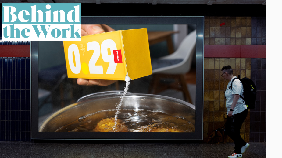
Matthäus> The world is becoming more complex, so communication needs to be clearer and simpler. We asked ourselves what this could mean for PENNY. After all, PENNY even alludes to ‘price’ in its company name, and Germans spend less on groceries compared to other Europeans. In recent years, prices have risen, making our customers even more price-sensitive.
If price is what matters most to people, why not highlight it as prominently and attractively as possible? So, we did just that. What stands out immediately when you print the price on the packaging is how clearly the stability of the price comes through – a perfect reflection of PENNY's DNA.
PENNY was enthusiastic about this idea from the start, which made us very happy, though we recognised the challenge ahead. We knew it would take more than just the marketing department to get everyone on board. The fact that this idea has now been implemented on such a large scale – with the packaging available in over 2,000 PENNY stores across Germany – makes us even prouder. It's a real achievement made possible through collaboration, courage, and mutual trust.
LBB> Why do you think this approach is so visually bold and effective?
Sebastian> Seals, nutritional values, notices – regular packaging often contains an overload of information. But when you look at private label designs, they’re usually inspired by well-known brand products.
Our design, however, focuses on the products' biggest USP: the lowest price. The aim is for these private labels to stand out on the shelf with their bold price message – something no one else in the food retail industry has done before.
Of course, we hope that the combination of a strong price and strong design will translate into strong sales. While the full impact will become clear in the coming weeks, the initial feedback has been outstanding.
LBB> At what point did you bring food photographer Silvio Knezevic on board and why was he the right person to bring the visual style and overall aesthetic to life?
Matthäus> Once we knew the packaging would be rolled out into stores, we began brainstorming how to elevate it with a campaign. It was crucial for us to present the products as authentically as possible, reflecting their role in everyday life. Silvio Knezevic’s work, particularly his travel and food reports for ZEIT Magazin and SZ-Magazin, perfectly embodies this sense of authenticity, making him the ideal choice for the campaign.
LBB> What were the key considerations in selecting the five products (oatmeal, toast, salt, crisps, and mayonnaise) for the limited edition packaging?
Matthäus> The product selection was made by PENNY, based on specific criteria that determined which items were suitable and which weren’t. For our concept, it was important to choose packaging that was as large as possible to maximise the impact of the price display. This was especially clear with the toast and crisps.
LBB> Design-wise, tell me how you balanced an eye-catching design with the practical considerations of packaging functionality?
Sebastian> The price is by far the prominent element on all the products. We also included the PENNY logo, product description and quantity as key components, with the Nutri-Score clearly visible on every item. The one thing we deliberately left out was a product image. While this was a calculated risk, most PENNY customers already know exactly where these products are located on the shelf, right next to the brand-name counterparts. The oatmeal, crisps, and salt even use similar colour schemes to the more expensive brands, so the chance of confusing the oatmeal for sugar is extremely low. As for the toast and mayonnaise, their transparent packaging makes them easily recognisable.
LBB> What challenges did the team face in creating the limited-edition packaging for PENNY, and how did you ensure that the design remained consistent across all products and retail locations?
Matthäus> Having worked with PENNY for years, we know how lengthy the process for new packaging designs can be and the many hurdles that come with it. That’s why it’s so remarkable how quickly we were able to bring this project to life, thanks to close collaboration with PENNY. From the initial concept to its rollout in stores, the entire process took just a few months.


