


Alpro Unveils Brand Identity Refresh, as Plant-Based Milk Market Booms

Plant-based pioneer Alpro has revealed a confident new look that reasserts the brand’s fresh, flavour-packed appeal amid soaring industry demand.
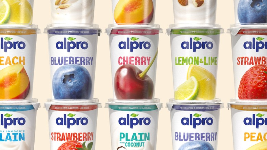
The revamp, led by global design consultancy Elmwood, focuses on Alpro’s delicious, natural ingredients via a series of on-pack and digital design accents. These include new photography assets, along with a playful tone of voice and bespoke typography from London-based lettering artist Rachel Joy in partnership with Monotype.
Using Elmwood’s strategy of “iconically always new”, the reinvention is intended to enhance Alpro’s position as a market leader in the USD $24 billion global dairy alternatives category. Refinements have been made with the aim of dialling up Alpro’s brand promise, reinforcing the power of its plant-based ingredients – as captured within a series of health benefits, along with an exceptional taste experience. The resulting restage work has finessed Alpro’s signature assets in line with a fast-paced ecosystem.
European alternative-milk sales jumped by 49% between 2020 and 2022 alone. Meanwhile, plant alternatives are becoming “a long-term” and “viable” option for global consumers and supermarkets alike, according to Bloomberg Intelligence. A burgeoning vegan population, along with lactose intolerance, animal welfare concerns and product innovation, are driving the shift behind plant milk’s move to mainstream status.

“We’re proud to have worked alongside Alpro for over eight years now,” explained Kyle Whybrow, executive creative director at Elmwood London. “When our partnership began, the conversation was very much about educating consumers with a simple, subtle design ethos. However, with a huge boom in awareness, we now have space to consider where Alpro goes next.”
“Through a co-creation process, we decided that there was room to move the needle, creatively, by focusing on Alpro’s wider brand story (rather than pack design alone). The result is an evolved design that focuses on the incredible taste and smooth, moreish texture of Alpro products – from drinks to yoghourts, mousses and more. Along with their positive impact on health and the planet, these changes show clearly that plant-based produce are no longer ‘just’ alternatives or supplements. They’re aspirational purchases in their own right.”
Elmwood’s new design ramps up flavour both through the photography and the language used by the brand on and off-pack. Taste descriptor notes such as “smooth, subtle, Creamy Oat” have been brought to the forefront, whilst the brand’s voice as a whole has become more youthful, including onomatopoeia and more descriptive language that helps consumers navigate the variety on offer.
This freestyle voice is combined with a rebalanced palette that combines vibrant whites with pops of colour. The result is a progressive identity, created to appeal to a broader audience – including next-gen consumers.

Building on the success of the brand mark that was crafted as part of Alpro’s previous rebrand in 2019, which was also led by the Elmwood London team, the logo plays a much bigger role in the updated brand world – showing up in more confident ways across various touchpoints and building on the leaf’s iconicity.
“The new design is rolling out across Alpro’s entire portfolio of plant-based product packs around the world – but we’ve also defined how the brand behaves, working collaboratively with Alpro’s other agencies,” noted Kyle. “This includes the .becoming team based in Brussels, who helped us amplify the global identity and pack design – to broaden the range of markets which Alpro plays in.”
“Working alongside these teams allowed us to bring the brand to life wherever it’s experienced, including out of home and digital. The idea is to take Alpro, as a recognisable and iconic brand, and stretch the parameters of its brand story to be more bold and celebratory, ensuring it is relatable to the widest possible demographic. And because Elmwood has a long-standing relationship with Alpro, the trust was already in place to enable that push.”
A hallmark of Alpro’s new look is the inclusion of a tailored hand-cut font from artist Rachel Joy. Created in partnership with Monotype, it allows greater stretch and variety in the brand’s design aesthetic and underscores its standout flavours.
“It was a great opportunity to partner with Elmwood to work out a new set of brand ambitions that speak to Alpro’s status as category leaders and innovators,” said Dominique Geeraert, head of design for the plant-based division at Danone. “Our new brand experience preserves everything we love about our products, while bringing a wittier, more confident edge to our market presence.”
Hedwig Borgers, global marketing director for the plant-based division at Danone, added, “Having partnered with Elmwood for nearly a decade now, we are incredibly proud of the updated packaging and brand world experience across Alpro’s core and premium portfolio – which looked to emphasise the benefits and health of our products as a core element of the rebrand. Together with Elmwood, we united our teams to create a punchy, flavour-packed design that aligns with our aim to communicate the wonders of plants to a wide consumer demographic. The resulting restage is sure to land well in Alpro’s markets across Europe and beyond.”


