


Using Design to Let Black Voices Shine with Kieron Lewis

When George Floyd was killed in police custody in May 2020, the event sent shockwaves around the world. In response, conversations surrounding racism rose as protests broke out and justice was sought to repair the wrongdoings which occurred. Though this happened in the US, the global effect was felt and shared across the world as the topic of racism was discussed far and wide.
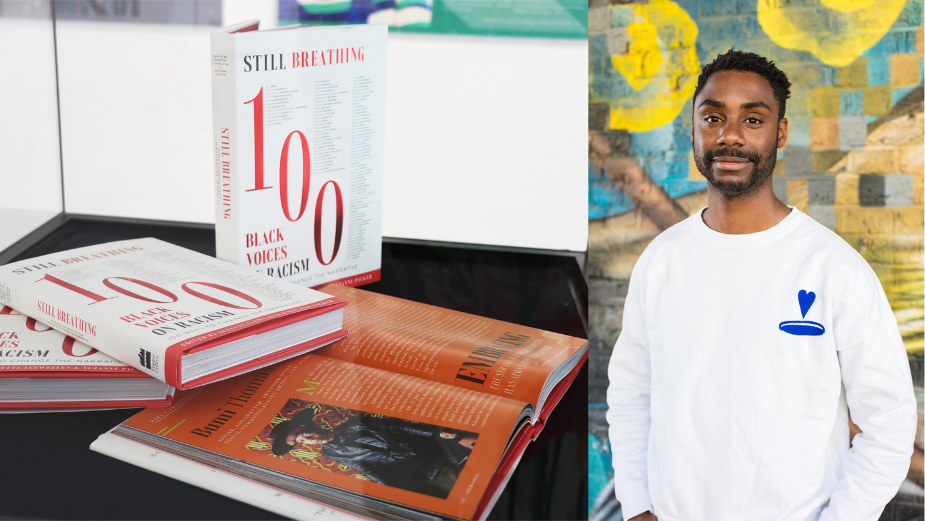
In response to the situation, actresses Suzette Llewellyn and Suzanne Packer decided to create ‘Still Breathing: 100 Black Voices on Racism, 100 Ways to Change the Narrative’. The publication collates stories from Black people across the UK to share their experiences and spread the message that injustice is still around us, and that there’s so much more to be done. This honest account of life in Britain is paired with the book’s support of the Ashdon Jazz Academy, to which all profits of sales will go.
To convey each story in the most visual way possible, graphic designer Kieron Lewis was enlisted by Harper Collins to tell the story in his medium. With a keen interest in empowering and inspiring the Black community, Kieron speaks at TEDxEuston, spreading the best ideas and innovations across Africa and the global pan-African diaspora. Also involved in Adobe Live sessions and engaging in public speaking, he’s keen to represent the Black community in creative spaces where he didn’t see faces like his own.
Sharing his experience of designing for the ‘Still Breathing’ publication, Kieron sits down with LBB’s Nisna Mahtani to explain how he brought the pages to life via visual storytelling and to share the new projects he's working on.

LBB> What were some of your initial ideas when it came to the design aspect of the publication?
Kieron> Over the years I’ve designed numerous publications, but this particular one will always have a special place in my heart. This was the first hardback publication I’ve ever created. From the cover to the interior, I designed the entire 300+ page publication.
Inspired by simplicity, my design rationale for the cover of the book was that emphasising the number would suggest to the readers the significant number of shared experiences on such a sensitive topic to the world. The dominant colour red would represent violence, danger and anger. The goal is to raise awareness and spark inspiration for a global honest conversation about such an urgent topic, regardless of your skin colour.

A gatefold was also applied to the hardback publication, with the ‘100’ text being embossed on foiling. Having the design on screen doesn't do justice to the design, but having the publication in hand, you will really appreciate the print production details.
LBB> You delve into various different styles, can you talk us through some of your favourite spreads?
Kieron> Tricky question, as each spread has its unique style and I really feel connected to the entire publication. One spread that I enjoyed creating was for Artist Fiona Compton (page 140).

I’m pretty sure all designers will agree, but when you’re giving beautiful high-resolution imagery to work with, we can do wonders! In this case, Fiona supplied us with many assets to work with and I had a ‘kid in a candy shop’ situation when choosing the one to work with. By selecting key colours that were featured in the artist’s imagery, in particular the yellow paint on her face, I was able to pull this out within my typographic design.
Another spread which sticks out for me was designed for an Anglican prelate, Rose Hudson Wilkin CD MBE KHC. With her spreads, the colour palettes used work well and I feel that the readers can get a clear sense of the content, before reading the paragraphs. Throughout the publication, two strong design elements that are very dominant are the typography and colours used. Ensuring that the colours I introduced complement each other accordingly, whilst not compromising legibility, was at times difficult. With 100 individuals featured, there are only so many colour combinations you can create until you go a little crazy.

LBB> How did you design to keep the voices of each person in mind?
Kieron> A book of this size, with so many individuals featured, can sometimes make it difficult to understand what you want your design to achieve. In terms of editorial layout, everyone featured has a very different spread. I was trying to keep coherent throughout the publication and at the same time considering everyone individually. This is so that I could reflect on their very unique personal experience of racism. In my opinion, if everyone had the same layout, then it would certainly dilute the emphasis on how important and different everyone's story is.
LBB> Talk to us about your personal experiences and connection with the topics covered in the publication.
Kieron> I’m a Brixton-born designer with Jamaican/Nigerian heritage and I’ve had numerous experiences of being the only person of colour in a team meeting during my time as a full-time employer. Especially within my days of working in advertising. So, one of the biggest challenges I faced during this project wasn't a design one. It was an emotional one!
As a Black designer, it was almost impossible to just lay the content out and not feel angry or saddened by what I was reading. Heartbreaking experiences and degrading words used to describe my brothers and sisters really hit home for me! I can honestly say, I’ve never worked on a project that I’ve had such an emotional connection with. I feel that I overcame this challenge by seeing the positives that publications such as this one can bring to our community, across all people.
I regularly give talks at schools, colleges and universities in the UK. I do this for various reasons, but the primary one is that when I was starting to attend lectures and talks, I rarely saw speakers that looked like me. Thus, it was difficult to relate or even draw similarities. So, I continually express within my talks to students that you can either wait for the industry to open the door for you or you create your own opportunity, with the aid of like-minded creatives.
Collaborating on self-directed projects is something I am a firm advocate of. Reading the different experiences and understanding how each individual overcame their obstacle can only inspire and encourage others, regardless of their heritage, to show compassion more and be respectful of people’s differences.

LBB> What are some of the challenges and rewards of designing a hardback cover?
Kieron> From a logistical perspective, When you have 100 submissions coming your way, imagery and copy at different stages and it is very easy to become overwhelmed. I like to think of myself as a designer who overthinks, colour codes and has a ‘plan b’ for every occasion. A gift and a curse, as many reading this might be able to relate. I developed a system by using an Excel document, which allowed me to keep track of all content, in particular the imagery that came through.
The positive feedback that the publication has received across creative blogs and other creatives has been overwhelming. When you put a book which is so hard-hitting with the content, you never know how it will be viewed by the public. Since it has been released, we’ve had the opportunity to feature it within galleries and have open group discussions in a relaxed setting. In my opinion, this is exactly why the publication was designed and why I wanted to be part of a project that would have an impact on many different communities and open the channel of communication between different cultures and experiences.
LBB> There are many different experiences which are covered within the book. From a creative perspective, what could the industry be doing more of, or doing better to encourage a more inclusive environment?
Kieron> The industry is forever expanding and I’ve realised more than ever, those in a position of power within our industry are incredibly active on social media. LinkedIn is a dominant one. Creating simpler and more effective ways of reaching out is something I believe would bring more diverse creatives to the table. This could be through online discussions or workshops that bring senior and junior creatives together in a relaxed manner.
The industry needs to remember that having the same people in the room will only bring the same conclusions. Mix it up, expand your thinking and ideas, and more importantly listen more. By listening more, you’ll notice that we all have exciting ideas to share. The only difference is that some might need more time to develop.
LBB> What’s the main message people should take away from this?
Kieron> My main message would be to start and continue the dialogue between different communities, backgrounds and abilities. I genuinely believe that this type of work will resonate across all generations. We have to ensure that this publication (and many more to come after this one) will be shared at universities and galleries around the world, as this will help set up an honest conversation surrounding racism.
The brutal truth is that racism will always be ingrained within our society. This will be an ongoing issue, and one that won’t be solved in my lifetime, or maybe even my grandchildren's. But, as long as we keep the conversation going, create more publications such as this one and make people feel uncomfortable by exposing the realities of others, we’re going in the right direction!
LBB> Are there any other up and coming projects we should keep an eye out for?
Kieron> So, I have two exciting projects, the first is another hardback publication but this time published with Chronicle Books. The title is ‘The New Brownies Book: A Love Letter to Black Families’. It’s a collection of artworks from detailed paintings and drawings to photographs and collages. It includes stories meant to be shared with children and adults, offering a way for all families – especially Black families – to connect across generations through the power of literature. The book will be launched on October 10th 2023.

The second is a collaboration between South London Gallery and co-curator Folakunle Oshun, founder and director of the Lagos Biennial. I was approached by both curators to work on the entire branding for their upcoming exhibition titled 'Lagos, Peckham, Repeat: Pilgrimage to the Lakes'. This includes the visual identity, a booklet, social media assets, tote bags and wall vinyl designs.

This exhibition looks at the connections between Lagos in Nigeria and Peckham in southeast London, from July - October 2023. The exhibition highlights the relationships, culture, shared history, communities and art that link the two places. The themes explored include transnational exchange, a sense of place and the contemporary metropolis.


