The Moving Picture Company Unveils New Global Brand Identity

MPC, the globally-acclaimed visual effects and creative production studio, today unveils a bold new expression of its brand identity for the advertising marketplace designed to simultaneously position the company for an expansive future while honouring its legacy as a leader in creating emotionally compelling content and stories.
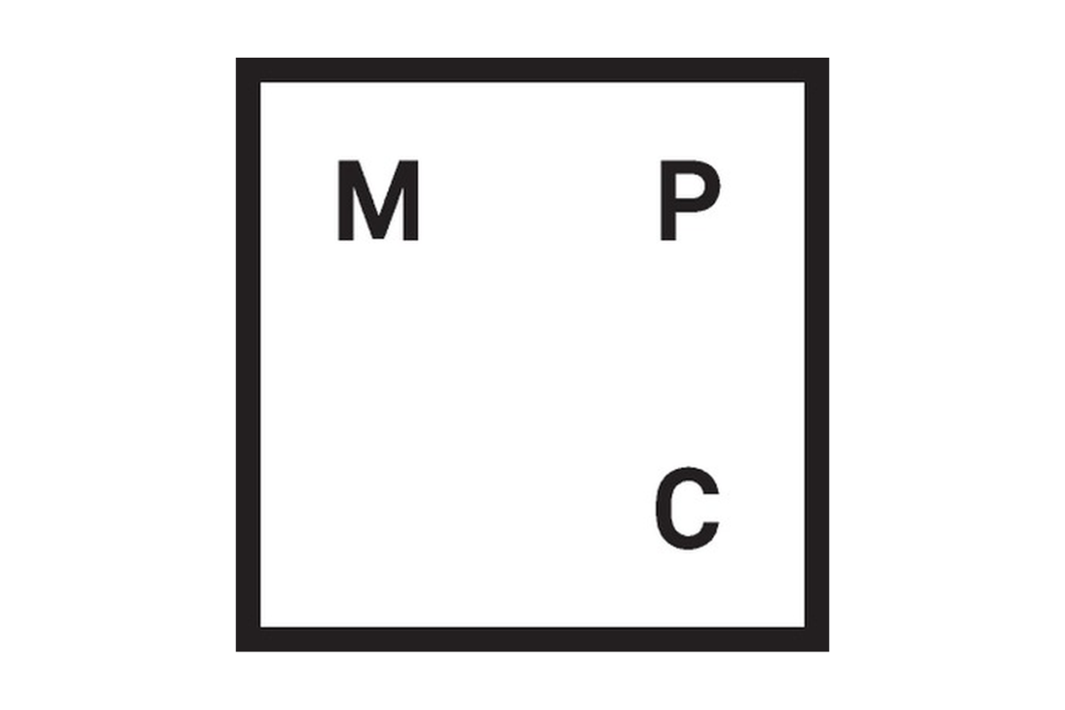
With a new logo created internally, the company is restoring its full name, the Moving Picture Company, to a place of prominence. The move underscores its ability to not only create moving images but to move audiences emotionally and persuasively with its work for global brands, marketers and ad agencies.
The new MPC identity relies on a strong, modular, typographical re-ordering of the company’s familiar initials, rendered with a fresh, contemporary look. Its logo will appear as a standalone design or with the Moving Picture Company wordmark, and will be rolled out across its digital channels directed at its advertising clientele, in all its market-specific branded collateral materials and at its studios in London, Paris (Mikros-MPC), Amsterdam, New York, Los Angeles, Shanghai and Bangalore.
“Our new visual articulation of the Moving Picture Company brand is an improved, more honest reflection of the position we occupy in the marketplace today, but with a deliberate nod to our past,” says MPC CEO Mark Benson. “Our artists, designers, directors, creatives, producers and technologists consistently produce award-winning content across every media category in which we work, from feature films to advertising. Our brand identity should reflect this confident commitment to quality in a way that demonstrates the pride and passion of our people around the world. And it does.”
A leader in its field since its launch in 1970 in London, MPC’s work has been widely recognised for its creativity and craftsmanship. MPC has earned countless ad industry honours ranging from D&AD Pencils to Cannes Lions to Clios, while MPC Film has won Academy Awards for The Jungle Book and Life of Pi.
The rebranding effort was in response to MPC’s realisation that its existing branding didn’t reflect the high level of work – both in terms of creativity and craftsmanship – its studios have been producing. It’s also a response to the changing nature of its marketplace.
“Our industry is rapidly evolving, both in terms of the kinds of work we do and the types of clients we’re partnering with,” explains Lauren Pollare, global head of marketing at MPC, who led the rebranding effort. “MPC is now working directly with brands, creating original content, working with location-based entertainment venues and collaborating with experiential agencies. We felt this was a great opportunity to redefine a company with a solid reputation, impressive credentials and a truly unique legacy, and position it with a clear, strong identity for a new generation of clients.”
In preparation for the process, Lauren and her team conducted in-depth interviews with close to three dozen key stakeholders from across the company, representing different roles, different locations and varying levels of professional experience and tenure with the company.
“The key takeaway from this exploration was that our branding and identity needed to be bolder, prouder, more confident and more innovative,” Lauren notes. “Almost uniformly, our people are excited about creating work that connects with audiences on an emotional, human, one-to-one level. Ours is not just a story about technology; it’s a narrative of purpose, of creative craftspeople using that technology in innovative ways to reach people’s hearts while we dazzle them visually.
“The acclaimed ads we’ve worked on for companies like John Lewis, VW or Samsung are widely known for their ability to connect emotionally with audiences,” Pollare continues. “People are genuinely moved by what we create, particularly our creature and character work. This is at the core of who we are and forms the foundation of our relationship with the agencies and brands with which we partner. So our new identify and positioning fell naturally out of our research and this heritage; we are the Moving Picture Company – we create experiences that move people.”
The task of applying this concept of ‘moving people’ to MPC’s visual identity fell to lead designer Manuel Sepulveda and his team. At the same time, the goal was to modernise the look and feel of the company and create a logo that would work across numerous channels as well as globally.
“When we started to ask, ‘Who are we? What do we do?,’ it became clear that we’re one of those firms that does what it says on the tin,” Manuel quips. “We’re the Moving Picture Company, we move audiences with our work – so an identity that was simple, bold and which above all conveyed this idea of movement or motion was something we were hugely interested in. We needed to be able to make our branding live and breathe.”
Extensive R&D was done to execute a moving, fluid branding, one that would look as dynamic on screen as on the printed page. “Movement is in our blood, so our identity needed to reflect that,” Manuel says. “We wanted something that could be adapted effortlessly whilst maintaining a strong and coherent visual presence. Working with the grid that encloses our initials, which is scalable to infinity and provides for hundreds of variations, helped us achieve this objective.”
“We believe that, within the guidelines we’ve set forth, our brand will evolve in rather playful ways,” Sepulveda adds. “It will be interesting to see how our artists around the world experiment with it, while keeping intact the integrity of the original design. I’d expect that through the various iterations they’ll create, we’ll see it constantly moving and changing, yet still conveying a strong, clear identity. And that would be exciting, as we didn’t want this to be too stuffy or corporate, and allow room for the creativity and imagination of our work and our people to shine through.”


