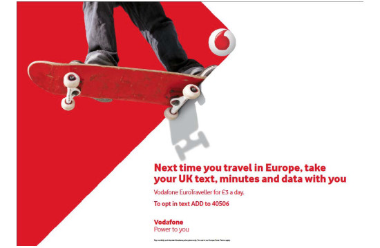
The Brand Union's Visual Identity for Vodafone

The agency’s teams in Singapore, Stockholm, London and New York, alongside digital brand consultancy partner Digit, were tasked with developing a new visual identity that was unique, adaptable across Vodafone’s markets, future-proof and modern. The final design selected was conceived in Singapore and developed in London.
The new identity, Power of Red, uses the bright red synonymous with Vodafone to convey confident energy and progression. Central to the new identity is a flexible rhombus shape that anchors to the Vodafone roundel, positioning Vodafone as a catalyst for progress. It is being introduced across Vodafone’s markets over the next few months.
Vodafone Group Brand Director Barbara Haase said: “Our new visual brand identity is a true representation of Vodafone: never static - always moving - and ensuring that our technology empowers everyone who uses it.”
Christina Futcher, Client Director, The Brand Union: “Today, every moment of interaction between brand and user must feel like a real relationship; a consistent experience wherever you are. To fall short on that authenticity test and the consumer will not allow you to progress any further. Our team at the Brand Union has been collaborating with Vodafone, evolving its visual brand identity for over a decade. It's an incredibly exciting journey we continue to be a part of."
Wally Krantz, Worldwide Executive Creative Director, The Brand Union: “This has been by far one of the most exciting visual identity projects that we've worked on, engaging the full breadth and capability of The Brand Union's global network. Considering the sheer size and scale of Vodafone's operations and its wide reaching, international consumer base, we believe this new visual identity talks to each and every individual connected to Vodafone in a more compelling, human and motivating way.”


