SRG Rebrands Jamba Juice as ‘Jamba’ and Redesigns Stores

Jamba Juice, one of the originators of the smoothie and juice category, is taking a bold step as the brand turns 30 to expand its offering and redefine its brand. Key to its brand evolution is a new identity and store design created in partnership with the Sterling-Rice Group (SRG).
With Jamba moving beyond juice to broaden its menu to feature smoothies, juices, bowls and on-the-go bites, SRG saw an opportunity to shorten the name to Jamba and to update its logo. The shorter name provided a way to accentuate Jamba’s wider array of offerings and enable the brand to expand.
In explaining the brand refresh, Jennifer Jones, Managing Partner, Brand Design at SRG said, “The leadership at Jamba knew the brand needed to evolve. Our design challenge was to find a way to shift the consumer mindset about Jamba to a more healthful and nutritious space. As Jamba set about redefining the category it created, we also needed to update its look and feel as the original logo had become dated and the colours felt artificial.”
SRG’s new logo features a simple script to give it a handwritten look, designed to make the brand feel more approachable and casual. The team also refined the signature whirl, which evokes the blending of ingredients, into a colourful expression of the fresh fruits and vegetables Jamba features every day.
“The logo and store environment use colours that are fresh and bright,” explained Jones. “We moved the colour palette away from sugary cotton candy into more fruity oranges and healthy, vibrant greens to reflect wellness and health.” Jones noted that the change in colours was inspired by nutrient rich superfood ingredients such as spinach, kale and spirulina.
“We’ve been offering balanced ingredients on the go for almost 30 years and must continue to evolve to meet our guests’ ever-changing definition of wellness,” said Jamba’s President Geoff Henry. “We’re staying true to our heritage as an innovator in the space and refreshing the brand to stay focused on how we can make it easier, better and faster for guests to live a more active lifestyle. We’re proud to have launched the smoothie and juice category three decades ago and can’t wait to join our guests’ wellness journey for decades to come.”

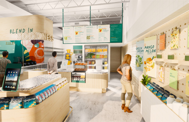
To bring to life Jamba’s new purpose SRG created a more local store feel to give the brand a less corporate look. SRG re-envisioned the interiors of Jamba locations to evoke its authentic, juice shop roots. Light wood finishes and simple, modern fixtures give the stores a natural and inviting ambiance. Peg-board walls provide a creative backdrop to tell stories about nutritious menu items in an inviting and educational format.
“Every corner, counter and wall of the store is designed to create a welcoming customer experience from the moment someone walks into a Jamba location,” noted Lance Reed, Creative Director at SRG. “Our goal with the light wood and colourful graphics was to celebrate the food that Jamba serves and make that the centre of attention. We call it food theatre.”

Inside Jamba locations visitors can navigate easily to the counter or the new built-in seating, which features a cantilevered table and stools. The interiors have been streamlined to provide a welcoming entry with ingredient stories and facts selectively featured on the wall to provide ways to educate consumers about ingredients so they can customise their food choices.
Starting this summer, new Jamba locations will utilise the new design vision while existing store locations will be remodelled to adopt the new look and logo.


