


Speedo Dives into a New Era of Branding

Swim gear and swim accessories brand Speedo has recently announced its rebrand with the help of creative agency Anomaly. The goal of the refresh was to revitalise the previously inconsistent and overlooked branding, while leveraging the motto ‘For the love of swim’ throughout and celebrating movement and expression in all of their forms – life, positivity, growth and abundance. Let’s dive into the design of it all.
Designing for Performance and Passion
“Speedo has such a strong latent legacy, it’s part of a handful of brands that are absolutely synonymous with their category,” says the team at Anomaly. “But the brand has started to lose a bit of its rightful place emotionally in the hearts of its core audience and the perception of a colder, performance-based brand that started to emerge.”
This perception, however, was at complete odds with the passion and love that Speedo and its consumers have for the sport – something that runs through and is inherent throughout swim culture. So it was time for change.
At the start, Anomaly says, “there was some great work that has already been done strategically, internally, before we dived into the evolution work.” There was a clear mission from the get go – to propel swim culture forward. “We wanted to have a brand idea that could tie both the elite and amateur swimmers in a shared passion.” This is where ‘For the love of swim’ was born as the lens the agency used to make every design decision from then on.
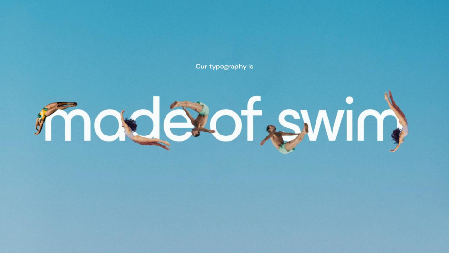
The approach was to put the swimmer at the heart of the design, so two main considerations emerged – evolving the recognizable mark of the brand and evolving the logo, and more specifically balancing them in a way that breaks the previous ‘lock’ they were in, making them more fluid and movable.
The mark, being the iconic Speedo ‘arrow’ or what they call the ‘boom’ that we are used to seeing in proximity to the brand name, has a long history of evolving with swim culture – it has changed colour, shape and has moved around the logo quite a bit over the years.

Anomaly’s goal was to retain its familiar silhouette and develop rather than reinvent the boom. This eventually resulted in the slight shortening of the “ascenders and descenders”, allowing for increase in size when applying on the product (the swimwear or accessories). “A reimagining of the Speedo S, by changing the angle of the letterform, allowed it to communicate speed and we were then able to reflect the angle of the accompanying boom mark.” This is where the desired balance was struck.
Outside of designer terms, Anomaly explains that the boom was given a “little nip and tuck”. They simply shortened the top to give more movement and balance it with the actual ‘Speedo’ wording, resulting in a moment of angle matching. “This means that the new S mimics the boom. The main move here was less about its form and more about liberating the two marks from the lock-up. We had the idea of these two iconic elements being able to ‘swim’ together across executions and motion. A move that really opened the possibilities around the world of application.”

Something Anomaly took very seriously was where the logo would most often be seen – on swimwear. And swimwear tends to stretch and twist in peculiar ways, not to mention its distortion underwater. So, they focused on how an evolution of the wordmark would need to perform. “We knew it had to stretch and mould around a swimmer’s body. The result is a new logo that retains its iconicity and legibility, whilst happily swimming in its natural habitat and beyond.”
Unintentionally Brat Coded
Next up, colours – the new brand colour is almost in perfect line with brat summer, as it’s a recognisable lime, neon-y green. But Anomaly assures us this is a mere coincidence, albeit a great one.
“Unexpectedly – what’s not to love about the timing of the brat summer green craze,” they say. “Something must have been in the ether, but we have a feeling Speedo’s colour will feel relevant a little longer though! Generally brands, like anything else that touches culture, are affected by trends and macro tastes and movements, but we really wanted to create something that was born, purely, from a design idea. And that would, consequently, stand the test of time.”

So what was the design idea? The brand and the agency’s deep dive (pun intended) into everything swim led to a piece of research around water safety called ‘On-water visibility’. It had concluded that Fluro green is more visible in water than the traditional orange used for water safety.
“That seemed like such a fantastic opportunity to us,” Anomaly says. “It made sense that Speedo should be the most visible brand underwater. We worked with Pantone to create a bespoke fluro green that has Speedo’s Olympic roots baked into it; a combination of Olympic gold and fluro green gave birth to a new iconic colour within the brand palette.”
When it comes to the rest of the brand colour palette, the starting point was quite restricted. The previous iteration of the guidelines consisted of Speedo’s iconic red, with black and white accents. “We wanted to expand our approach to colour, allowing it to show up in the different energy states and applications that would be required of it.”
In line with this, Anomaly re-introduced Japan blue, an iconic blue that has been part of the history of the brand, allowing them to take water to physical spaces. “Beyond the core palette we implemented a responsive colour approach for communication that considers new brand themes, from iconic to expressive, bold and functional. Each theme flexing the palette in subtle ways.”
The Visual Language of Pools
Something quite abstract for us non-design folk that Anomaly took into consideration was the “language of pool shapes and the grids found in pool tiling.” They explain that getting to a flexible grid system was core to creating consistency and fluidity across all brand applications – it had to be a system easily used, from packaging design to print and digital communications.

Their team combined two thoughts they’d been playing with, which immediately “opened the beautiful system that [they] eventually created.” The first was the base, a physical grid reflecting the imagery and design of any pool: blue square tiles arranged in perfect combination.
This was then overlaid with “fluid behaviours” for the grid: swim lanes, pool edges and shapes, inspired by real-life pools, which ended up giving the system a versatile feel and an ease of adaptability.
So there you have it – brat green, gold-medal yellow, pool language and a whole bunch of other nifty design details all went into creating this new look for Speedo. Now, back to watching the Olympics.


