


Sky Creative Draws a Parallel Between Impressionist and Golf Masters

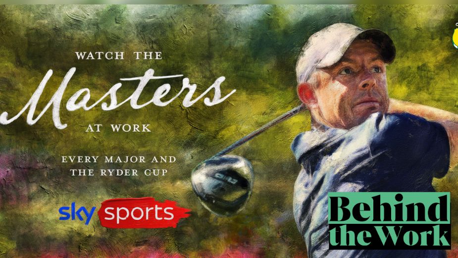
Sometimes the simplest creative idea is also the best one. Tasked with promoting the anticipated Masters golf tournament– featuring golfers Rory McIlroy, Shane Lowry, and Bryson DeChambeau in Augusta, Australia across TV and OHH – the Sky Creative team turned to the masters of art for inspiration, drawing a parallel between artistic mastery and golfing excellence.
Copywriter Adam Rimmer and art director Pete Davies say that making the analogy between golf’s and art’s masters felt instinctively right for the campaign. Plus, the Augusta golf course – famous for its beauty – lent itself naturally to being represented like a painting.
Executing the painterly style of 19th century Impressionists Claude Monet and Édouard Manet proved challenging and the CG and motion teams worked tirelessly to create the layered, organic feel of brushstrokes on canvas. The visuals were so detailed that “each image ended up having hundreds of layers on top of one another, creating some of the biggest file sizes Sky Creative has ever seen!” Adam and Pete reveal.
LBB’s Zhenya Tsenzharyk caught up with Adam and Pete to learn about the idea’s evolution, the challenge of executing the Impressionist aesthetic, and confidently leaning on simplicity.
LBB> Drawing a parallel between golf’s masters and art’s masters is brilliant, elegant, and deceptively simple. Tell us a little bit about the ideation process and how you landed on the idea?
Adam and Pete> Sometimes a creative idea can spring immediately from the briefing, if the strategists and account team have provided a great proposition or turn of phrase… and happily this was one of those times. They talked about seeing the “masters at work” and immediately we saw the analogy with the incredible abilities of the masters of painting.
And it felt like a very appropriate analogy for an event taking place at Augusta – a course so stunning, it already looks like a landscape painting! Plus, you can just imagine they’ve got similar paintings of golf scenes lining the clubhouse walls there.
LBB> Was there ever a discussion/worry that the concept was too simple?
Adam and Pete> No, not really! We thought it was simple in a good way. We did have a slight worry that saying “watch the masters at work” could create a confusing triple wordplay with the event The Masters itself. Would people think we were referring to the tournament rather than the players? That’s why we only made the word ‘masters’ big in our headline and TV endframe. If we’d made ‘The Masters’ big it might have been read as “watch The Masters,” i.e. the tournament.
LBB> The OOH leans fully into the old masters’ style while the TV spot is a blend of realism and the art style. Talk us through that decision.
Adam and Pete> We had originally thought that the TV spot should be 100% painted. Then we tried showing the real world transitioning into the painted world on key sequences…and as soon as we saw the first versions of this, we knew we had to keep it!
The way we animate into the painted world through a painter’s brush strokes on canvas gives the spot an extra dose of dynamic energy, as well as providing extra visual elements to our artistic theme.
And by showing the real world first then the painted, it makes our creative idea even clearer and more impactful – there’s no chance you can miss it. It also gives us a good dramatic surprise when the painted effect suddenly appears seven seconds into the spot.

LBB> Which artists served as the inspiration for the visuals?
Adam and Pete> We took the 19th century Impressionist masters Claude Monet and Édouard Manet as our closest inspiration. We wanted a style that was sufficiently abstract – if we went too close to realism you might miss it’s a painting – but that could also convey enough detail so each player was instantly recognisable and both of their works were a good reference for achieving this balance.
And in both the TV ad and print work we subtly shift this balance through each scene, so we’re more abstract with thicker, more noticeable, oily brushstrokes in the background, but have a slightly more refined, detailed look on the golfers’ faces in the foreground and centre, whilst ensuring this difference isn’t manifest across the image.
LBB> The campaign is beautifully executed, and we’d love to know what went into it to ensure that it looked really impactful. How did you actually create the artistic visuals? Did you run into any challenges during the making of this campaign?
Adam and Pete> Our challenge was to create the painted effect in two separate ways for TV and print yet have the two worlds look sufficiently similar. And even though the two mediums were created differently, perhaps unsurprisingly, they shared similarities in how they came together.
We were confident we could achieve the required standard in the still images in time, but the AV was more of a challenge. We needed to find a brilliant solution quickly, so we put the idea out to pitch to several big postproduction companies, but they were struggling to land both the quality and turnaround speed required. It was important for the final look to be worthy of our comparison with the masters of painting – a lot of the painting software plug-ins gave a slightly basic or watercolour look.
In the end, our brilliant in-house design teams’ collaborative efforts across our static, CG and motion teams saved the day. They’d tried numerous techniques – from off-the-shelf plug-ins, to bespoke codes and scripts that turned Photoshop into a render engine for After Effects – before finally settling on a combination of tools that allowed them to rebuild pixel information layer by layer with tens of thousands of individual brushstrokes. This made sure our output had an organic crafted feel, where every frame was unique, rather than the digital looks created by filters and effects.
Combined with general compositing techniques (including adding extra brushstroke textures to the backgrounds) and animation, they were able to craft a wonderfully rich style that matched our static visuals, creating a seamless look for the campaign.

LBB> And the print work came together in a similar fashion?
Adam and Pete> Yes, the designers creating the still images went on a similar journey. They tried numerous Photoshop plug-ins and internal filters, but none of them worked well enough on their own (although some provided brushes and textures they used later on).
A breakthrough was discovering the art history brush, which they used to layer different levels of detail in as a base point for each image, using a combination of different brush types and sizes to bring the information through in the style and texture of a painting.
This foundation was refined by digitally hand painting to add the textures and divots of real brushwork. Each image ended up having hundreds of layers on top of one another, creating some of the biggest file sizes Sky Creative has ever seen!
It also meant that any changes to the content of the image meant going back to square one for that section and building the whole complex symphony again from scratch. Fortunately, it all came together beautifully in the end, thanks to the patient craftsmanship of our masterful design team.
LBB> What was your favourite part of working on the campaign?
Adam and Pete> That moment when we turned a corner from worrying if we could achieve an artistic look sufficient of the lofty title ‘The Masters’ in the time we had, to seeing that it was all coming together beautifully in the end to achieve this.
In golfing terms, it was like attacking the green with a fairway wood. It’s ambitious and most of the way there you’re not sure how successful you’re going to be, then it lands near the end and you see that everything’s going to end up glorious and you can enjoy those last moments seeing it draw to a successful conclusion.


