Reimagining an Icon: Behind BBH London’s Bold Tesco Campaign

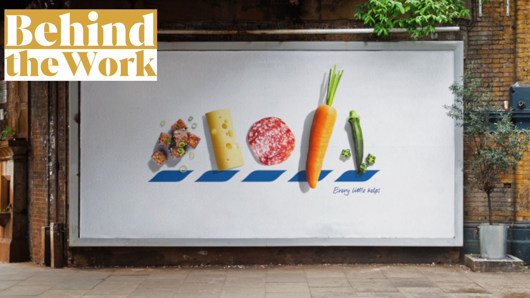
In BBH London's latest campaign for Tesco, titled ‘ICONS’, the agency took a bold step and reinvented the retail brand's classic logo with a fresh twist: replacing each letter in ‘Tesco’ with beautifully-photographed food items.
This visual approach is a nod to Tesco's emphasis on quality and lets the products quite literally speak for themselves. Developed in response to Tesco’s aim to reinforce its image as a quality food retailer, ‘ICONS’ combines clean visuals with clever minimalism, transforming the brand’s famous logo into a vibrant culinary showcase. The campaign's simplicity and engaging imagery are designed to capture attention in high-traffic areas across the UK. It not only elevates Tesco’s brand image, but further underscores BBH’s willingness to push creative boundaries. Through a mix of simplicity and playfulness, BBH created a campaign that stands out in the cluttered out-of-home space and invites consumers to engage with the brand on a new level.
Today, Felipe Serradourada Guimaraes, BBH London's deputy executive creative director, dives into the creative process behind ‘ICONS’ and discusses the careful risk assessment involved in altering an iconic logo – a move that defies typical brand marketing wisdom. Felipe reveals how BBH’s team worked closely with photographer Will Cooper to ensure each food item reflected the essence of Tesco’s quality while maintaining the logo's visual integrity.
LBB> Tesco’s brand is iconic and instantly recognizable, even when altered. What was the inspiration behind replacing the logo letters with food items, and how did you ensure this creative decision still aligned with Tesco’s brand identity?
Felipe> Food is at the heart of everything Tesco does, so it made sense to literally put it front and centre, and let the food do the talking. Only a brand as iconic as Tesco could do something like this.
LBB> How did Tesco initially react to the bold proposal of altering their iconic logo?
Felipe> They reacted like everyone else. They looked at it and said ‘That’s Tesco’. The simplicity of the food being so closely linked to the brand meant that the removal of the words didn’t seem scary. They could see the value in doing something simple and iconic, that would hopefully get talked about.
LBB> Conventional marketing wisdom advises against changing established logos. How did BBH approach this risk, and what convinced you that this bold move would resonate with Tesco’s audience?
Felipe> It’s important to stand out, be loud, and make sure our work is talked about. But Tesco is one of the few brands that you can strip back to a few elements and it still be distinctly ‘them’ so we never saw it as risky. I think we knew it would resonate because it’s got that little satisfaction of ‘getting it’ for people who engage.
LBB> How did you work with photographer Will Cooper to ensure that the food not only looked appealing but also communicated the message of Tesco’s dedication to quality?
Felipe> Will was fantastic. We chatted with him about how important it was to make each item of food as iconic as the logo. And he delivered. And I think the care and attention to detail put into the ads reflected Tesco’s dedication to quality.
LBB> You mention the campaign is aimed at everyone who loves food. How did you ensure that the diverse range of food items in the campaign appealed to different tastes and preferences across Tesco’s broad customer base?
Felipe> Tesco is the nation's supermarket. It sells everything to everyone so finding a range of products was the easy bit. Making sure we had plenty of E’s and O’s less so.
LBB> How did you adapt the 'ICONS' concept to work across a variety of settings, from billboards to bus stops, ensuring that it would maintain its clarity and impact?
Felipe> The beauty of the campaign was its simplicity. It was made for OOH, so no matter its placement it worked. If you see it at a glance you think that’s Tesco. If you sit and work it out you say, ‘Ohh, it’s actually T.E.S.C.O’.
LBB> What were some of the key challenges you faced in executing this campaign, from conceptualising to final production? Were there any unexpected hurdles, especially when working with such detailed food photography for outdoor settings?
Felipe> They weren’t challenges as such but when you have so few elements on the page you can drive yourself crazy dissecting every detail. But that’s the job, right? Craft it. Although, when you’re moving edamame beans with tweezers for the 17th time you do question your sanity.


