Prophet Rebrands Reorg (Now Octus)

Reorg, the leading provider of global credit intelligence and data, has renamed and rebranded itself as Octus with the help of growth strategy firm Prophet. Revealing a new brand identity that better captures the breadth and depth of the company’s capabilities across the entire credit lifecycle, Octus reflects the company’s market leadership supporting the world’s leading investment banks, buy side firms, law firms and advisory firms. From deal origination and primary issuance to performing, stressed and distressed credit, Octus is the essential source for data and insights across all aspects of sub-investment grade credit.
The name Octus is inspired by oculus, Latin for eye, and speaks to the company’s ability to reveal insights and unlock truths that accelerate critical decisions and fuel decisive action across financial markets. Octus is a short, impactful and meaningful name that allows the company to showcase its value across the full credit lifecycle, enabling our audiences who seek clarity in a complex market to see inside credit.
“We were asked to help reposition a brand that needed to catch up to its growing business and expansion into new services, and we’ve created an expression of a leading company with deep knowledge and scale in its industry,” said Craig Stout, senior partner and executive creative director at Prophet. “With a unique story and tonality, Octus stands out in the competitive landscape, positioning itself to build equity into the name and assert competitive differentiation now and into the future.
“The rebrand from Reorg to Octus was a holistic, ground-up approach, from developing a revised messaging framework, logo mark, and name to creating core activation resources, such as our new brand video and a completely new website,” said Drake Manning, senior director, corporate marketing. “I’m extremely proud of our team’s partnership with Prophet, the creative vision of the brand team, and our ability to accomplish the full scope of the rebrand in less than eight months. It was a huge lift, successfully executed by all.”
Logo
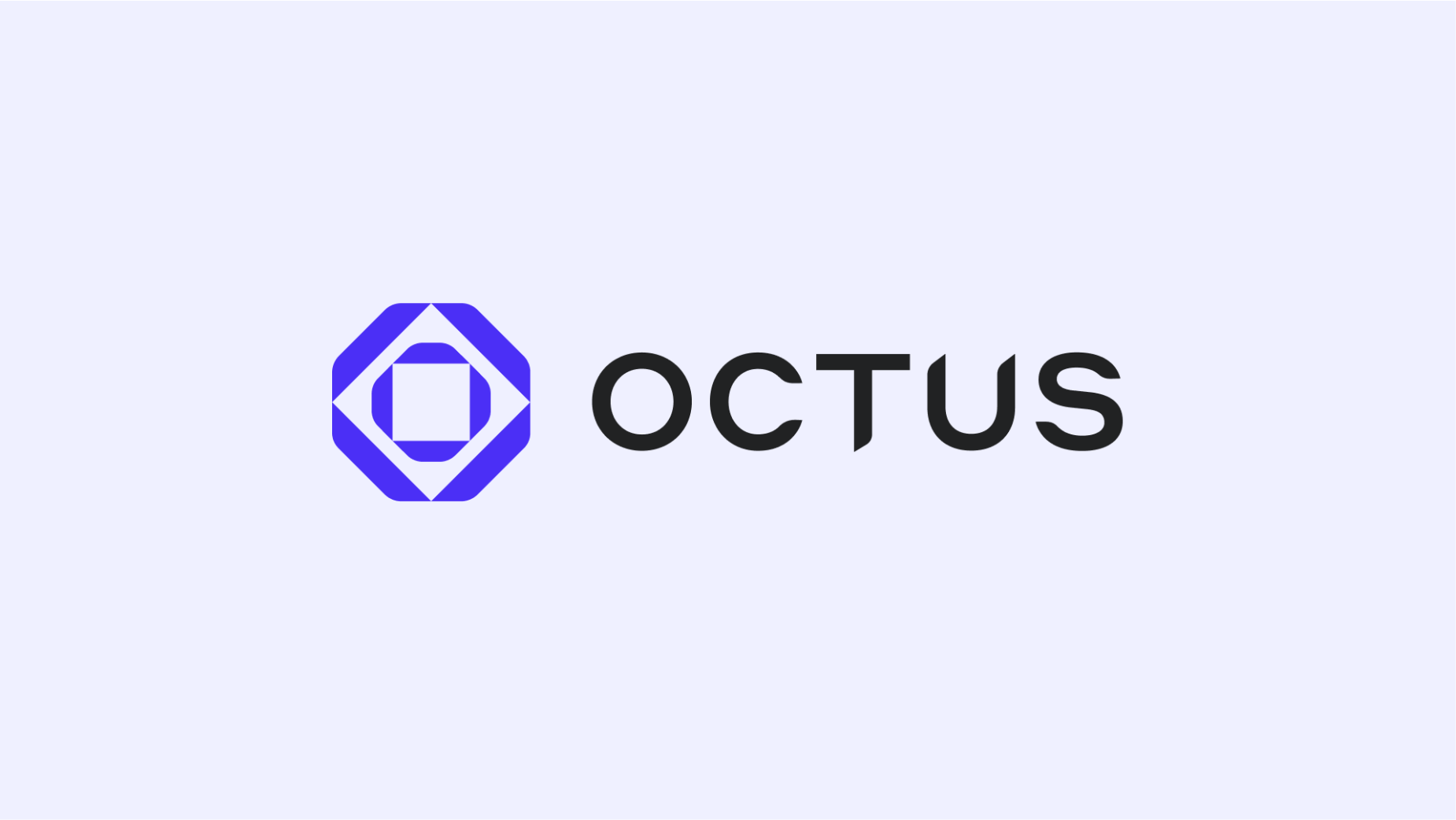
The new logo mark, the Octolens, contains eight segments, calling back to the “octo” meaning of eight. The Octolens symbolises viewing new insights and uncovering new perspectives. Nested parts recall a kaleidoscope, symbolising the company’s breadth and depth. In addition, the “Octus” wordmark implies precision, strength and sophistication through customised, hand-drawn typography that is set in all-caps.

Typography
The new type system consists of two font families, serif and sans-serif, chosen for its precise lines that balance a tech and editorial feel. The Serif font, Tiempos Headline, brings in a sense of expertise and sophistication while the Sans-Serif font, NB International Pro, brings in a sense of clarity to support information hierarchy. The main objective of the typographic style is to support clear communication of the company’s key messages.

Colour Palette
Octus’ new brand colours are modern, bold and vibrant. They are designed to give flexibility across its visual identity while being simple and easy-to-use - in White, Ice, Octus Blue, Octus Dark Blue, Charcoal, and Black. As the colour blue naturally conveys trust, Octus Blue was chosen specifically to convey the “sea of trust” within Octus’ products and to differentiate it from others in the financial services category.

Visual System
Prophet crafted the entire look and feel of the Octus brand with guidelines and systems that create ownable Photography Styles, 3D Graphics, Iconography, Illustration, Data Visualization and Layouts - used by Octus in its marketing, client communications, sales materials, signage and more.

Process
Prophet worked closely with Octus through a very iterative process - starting with mood boards and brand worlds to imagine, including what the holistic design would be for each world, the Prophet team then built out the chosen Octus identity into a complete brand strategy. The resulting rebrand took a complex business in Reorg to a carefully crafted design that creates clarity in what Octus brings to the market.
“Reorg was experiencing impressive growth while also expanding their reputation and reach in the global credit market, and it was time for their limited brand perception to catch up with the success of the company, " said Mike Fleming, senior partner at Prophet. “We took a holistic view of the brand in creating Octus to embody its expansive scope of offerings and the trustworthiness of the company’s positioning at the intersection of finance, media and technology. We generated over 1000 names, but one stood out above the rest - Octus - a short and powerful name that sets up for the future, allowing the company to showcase how it supports the full credit lifecycle and highlight what it does best: uncovering truths, revealing insights, and helping customers see the way forward.”


