


OOH: "The Only Truly Unskippable Ads"

“If it doesn’t work at a glance, it doesn’t work at all.” The sentiment by VMLY&R’s executive creative directors Justin Ebert and Niraj Zaveri is pretty indicative of OOH (out of home) advertising and the impact it has to have for an audience to engage with it effectively.
The advertising medium refers to anything from billboards to posters, bus stops to instillations and pretty much anything that you see out and about, either on a screen or just in the open. “It strikes me that the only truly unskippable ads in the world now are OOH campaigns,” says Fold7’s executive creative director Dave Billing when reflecting on the unique qualities of this type of ad style.
The impact of OOH is somewhat unprecedented, in the UK it is estimated that roughly 80% of people are exposed to this type of advertising and in the US, the Advertising Association of America stated that in 2019, 40% of people searched for a brand online after seeing an OOH ad, and 74% visiting that business shortly after. With the statistics showing the clear benefit to businesses, it’s up to the creatives behind the scenes to tap into the audience through innovative methods and beautiful creative pieces. So what actually captures viewers and what are the secrets to creating effective OOH ads?
There are several different approaches which creatives take to the process, from standing out to letting creativity take reign, to prioritising humour or minimalism, or just a combination of several different factors. The main aim is ultimately to catch the eye of passers by, convey a brand’s tone of voice and make that all important sale.
Standing Out in the Crowd
In the advertising world, there’s nothing better than catching someone’s attention. “In the bustling world of outdoor advertising, where every brand clamours for attention, it’s vital to break through the monotony and stand out like a culinary maverick in a sea of microwave dinners,” says Mike Watson, creative director at Wunderman Thompson. “This is where art direction and design play a pivotal role. They are the disciplines that help you present your product in a manner that’s appealing to the eye. And these days, if you can get people to look up from their phones it’s an accomplishment.”
Getting people to pay attention, however, is a matter of substance over style, as Mike reminds us. “But just as in the gastronomic world this expanding analogy is being drawn from, your work needs to taste as good as it looks, especially in a field where creativity meets commerce. Let’s not forget that the purpose of advertising is to sell. That’s why clients hire us.” He explains how ideas must reign supreme and that memorability is key in this medium.

Global Street Art’s co-founder and CEO, Lee Bofkin shares his thoughts on standing out, “The role of advertising is to (try and) stand out so the rules focus on what you can’t do, not what you can.” He continues, “The murals we produce are as close to art as advertising can be but there is still a clear distinction for us: if there’s a commercial message, it isn’t street art,” he further explains how advertising should capture viewers in a different way to pure artwork. With the agency working on both mural work and advertising efforts, they’ve learnt what it takes to distinguish between the two.
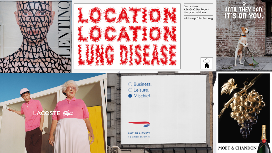
“I believe that, if a client could put an artwork on a billboard or DOOH (digital out of home) screen, they should also be able to paint it; HPA shouldn’t be at a disadvantage versus other forms of outdoor. Some recent murals that we’ve painted that would stop you in your tracks include, well, most of them.” Lee goes on to mention campaigns by Tinder, Diablo, Valentino, and Charlotte Tilbury that have engaged viewers through their striking nature, pushing the limits of what’s possible.


Focusing specifically on posters, AMV BBDO’s creative design director Mario Kerkstra mentions the striking work they did for COPI’s addresspollution.org campaign. “[We] used punchy writing combined with eye-catching type design to stand out in a sea of outdoor sameness. They were distilled down to the only elements that were needed to get the message across in the clearest way possible,” he says. Creating this balance between clear design and punchy copy made passers by stop and take note.

“If nothing else, outdoor advertising has to stand out,” says Thinkerbell’s executive creative tinker Paul Swann, agreeing with the rest, “one great way to do that is through novelty, therefore we have permission to expose people to progressive graphic design and typography as well as striking photography.” He explains how a minimalist approach can aid the striking nature of visuals delivered for clients. “It would be a bit self-aggrandising to suggest that we’re delivering some sort of public service here but we are being given an opportunity to impact culture so we should think about that when the next opportunity presents itself.”
M&C Saatchi London's creative director Tom Kennedy agrees that OOH is anchored by one thing. "Its very job is to steal your attention from the world around you, so doing the opposite comes with a cost," he says. "You lose that jolt. You instead have to play for a slower, targeted smile in the mind – to allow some eyeballs to miss your message, in favour of the few you want to attract. When a brief comes around that allows that pace change, it’s a wonderful test." He believes that ads don't always have to add to the environment they're placed within, "But when they do, it can be something pretty special."
M&C Saatchi London's creative director Tom Kennedy agrees that OOH is anchored by one thing. "Its very job is to steal your attention from the world around you, so doing the opposite comes with a cost," he says. "You lose that jolt. You instead have to play for a slower, targeted smile in the mind – to allow some eyeballs to miss your message, in favour of the few you want to attract. When a brief comes around that allows that pace change, it’s a wonderful test." He believes that ads don't always have to add to the environment they're placed within, "But when they do, it can be something pretty special."
He explains a piece the team recently worked on. "We reproduced multiple Old Masters with modern twists. A Durer taking a selfie. A Gainsborough with wind turbines, but most prominently, Vermeer’s Girl with a Pearl Earring, at scale. A 100ft mural of the world-renowned artwork but with a twist, replacing the jewellery with an ear pod. The visual added to the graffitied streets of Shoreditch, as did the spectacle of it being meticulously painted. The subtle message spoke to the brand’s storied expertise combined with modern techniques, but only needing to be fully understood by its specific audience."

Beautiful Design Makes a Difference
“First create something simple and beautiful, if possible, smart and honest,” says BETC Paris’ creative director Damien Bellon. In theory, this is a simple sentiment but can prove to be quite challenging in practice as he explains, “It is better to avoid familiarities, and to respect the audience regardless of age, considering that they consist of our own relatives and individuals with diverse sensitivities.” This, however, doesn’t come with ‘safe’ choices.
He says, “Exceptional out-of-home advertising should entertain, make people laugh, or challenge preconceived ideas, share beautiful craft, although achieving this level of excellence is rare.” In particular, he refers to the work from Moët & Chandon which features what Damien describes as “intriguing, simple, and beautiful images.”

Paul Swann’s prior comments about minimalism apply here too. “Another way to create beautiful yet effective OOH work is to take a minimalist approach, employing fewer but better crafted elements,” he explains. “We can learn a lot from thinking about the principles of art and the artistic method. Great art begs questions and provokes thought and great advertising can do the same. We can engage consumers by rewarding them for joining the dots or entertaining them with unexpected language or visuals.” While the aim is to convert people in a way artwork doesn’t, the point stands nonetheless.
“Artists break rules and mores and that’s something we try to do too, eschewing standard grids and logo placements for more interesting layouts.” That’s played into the Thinkerbell team’s approach. “We’ve been encouraging our teams to subvert the rules by repeating logos or taglines and defy the lazy conventions of sticking them in the bottom right-hand corner.”
Speaking about Sheba’s ‘Hope Reef’ spot as well as Guinness’ latest non-alcoholic outdoor campaign, AMV BBDO’s Mario says they’re “simple ideas executed beautifully,” as he explains the power of “meticulous craft” when it comes to outdoor. He continues, “Next to that, well balanced and considered layouts tend to be a lot more effective in capturing the viewer’s attention than those with an overload of messaging where you can’t see the forest for the trees. The very best posters also have the ability to enrich the environments they are placed in.”

Fold7’s Dave also explains why brands shouldn’t fall into the trap of replicating existing content in their efforts to create beautiful work. “Too many campaigns recreate the standard OOH execution in paint. What’s the point of that? I love the opportunity to create something bespoke for a particular wall, its shape and its context.” He continues, “That’s what led us to paint an almost photorealistic country cottage for Rightmove in the heart of Shoreditch. It confronts the passer-by with the dream, just as they’re living the reality.”

It's also about the way in which you consider the client and ensure that even at a small scale, things deliver a large impact. "Creating beautiful work that stands out on the street is all about how you approach the task in the first place," says Craig Dobie, founder and creative director at Applied Design. "I distinctly remember my art school professor telling us to design postage stamps by thinking of them at poster size. He designed award-winning stamps for the Royal Mail, so he knew a thing or two about how to convey ideas well at a very small scale."
"At Applied Design, we often use the theory in reverse, sketching out initial ideas for very large scale out of home campaigns on stickies. A tiny space that forces ideas to be conveyed with radical simplicity and graphic immediacy. Once at scale the simplicity takes on a beauty of its own." Craig continues, "For example, in our Westfield Shops at the Oculus 'But First' campaign we convey the ideas in uncompromisingly simple forms with the beauty coming alive in the details sweated beyond the bold first impression. The campaign brings a new energy to the Shops at the Oculus at a time when creating a stimulating environment that engages visitors in new ways is paramount."

Funny at a Glance
“OOH is still one of the most conceptual and challenging mediums to work in,” says Justin Ebert and Niraj Zaveri. “Because the idea — to work, to be impactful — needs to be quick and powerful. If it doesn’t work at a glance, it doesn’t work at all.” They continue, “The NYC Department of Sanitation (DSNY) came to VMLY&R at the beginning of the summer and said it needed an OOH campaign to prevent littering. The city was filling up with garbage, and New Yorkers didn’t seem to care. It was a good challenge.”
Justin and Niraj continue, “We needed an idea that spoke to New Yorkers like New Yorkers speak to New Yorkers. Both visually and through copy. It had to be quick. Sharp. Unabashed. It needed a message that didn’t just point out the problem — it had to be something people would want to quote to each other.” The result was the ‘Don’t be garbage New Yorker’ campaign, with images of people replaced with actual garbage picked up off the streets. “In short, we had to start talking trash to get people to stop leaving it on the street.”
BETC’s Damien agrees that a humorous approach isn’t one to turn your nose up at. “A very ugly and foolish poster (which is quite common) is a subliminal message of the lack of respect we have for one another. I believe that beauty and humour are far more essential in our lives than we are led to believe,” he says. “I feel either naïve or pretentious about the idea that advertising can really change the world. At least it can inspire a bit…We should keep in mind that we are mostly entertainers and salesmen. Our collective responsibility is also about making a clear distinction and choice between what is smart and what is sneaky in the messages we send.”

Wunderman Thompson’s Mike, using his tried and tested food-related metaphor, leaves us with this, “Outdoor work that stands out isn’t drowning in sauce, everything is perfectly balanced, and you can still taste the idea.”


