


New Brand Identity and Platform for Rockwear by 72andSunny

Rockwear and 72andSunny have teamed up to reinvigorate the Rockwear brand with a design rebrand and relaunch campaign. Following a process of extensive interviews with the company and potential customers, and a collaborative design sprint, a new brand strategy will now spearhead the evolution of the company.
The new rebrand positions Rockwear as more than just activewear, focusing on their heritage of empowering women to move for over 30 years. With Rockwear, women have sweated, they’ve laughed, they’ve grown. Together, they have built a community that believes exercise shouldn't feel like hard work; but like play.
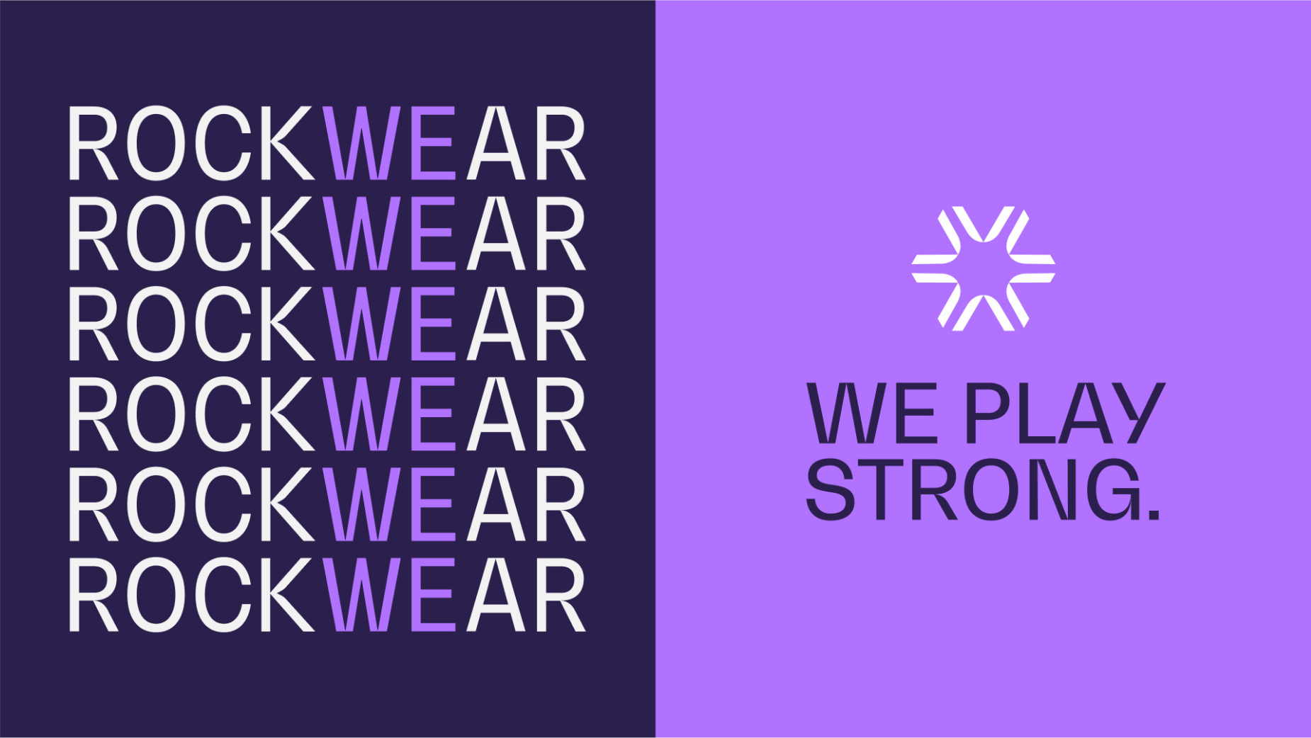
At the core of the rebrand is the new brand platform We Play Strong, designed to guide Rockwear’s communications across all touchpoints, from marketing to new employee inductions and the in-store experience.
We Play Strong is Rockwear’s mantra for all women who believe exercise and feeling strong inside and out shouldn’t feel like hard work. It speaks to the strength of both Rockwear’s high-performance activewear, and of the brand community.
The new visual language preserved the essence and maintains a familiarity that has been instrumental in building the trust and recognition associated with the brand. However, in an ever-evolving landscape, it's crucial to stay current and relevant. Thus, the team embarked on a journey to infuse the existing design with a more contemporary flair. The refreshed design features cleaner lines, a more dynamic colour palette, and an adaptive layout that seamlessly translates across various platforms. It embraces minimalism where it adds value, but without compromising personality and playfulness.
The new wordmark exudes strength yet embodies a playful undertone. The choice of BW Gradual Regular typeface perfectly aligns with this vision, offering a robust and solid appearance. At the same time, it incorporates unique and playful elements, particularly noticeable in the design of the letters R, W, and A. This typeface strikes a harmonious balance between a commanding presence and engaging, fun details.
The accompanying monogram is a visual metaphor for the inherent strength within each of us. Crafted from unique elements of the wordmark, this simplified spark symbolises the
fundamental principles of Rockwear. It stands as a graphical embodiment of the brand's core values, reflecting its essence in a concise and impactful form.
− Community: Depicted with the coming together of numbers elements.
− Strength: The negative space creating triangles - the strongest form.
− Optimism: A mark with a sunny disposition aligning with the brightness of our origins on the Sunshine Coast.
In addition to The Spark, the team have developed a library of icons that reflect the ethos of the brand.
Colour was pivotal in revitalising the brand's identity, leading to an innovative colour system, choosing a simple primary colour palette to maintain brand consistency, and letting the product and imagery take centre stage in all communications. To enhance brand recognition, the team meticulously selected two shades of purple, each carefully chosen to represent the brand's essence. Purple is often a colour associated with Power and Creativity, encompassing the duality of We Play Strong.
The revamped brand platform has inspired a comprehensive overhaul of Rockwear's communications, encompassing the logo, typography, colour system, and photographic style, as well as the branding on clothing labels and shopping bags.
72andSunny has also developed a campaign to introduce the rebrand, featuring a diverse array of Australian women demonstrating strength in all facets of their lives. This campaign is anchored by the new tagline, “We Play Strong,” a rallying cry that embodies the fundamental spirit and purpose of the brand.


