


Making the Grade: Being a ‘Swiss Army Knife’ with Billy Hobson

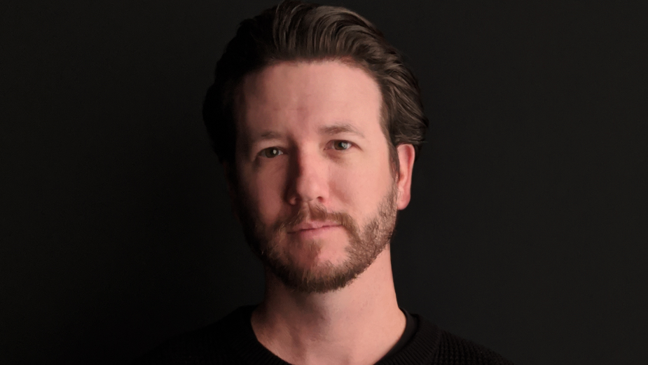
Billy Hobson is a senior colourist at Harbor. Billy’s most recent colour work includes CBS's FBI, FBI: Most Wanted, and FBI: International, the critically acclaimed Peanut Butter Falcon, Disney’s Lady and the Tramp, Tiesto and Karol G’s “Don’t Be Shy” music video, Bebe Rexha’s “Sacrifice” music video, and The Way Back starring Ben Affleck. He has also collaborated on critically acclaimed non-fiction films including Lauren Greenfield’s latest feature-length documentaries The Kingmaker and Generation Wealth.
Major commercial brands include Gatorade, Toyota, Carl's Jr., and Powerade, along with Super Bowl commercials for Olay, Tostitos, and Buick.
LBB> What was your first experience with the world of colour grading – and when did you decide that being a colourist was a role that you wanted to pursue?
Billy> In the earlier days of my post production career, I worked for Technicolor On-Location Services as an engineer, developing file-based workflows, calibration of display systems, system admin, R&D, and overseeing and providing support on dailies shows around the world. In that role, I was heavily involved in the flow of dailies data and colour pipeline elements into VFX and DI, so I spent quite a bit of time around colourists of all types. In 2012, I was working with a dailies colourist named Mark Sachen for a film called Gangster Squad. We spent three months together on the show, and he would sit me down and teach me how to do basic colour during some of our down time. From then on, I was absolutely hooked on becoming a colourist. I was just so fascinated by the process of colour grading, and the combination of technology and art that it provided me.
LBB> What was the project that you felt really changed your career?
Billy> In 2016, I was the colour assist on a massive Apple Watch campaign that Yvan Lucas was finishing. We had a return session with the client; they wanted to make a minor tweak to one of the spots. Yvan had a busy schedule, and he knew I was passionate about becoming a colourist, so he asked if I wanted to drive the session with the clients. I immediate said “Yes!” and he told the clients I would run the session. I had been doing some pre-grading and little things here and there for a year or so, but this was my first real session. I was super nervous, but confident I could do what they were asking. We started making some tweaks and the client was immediately into what I had shown them, and they left happy with the results. It wasn’t something that I got recognized for externally, but it was enough proof for Yvan and the management team that I could really run the room with ease. This one session almost immediately put me directly onto the path on which I stand now.
LBB> How/where did you hone your craft and did you have any particular mentors?
Billy> I worked alongside legendary colourist Yvan Lucas in 2015 onwards, doing all sorts of work for finishing at Shed (now Harbor LA) colour assisting, conform, engineering support... I was a Swiss Army knife of sorts. We would regularly work on films and commercials together: he would provide me the opportunity to pre-grade his commercial work, and then critique what I had done before we did the client session. We maintained that cadence for a while, and I continued to fit into whatever role was needed. I learned and absorbed as much as I could from him and the team while getting access to work on some of the biggest films and commercials. I gained enough of his trust for him to take me under his wing and help forge my path as a colourist in technique and taste with his 30+ years of experience in the industry. I am very fortunate to have been under his supervision for 5 years, and I don’t think I would be at the level I am without this deep wealth of knowledge and support from Yvan.
LBB> Tell us more about your creative process - (e.g.when you get a project, how do you go about developing a look?)
Billy> Colour grading is a highly collaborative artform. As a colourist, I am here to help tell other people’s stories and enhance other artist’s work, so the process is very different from show to show. Sometimes I get strong direction from the DP, with inspiration images and movies as reference…and sometimes they are trusting me to find the look, so I must be flexible to work with both approaches. Ultimately, it’s about what is on the negative, regardless of any references. I must respect what was shot, then rely on my own taste and toolsets to help guide the project into a world that the creative team is happy with and which aligns with their vision. A lot of my process is guided by intuition. Sometimes it’s difficult to put it into words: I can just feel when the colour is right for the image.
LBB> From experience, we’ve found that colourists often love art and photography - when you’re out of the studio, what inspires you?
Billy> I do fall into that camp: I love art and photography. In my opinion, mother nature is the best subject for the most balanced beautiful imagery possible. I’ve been into photography since high school, shooting on everything from large format film to DSLRs, and I’ve always loved the process and results. Even though art is an obvious source for a lot of us, I try to be open, because inspiration can come from the most unexpected places when you least expect it.
LBB> Colour grading is largely a digital affair, but there’s also been a resurgence of film over the past few years in commercials and music videos. What are your thoughts about working on film versus digital formats like 4K? And what are your favourite techniques for capturing a vintage or tactile feel?
Billy> I enjoy working with both for their own specific traits. Within our industry, I think film will always be the undisputed king of desirable image qualities for most creative people… it’s been the standard for over 100 years, and decent digital cinema cameras have only been around for 15 years or so. It’s tough to beat the nostalgia. No one is out there trying to make film look like digital, but productions large and small are always trying to make digital look like film. Film is incredible to work on when I get the opportunity: there is an organic texture and the intrinsic 'flaws' make film feel more real and aesthetically pleasing. Making digital captured images feel like film is much easier now too, with so many toolsets offering addition of grain, halation, film burns, etc. Using those in combination with custom modifier LUTs to match the colour and curve of older film stocks, I can really do a decent job of getting close to the feel of real film when desired.
LBB> When working in commercials, what role can colour and a grade play in enhancing a brand’s assets and what sort of conversations do you have with creatives and clients about that (e.g. is there often a strategic/consistent ‘look’ for a brand? Can these be too heavy handed?)
Billy> Commercial work is all about capturing the viewers’ attention quickly, portraying the emotion of the spot, and keeping the brand recognition consistent. I often get product samples, paint chips, Pantone codes, etc. ahead of time to ensure that the products match what you see on store shelves or on the dealership parking lot. This is top priority for most agencies and brands when they book you for colour, and I generally receive specific guidance from creatives before we start on a commercial. Sometimes it can be heavy handed, but that’s up to me, the colourist, to make sure those points are checked off without being comically overdone.
LBB> How do you ensure that each colourist-director partnership is a success?
Billy> I don’t believe I can ensure that it will be a success…sometimes you just don’t click with someone, for any number of reasons. I can only go into the director/colourist relationship with a confidence in my own skillset, keeping my own ego at bay, and being there to realize the story they have in their minds. I try to be flexible to grow those relationships, and I always approach sessions with a personal touch, investing myself into the person themselves and not just the work at hand. There must be a level of confidence, vulnerability, and trust on both sides for it to truly work.
LBB> What advice would you give to budding colourist?
Billy> Go out of your way and invest your own time into learning as much as senior colourists and assists around you are willing to teach. Work on your own projects as much as possible, no matter the quality. You will learn the most from the projects that aren’t shot well.
LBB> In your opinion, what’s difference between a good grade and a great grade?
Billy> A good grade calls attention to itself. A great grade is one you don’t notice. A great grade hits on all cylinders… it sets the tone of the scene, respects what was shot and matches it perfectly, but isn’t overdone. Simplicity and subtlety are the key to great colour grading.
LBB> How is the craft and trade of colour grading changing?
Billy> Grading tools have become so robust, that a lot more effects-type work is being done in the colour suite, and I think this trend will continue as AI tools develop and are integrated into software. I also think that because of digital capture, streaming services, and networks moving more content to streaming, there is such a surplus of content right now. Because of the volume, colourists must collaborative between each other, and less competitive, to keep up with the demand. I think we are all stronger together supporting one another, rather than competing for work. That’s the culture we try to foster at Harbor.


