


Lessons in Branding from Severance: The Dark Art of Lumon’s Corporate Identity

The following article contains spoilers for the Apple TV+ show Severance.
The images in this article are taken from the official Season 2 Severance Trailer
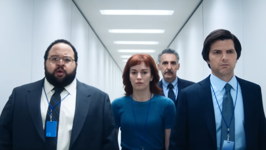
This Friday, audiences across the world are about to feast their eyes on the very last episode of Severance’s season two, making it the most-watched Apple TV+ show so far. And if you’re part of the majority, you’re spending your days between episodes deep-diving into fan theories, rewatching the season frantically, and learning the severed floor map by heart.
Arguably, one of the most sinuous parts about the series is the immersive brand world that Lumon has built for its employees – not only because some of them literally cannot leave, but also because it needs to conceal a more sinister identity behind its soft edges, friendly animations and, of course, coffee cozies.
To this end – and since it looks like I chose to come back to my office today – while we wait to find out if the innies will make it to the exports hall this Friday, I decided to speak to some mysterious and important creatives at Landor and Mother Design about what brands and agencies can actually learn from Lumon’s graphic design. Or maybe, what Lumon has learned from the industry at large?
Landor’s Ryan Frost starts by zoning in on Lumon’s Machiavellian use of nostalgia. With a perfect blend of retro corporate styles – old-school IBM, clean geometric looks, Paul Rand references – it flips the script by adding big pharma vibes to the mix.
“This says, ‘We’ve been here forever and aren’t going anywhere’, and reminds us of giants like GE or Siemens,” he says. Here, feelings for the past are utilised as a sneaky emotional trigger, making audiences feel connected to the ever-desired “simpler times,” and institutions that have stood the test of time, while injecting this feeling of safety with manipulation.
“It shows us that the ‘good old days’ of corporate America weren’t actually good – companies were just more honest about controlling you back then,” explains Ryan.
“It uses our own fuzzy feelings about the past against us, which is exactly what clever branding often does.”
The clunky computers and keyboards, complemented by the dated furniture and carpeting, stand out against some more futuristic parts of the company – a juxtaposition aiming to harbour confusion, both in us as viewers, and in the innies. “It’s similar to the way Kodak or Bell Labs looked in their prime,” says Ryan. “And also we can’t forget that government-agency blue and white that screams ‘Trust us, we’re official!’,” he adds.
Blue and white are certainly prevalent, especially in the Lumon logo, which we now know has gone through some refurbishment over the years, to arrive at its current webbed ellipse. Ryan explains why a brand like Lumon might choose to soften its logo in such a manner:
“Logos that tend to feel ‘safe’ usually have rounded edges, blues and greens, and balanced designs that don't challenge the eye too much. When logos have sharp angles, heavy shadows or hidden meanings, they can look… off, somehow.
“What’s brilliant about it is that Lumon’s logo actually plays both sides. At first glance, it seems simple and trustworthy, but the longer you look, the more mysterious it appears. Like the visual equivalent of a smile that doesn’t quite reach the eyes.”
Once you see the brandmark against the stark white walls, it quickly transforms from ‘just another corporate name’, to something that feels more like a surveillance symbol, or even cult emblem. “Pure visual manipulation,” says Ryan.
Nostalgia As Manipulation at Lumon
When watching Severance, one can’t ignore the show’s Marxist commentary either – the Brutalist references in the architecture and the artwork inside the building, are the stars of this conversation.
“Brutalism is perfect for creating disconnect, because it prioritises function over comfort,” explains Ryan. “Everything has its place in a rigid hierarchy. There’s zero fluff, or decoration – no room for personality. The materials – thick concrete, steel, laminate – resist personalisation.”
When there is personalisation, it’s in the form of posters that resonate with Soviet propaganda. However, without them, our innies wouldn’t remember to hang in there!
Ethan Hodson, from Mother Design, explains that it’s the modernism of Bell Labs, where Lumon was filmed, that really stands out to him.
“Stepping into Lumon, you’re immediately confronted by that enormous stone carving of Kier Eagan, a clear nod to the iconic imagery of Lenin seen in sculptures across the Soviet world.
“As the show unfolds, we encounter paintings that further build the sense of a cult of personality in, and out of the severed floor.”
With a keen eye for detail, Ethan explains that ‘Kier Taming the Four Tempers’ is a clear reference to Rembrandt’s ‘The Blinding of Samson’, where in the first, Kier is portrayed as a heroic, almost biblical figure meant to be idolised.
Another reference is ‘Kier Invites You to Drink His Water’ and its relation to ‘Wanderer Above the Sea of Fog’, where Kier surveys his supposed achievements, in a state of elevation synonymous to one of a godly figure. “This propaganda aims to evoke devotion in the innies,” adds Ethan.
“The dramatic contrast between these artistic representations and Lumon’s otherwise austere visual environment only heightens their effectiveness as propaganda.”
Colour Psychology and Control
Lumon’s colour palette, which we touched on briefly, with its sterile whites, muted greens, and occasional bursts of colour, feels highly intentional, reinforcing control and hierarchy further.
“Those relentless whites in the hallways aren’t just aesthetic,” Ryan tells us.
“They create sensory deprivation that makes you susceptible to control. There’s no visual noise to stimulate independent thought or creativity.”
MDR’s muted seafoam greens aren’t random either, as green is often analogous with safety and permission, but this hued version feels more sedative and clothed in the deceptive notion of well-being.
Ryan points out that each department has its own subtle colour coding, with O&D donning warmer tones, helping employees quickly distinguish who ‘belongs’ where on the floor.
“Lumon uses vibrant colours as psychological triggers too – like those vivid reds that pop up during data refinement, designed to create focus points that direct attention exactly where management wants it.”
He continues: “The theme of disconnect is reinforced everywhere in the colour usage. Even in the break room, the lighting shifts to a sickly green during ‘reconditioning’ – your brain immediately registers something is wrong. Genius, but terrifying.”

Ethan is equally mesmerised by Lumon’s deliberate colour coding, with its seamless division of ‘in’ and ‘out’. But to him, this red/blue dichotomy extends beyond just the colours of objects.
“Architecturally, we move away from Lumon’s cold brutalism, and to the warmer, more natural Frank-Lloyd-Wright-inspired design of Devon and Ricken’s home. These visual shifts powerfully reinforce the psychological separation between the severed and unsevered experiences.”
Back on the severed floor, Ethan points out that objects of pleasure, or ‘treats’, tend to stand out against the otherwise minimalist Lumon aesthetic through colour. “Even basic food and drink items, while packaged in Lumon’s clinical branding, introduce bolder, brighter colours that punctuate the sterile environment.”
From watermelon parties, to Defiant Jazz, light shows and coveted egg bars, colour comes hand-in-hand with company ‘perks’, creating a scarcity for it in the innies. Which only makes Ricken’s book all the more enticing for them once it does arrive on the severed floor, with its campy branding and vibrant cover.
Brutalist Design and the Cult of Personality
So, do modern brands borrow from Lumon’s sly strategies? Ryan believes that while our world branding attempts friendliness, playfulness and empowerment, Lumon is a lot more honest about its unfriendly core. Dated design, rigid systems, and compliance placed over creativity, are the pillars that set it apart from real-life brands of the same size and influence.
Ethan reminds us that Lumon has no rivals when it comes to terrifying work environment either: “In today’s corporate environment major companies actively work to blur boundaries of ‘in’ and ‘out’ through human-centred design, approachable ‘We’re one of you’ style of communication, and spaces that feel more like homes than offices.
“The strength in Lumon’s aesthetic lies in how it leverages these visual cues to reinforce the show’s central theme of corporate control, which modern branding works so hard to eliminate.”

When tasked with potentially expanding Lumon’s brand universe, Ryan jumps at the opportunity: “In a twisted way, it would be so fun,” he laughs.
But how would he do it? Keeping Lumon’s public presence to the minimum is a start – a bland corporate website that tells you nothing about what the company does should cut it. Then, he says “vague wellness products” are on the cards as well – supplements, air purifiers, bringing you benefits that never get fully explained.
“The tagline would be something like ‘Lumon. For a Better You’. Better how? They’ll never tell you!”
And, since we’re looking at this from an advertising point of view, ‘disruption’ (widely loved in adland) would take a step back in favour of tradition and stability, when it comes to recruitment materials and company culture, according to Ryan.
Ryan even goes as far as to give us an example strategy on how building Lumon’s branding should be tackled, step-by-step: defining the promise, without revealing the actual product; making the promise, and tying it in with the visual identity, à la ‘wolf in sheep’s clothing’; and finally, keeping the promise, through consistency and experience, aimed at normalising it overtime.
“We’d focus on getting employees to embody the brand before showing anything to the outside world,” says Ryan. Creepy. Someone get this guy a milkshake.
“The Egg Bar is Coveted AF”
A detail that could potentially go unnoticed as a control mechanism at Lumon is its food and the way it provides it to its employees. And it’s brilliant, because as Ryan notes, food becomes part of you.
“When a company feeds you, it creates a shared ritual – like the bizarre melon parties – that bond people together,” he explains. “They’re also setting up rewards they can give or take away – ‘Sorry, no coffee carafes today because metrics are down!’.”
Unsettlingly parental, this dynamic is necessary to further hierarchical systems in the company – “like being fed by authority figures when you were a kid.”

Even at the ORTBO retreat, Mr. Milchik reminds the innies that Lumon will always ‘protect and provide’, but later takes away the notice and Lumon-branded marshmallows as punishment for ‘Helly’s’ distasteful joke. “So much workplace conversation revolves around food,” adds Ryan. “It’s the perfect Trojan horse for company culture.” We’ve all fallen victim to clapping like dumb seals over pizza parties, surely.
It’s details like these that make Lumon as a company so chilling and curious to watch.
“It strips away the friendly veneer most companies use to cover up similar control tactics.”
Many modern brands dress their offices in drapes of colour and ping pong tables, adopting similar psychological techniques, branding, and friendly graphic design says Ryan. “The fundamental purpose hasn’t changed: [it’s how they] direct behaviour and maintain control.”
Lumon is just corporate without makeup, he explains. “That’s why it feels so familiar – it’s showing us what was always there. Kind of makes you look at your own office differently, no?”
Who Can Learn What From Lumon?
Lumon’s design does much more than just storytelling. Perfectly-aligned hallways and a maze-like layout subtly nod to hidden layers and unquestioned rules on the inside, and vintage elements combined with tech-y big pharma design that remind us of the company’s complex history on the outside. This confuses and entrances Lumon’s consumers and its employees alike.
“[The design] uses signs and symbols to create a complete universe,” says Ryan. “and it feels both familiar and alien at the same time.”
But the show’s greatest lesson for big brands is that “True world-building isn’t just slapping a logo on things – it’s creating a complete, multi-sensorial system where every choice reinforces the story you want to tell. Those maze-like hallways aren’t just cool set design, but a metaphor for the entire employee and consumer experience. That’s designing with depth.”


