


Popeyes’ Logo Proves Its Hard to Say No To

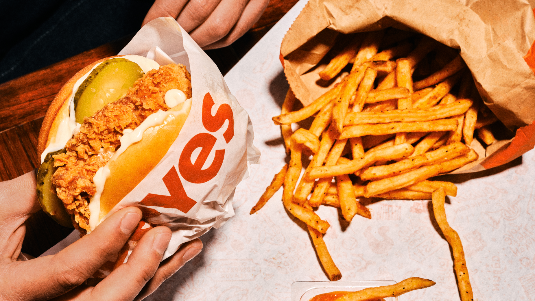
How do you visually capture the irresistible allure of a product? Popeyes and its agency Change, an FCB alliance, with photographer Guillaume Belvèze Abitbol, have found the answer: by only showcasing the 'YES' from its Popeyes logo.
In the new campaign, titled 'Hard to Say No,' the American fried chicken brand breaks away from traditional advertising codes and reimagines its visual identity. Across the four campaign visuals, only the 'YES' from the end of the logo is visible. By turning the logo into a statement of its own, this bold design choice sends a simple, clear message: it’s hard to say no to Popeyes.

There are no slogans, no taglines - just the products speaking for themselves. The 'YES' becomes the instinctive response to visuals that are mouth-watering, where the Cajun fries are golden, the 12-hour marinated chicken is perfectly crispy, and the drink is refreshingly cold.

Each visual captures that exact moment of irresistible temptation, that spontaneous urge to give in. There’s no posed model, no fixed scene. Just hands, movement, and authenticity. Above all, there’s desire.

Visually, the campaign leans into rich colours, textures, and raw, unpolished feel. The packaging looks realistic, and the shots are tight and instinctive. The aim is to provoke a gut reaction: 'YES.'
It’s a campaign about branding, food indulgence, and minimalist strategy. Running across print, posters, and digital OOH, 'Hard to Say No' appeals to food enthusiasts and fans of clever, impactful campaigns alike.


