Invisible Hazards: How Motion Sickness Took a Fresh Look at Drivers’ Blind Spots

Auckland Transport's latest road safety campaign, 'Invisible Hazards', takes an unconventional approach to highlight the importance of paying attention while driving.
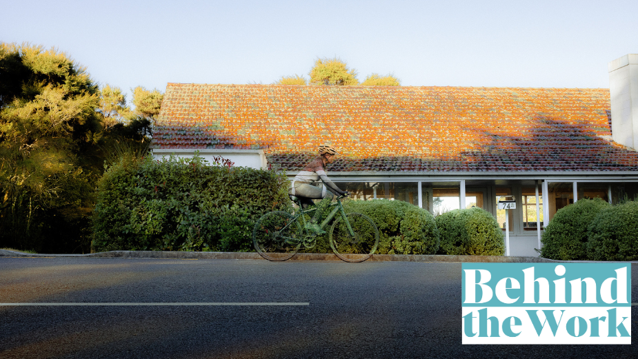
The campaign features everyday road hazards camouflaged into their surroundings, revealing the consequences of inattentional blindness — when people miss things happening right in front of them due to a lack of focus.
Motion Sickness creatives Andrew Hathaway and Kelly France caught up with LBB’s Tom Loudon to talk about the inspiration behind the concept, designing inattentional blindness, and the benefits of hand-painting your subjects.
LBB> What was the inspiration behind the concept of the Invisible Hazards campaign?
Andrew> The project was actually first briefed as three separate jobs: paying attention at intersections, considering signals, and giving consideration to cyclists. After interrogating the briefs a bit, we realised they all ultimately boiled down to paying attention while driving. So we made the call to combine them. That’s when we uncovered the insight around inattentional blindness which sparked the inspiration for this campaign.
LBB> How does the campaign aim to raise awareness about the importance of paying attention while driving?
Kelly> We wanted to do something a bit different from what people are used to seeing in this space. Traditional road safety ads highlight hazards, so we decided to hide them instead. By camouflaging dangers into their surroundings, we essentially put ‘distracted goggles’ on viewers to show them what happens when they lose focus. We felt that a fresh angle would jolt viewers into action.
LBB> Could you tell us about ‘inattentional blindness’, and how this was incorporated into the campaign?
Andrew> We went pretty deep on the psychology behind what happens when you lose focus, which led us to a video called ‘The Invisible Gorilla’ where you have to keep count of a basketball being passed around a room by people in white and black shirts. Halfway through, a gorilla struts in and starts pounding its chest. Most people miss the gorilla. We found that pretty wild. This links to ‘inattentional blindness’ — a phenomenon that causes people to miss things in plain sight when their mind is diverted to a secondary task. We figured most people focus on other things while driving, which essentially makes you blind to certain hazards on the road.
LBB> What was the process like collaborating with artists and body painters to camouflage everyday road hazards into their surroundings?
Kelly> It was pretty humbling watching the wizards in their element. Such attention to detail. We came across a guy called Marc Spijkerbosch on Instagram who specialises in illusion mural art. He was our guy. He spent three days, with the help of his wife, painting the car and traffic light in the Motion Sickness studio. The body painter, Yolada Bartram, painted the bicycle and cyclist on location. It was crazy watching how fast she operates. We were up against the sun all day, having to time the shots perfectly between spots of sunlight and clouds so the lighting wouldn’t throw off the colours. Bit of a headache, but we got there!
LBB> What was the benefit to the campaign in hand-painting the subjects?
Andrew> This job could have easily been briefed into a retoucher and designer, but we felt that would ruin the magic a bit. We also didn’t want the objects to appear too invisible. Hand painting gave us more control and revealed the little imperfections so people could just make out the hazards after a double take. The painted car is also going to make an appearance as an activation at Auckland Transport head office!
LBB> Why did this approach prevail over a more traditional road safety ad?
Kelly> Lots of work in this space highlights hazards or reinforces what you should do while driving. We wanted to put people in the seat of a distracted driver and show what inattention looks like in an unexpected way.
LBB> On a final note - as this is the first collaboration between Motion Sickness and Auckland Transport, how did the partnership come about and what was the experience like working together?
Andrew> Motion Sickness was appointed to the Auckland Council panel (shared with two other agencies) after a competitive pitch last year. Among other projects in the pipeline, this campaign marks the first campaign since this partnership.


