Humanity and Technology: Embracing Both Sides of the Coin

In 2012, New Yorker Beryl Chung moved to Shanghai to, in her words, ‘be more Chinese’. But, through her time working at a series of art director and designer roles, the third-generation Chinese American found herself developing a more universal skill – empathy.
“Working in social and interacting in digital in a totally different marketplace really helped me to feel empowered,” she says. “Not only learning but going on to work in Chinese, keeping up with WeChat's fluctuating regulations, and getting deeper cultural insight from personal relationships with my local colleagues.
“What I came to after 30 years of thinking I need to be more American or more Chinese, is that I can really leverage both of those things. It’s not having to choose one of the other, it’s about letting both of those inform you so you can make the best decision in the moment. You don’t need to choose one as right and one as wrong. It’s about understanding both sides of the coin.”
Beryl moved to Amsterdam at the start of last year to work in the global headquarters of MediaMonks. Her appreciation of empathy has stuck with her and forms a key part of how she approaches her work there as a senior creative, balancing the tension that drives the best of the work they do there - the balance between new technological innovation and natural human experiences.
She explains the two sides she tries to see things from. “It’s about making interaction more human and then using that interaction to encourage more human connection and empathy,” she says.
Beryl’s past creative life isn’t as deeply rooted in technology as many of the over 1,000 Monks at the S4 Capital-owned company. She got into illustration as a kid, copying Pokemon cards on classmates' notebooks for snack money. Eventually that led to a passion for writing and illustrating her own comic books, repeatedly drawing her lifelong obsession - Elvis Presley - and then moving into the worlds of design and, later, art direction.
She picked up a more digital focus while at Ogilvy Shanghai a few years back and has since felt an appreciation for both the human and technological sides of the industry. “In a traditional ad, you’re requesting really passive engagement from your user,” she says. In contrast, she’s often fascinated by the multi-sensory possibilities that interactive projects can deliver, “not just sight and sound but also sometimes touch and smell and everything else.”
Digital experiences may not be as immediately intuitive as a comic book, but the potential for human connection with them is greater, she argues. “In some ways all the new tech presents unique barriers in that you need to educate people how to use it, but then also the invitation is much richer. The interactions are going to be much richer and that connection is going to be greater as a result. The more that we can move away from what we consider normal perceptions of digital, the closer we are to approximating real life and real connection.”
A project that Beryl worked on recently took a tangible experience that we’re all used to and used the wonders of technology to blow it wide open. To promote Stranger Things Season 3 with Google and the New York Times, the MediaMonks team built a Google Lens experience that turned a fictional ad for Hawkins, Indiana’s new Starcourt Mall into a portal through which you can discover more about the Netflix series and experience the series in new dimensions.
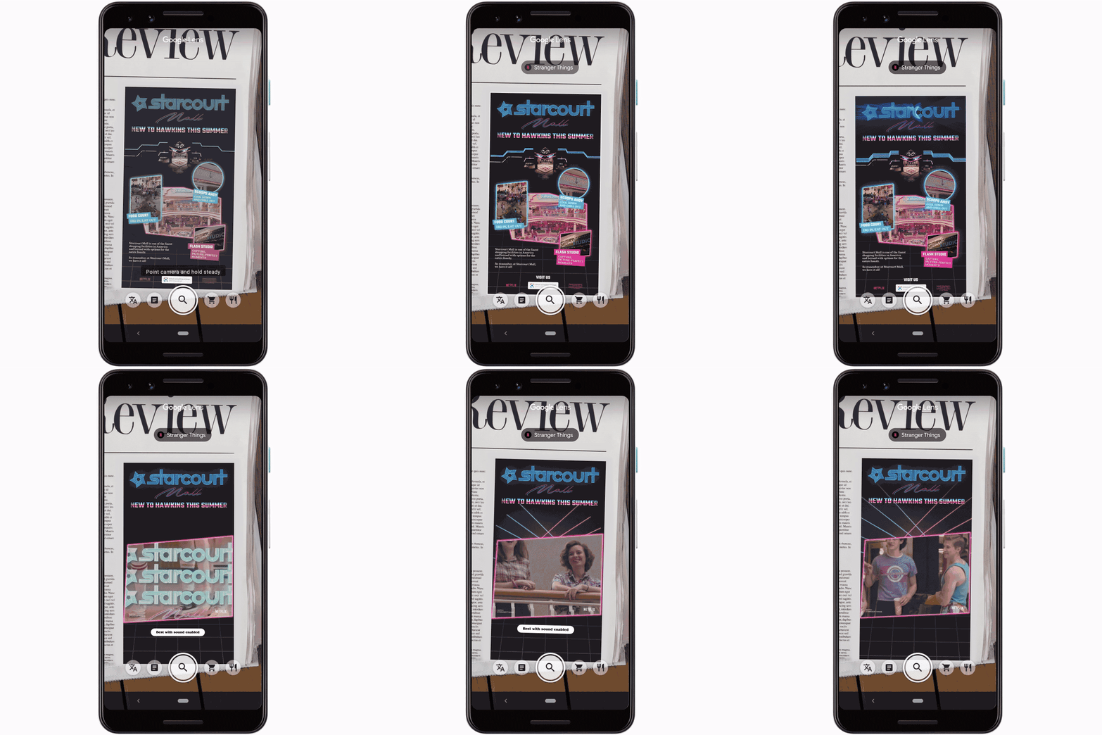
Beryl loved the tactile grounding of the project. “When was the last time we did something in print?” she says. “We had to check our CMYK against our RGB!” It was realising a science-fiction inspired ambition that people have aspired to for years. “I think that’s been in the collective imagination for a very long time that you’d be able to scan a movie poster and then watch the trailer right there,” she says. “But these are on an even deeper level of content, so you’re not just getting exactly the same teaser trailer; you’re getting exclusive content from the show, shots that you haven’t seen before as well as animation and secret messages that you wouldn’t find otherwise.”
But with the intersection of the tangible and digital, there’s often a barrier to the experience being accessible. In this case, users needed to be curious enough to open the Google Lens app on their phones while they were reading the New York Times and scan the ads with it. “The risk is there but also the reward is high,” says Beryl. “There were three different ads each with its own theme, it’s own animation and content. And then they were hidden throughout different sections of the paper. I think there’s this added delight in discovery. You’re able to flip through at your own pace and then when you do find something, I think it gives you this greater ownership, like, ‘I found this’. That’s a point of pride for a user.”
Empathising with people’s incentives to act is something that occupies a lot of Beryl’s and MediaMonks’ thinking. 'The Lioness Pride', an AR app, created with Ogilvy, Google, and the UN Women’s Unstereotype Alliance, was one project where this ended up being a key consideration. The creation’s aim was to break down the isolation reported by so many women in advertising through firsthand anecdotes and interactive storytelling, but why did it need to be an AR app?
“The Lioness Pride is a very abstract concept,” explains Beryl. “It’s a very sensitive, political topic at the moment - the deficit of women in advertising across the industry. What we really wanted to do is move past this feeling of isolation. There might not be another female creative director in my immediate department, but there are women across the world experiencing the same struggles and obstacles that I am.”
The app was intended to be released at Cannes Lions, which is where the big cat theme comes in. In the experience, life-sized lionesses appear before you. You can interact with these and gradually hear women share their experiences and advice as you help them achieve various tasks in a series of AR games. “That’s much more of an immersive experience than reading an article that’s an interview with one of these women,” says Beryl.
It was about presenting the information clearly, as well as in an attractive way. There was a lot of information to deliver to the user, including narration and quotes from specific women who had been interviewed. If these had been presented on-screen as flat, 2D cards, “it removes you from the 360 experience,” Beryl says.
This experience is also more human. “Not only is it this person’s individual approach to this problem, it’s also in their own voice. These are really powerful things that we’re able to do because of the nature of the augmented reality medium,” she says.
Beryl’s grounding in traditional design principles, gained from her illustration background and the comic book obsession she grew up with, provides a foundation of human experience design that applies to practically all digital experiences. “When I started doing comic books I had to learn this method of storytelling,” she says. “Being able to draw a single image is very different to drawing a page with multiple panels. You have to think about the composition within each frame and then how all of those frames fit together. Then you have to determine the fact that the frame as a proportion of the page will contribute to the pacing of your story.”
Comic books were Beryl’s introduction to information design - a key to good UX in digital environments. “You know how to read a comic book, instinctively. But if you break it down there’s a ton of different kinds of information. There’s a difference between speech bubbles and thought bubbles, then if you have a block it might be a narrator. It could be: ‘Meanwhile, across town…’ Then you have to have defined borders in between panels so that you have space to read it and digest each thing. Those are directly translated to digital design. You put padding and borders on [digital objects] - that’s the really obvious translation of the speech bubble.” She comes back to those principles no matter what medium she’s working in, whether it’s intended for a smart speaker or in virtual or augmented reality.
One of Beryl’s favourite approaches to digital work that’s bourne out of her illustration background is doing it by hand. “That’s still something you can incorporate,” she says. “When I first became an art director and I had to interview people, I would ask people coming out of school who is the artist or designer that has influenced them the most. I’ve been in interviews where it gets as granular as who their favourite typographer is...
“One time in China this young designer told me their favourite artist was Vincent Van Gogh. I was like, ‘Great so how have they influenced you?’ And this person couldn’t make the connection. That’s such a shame. It doesn’t have to be, ‘In my advertising work I’m going to paint like this.’ It could be something about his process or the way that he considers colour or movement. There’s a million other ways that you can apply the thing that you love to what you’re doing.”
Women in the House, another project MediaMonks created to push the dial on gender diversity, is a great example of the power of a hand drawn, illustrative quality. The music video and animated questionnaire, designed to encourage more American women to run for political office with Pereira O'Dell and Ignite National, allowed Beryl and the team to set the right aesthetic to encourage engagement. “Just the nature of the shading being textured as if it’s in pastel for instance, I think gives it a much more humanistic feel. You can sense that somebody’s love and craft went into those things,” she says. The questionnaire is highly interactive, but somehow familiar. “We wanted to throw the flashy stuff on it but we arrived at this place where the idea is better supported by a more conventional style.”
Speaking of flashy stuff, new innovations are the sort of thing Beryl keeps an eye on to help MediaMonks make technological experiences more human to interact with. She’s excited about the advent of ‘occlusion’ in AR (the hiding of virtual objects behind real things). “A huge part of the challenge is keeping within that illusion of having virtual content within that real environment,” she says. “So if someone walks in front of it and you see their feet sticking out from a rock then that’s broken. That’s definitely been the holy grail for a long time.”
Thankfully, that problem looks to be solved soon. Pokemon Go creators Niantic have developed a prototype for it, showing how Pikachu will be able to run behind real objects. “It’s super cute! And also functional,” says Beryl.
Another example of where advancing technology is helping creators like Beryl make experiences more accessible to our humanity is face filters - a trend that’s been hard to ignore the past few weeks with FaceApp’s youth-defying offering. “More and more is being done to have realistic placement, lighting that reflects where you are, and all of those things are based on being able to recognise where your eyes are, where your eyebrows end,” says Beryl.
Beryl worked on one project for Puma in Shanghai had a simple idea that relied heavily on recent technologies to help make sure the experience felt natural. In Run My Way users could scan their faces and would each get a custom puma that looks like them, in their favourite colours and textures, generated as an animation of them running as the puma. The process could have been clunky, but for the power of the technology behind it, says Beryl. “You have to scan your face, then you have to pick the colour, pick the soundtrack, enter your user info so you can receive it on social - all the other steps that go in between.”
Motion sensing and touch sensing technologies were the keys to make sure this went smoothly and quickly. “Immediate feedback also really helps,” she says. “The fact that you can watch your puma evolve in real time is really powerful.” By understanding where the experience should and could be made more human through technology, the MediaMonks team ensured people paid attention and stuck with the experience long enough to get the reward it promised.
Empathy is key to working out how users will interact with creative technology, but it goes the other way for Beryl too. She notes that projects like The Lioness Pride, Women in the House and MediaMonks’ internal WoMMen in Tech initiative, all of which aim to address problems of diversity, reveal a gap in empathy that she thinks creative tech can help to close. “There’s a great opportunity there. I’m a woman and a person of colour and I find often when I participate in these diversity or inclusion initiatives that the only people that aren’t addressed are the majority,” she says. “And it’s the majority that ends up being most resistant or with the least understanding of why it’s happening. That is the missing piece. So what we’re looking at now is ways to use that human interaction to enhance empathy through digital. Are there ways to help people of all genders connect these human experiences that are universal to specific struggles that we can overcome in the office together?”


