


How Kids Help Phone Got a Colourful Brand Redesign

In 1989, Kids Help Phone (KHP) launched - providing free, 24/7 e-mental health support for the youth in Canada. Since then, the service has been recognised and appreciated across the country, and undoubtedly, has proven to be a positive force in the lives of many youths. However, with the passage of time comes the need for change. Given the brand’s belief that youth today need access to support that is relevant to them - more so ever than ever before - December 2022 seemed the perfect time to turn a page with the launch of a refreshed brand identity.
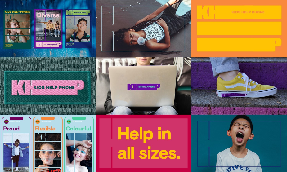
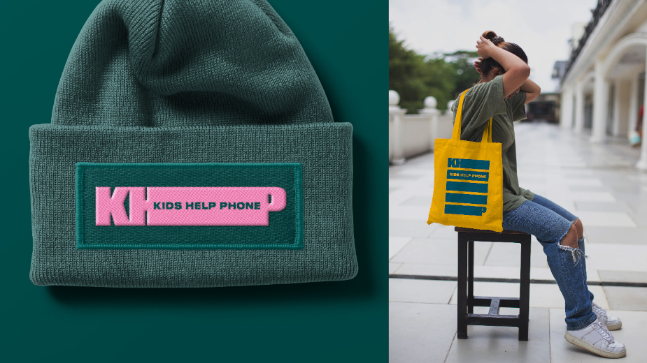
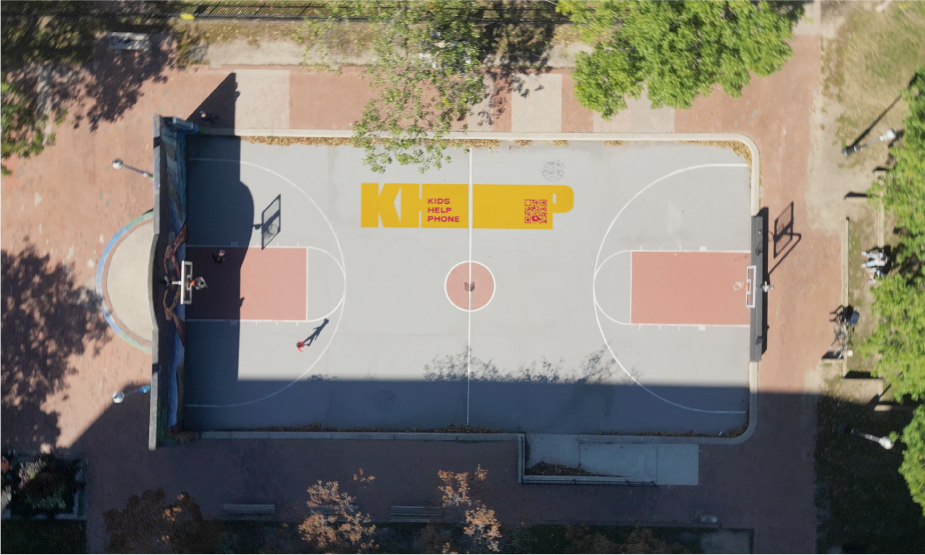
The result? Created in partnership with McCann Canada, KHP embraced a new truth: ‘Help in all sizes’ - launching new OOH, digital, social, PR, and merchandise to reflect the brand’s commitment to being as flexible, colourful and diverse as the young people it supports. Additionally - and perhaps most notably - this change also saw the replacement of KHP’s classic blue logo with a new, modular logo that features over 14 colours. Representing its decision to break away from the previously limited brand colour palettes and single size, this new logo is capable of stretching and shrinking to fit any space, and represents the fact that when it comes to issues KHP’s services cover, there is no problem too big or too small.
To find out more, LBB’s Josh Neufeldt sat down with McCann Canada’s chief creative officer, Josh Stein, to discuss how this rebrand came to life.
LBB> Tell us about the partnership between yourselves and Kids Help Phone. How did this come to pass, and what was the brief for this project?
Josh> There are a couple of projects we have been working on together, but the rebrand represents our first and arguably most important collaboration. In terms of pitching, that took place in the middle of the pandemic, and because of that, we were forced to find a way to leverage technology in the hopes of bringing us and the Kids Help Phone (KHP) team as close together as possible. That’s ultimately what happened! By the time we were awarded the business, it felt like we really knew them on a personal level, and because of that, we were able to have a lot of great conversations about their vision for the brand.
Regarding the brief, the problem the rebrand had to solve - which was as simple and straightforward as you could ask for - was that the brand (not the organisation) lacked the identity and cultural relevance necessary for youth across Canada to see them as a brand at the forefront of mental health solutions.
LBB> You were tasked with a complete rebrand, including OOH, digital and the website. Where does one start with a task like this, and how did you approach it?
Josh> We approached this the same way we approach most things - one step at a time while keeping an eye on what our big ambitious goal was, and simply filtered the work through that lens.
As we were working on the rebrand, we were also developing a new creative platform and youth campaign for KHP, so we were able to see how it was all going to come to life and we felt really good about the connection of the pieces right away. We were creating on the go, which was a little bit chaotic, but incredibly fun!
LBB> What were your goals for this process? And specifically, in the case of the logo, what inspired the decision to move away from the old single-coloured, single-sized option?
Josh> When you start to hear about the wide range of issues that KHP helps youth with, it was easy to see how outdated that old, bubbly blue icon had become. Icons like that are also time-stamped, so right away, it felt dated and old to us - which was probably how it felt to a lot of kids out there. In the same vein, our shift to the ‘KHP’ acronym was also a decision made to help us overcome some of the dated perceptions.
LBB> The ‘Help in all sizes’ line is great! Did you instantly know this was what you wanted to go with, or were there other phrases under consideration?
Josh> Short answer, yes. Sometimes you just need to hear an idea as simple and powerful as ‘Help in all sizes’ to know it’s the one. Everyone immediately felt the energy of it, and then, once we started to play around with the idea, we naturally gravitated to a flexible design system with colour, type and shapes that brought the potential of the idea to life.
LBB> What was the collaborative process like? Did KHP let you take the reins, or was there a lot of back and forth?
Josh> I feel like I’ve said this a lot about our relationship, but it has been incredibly collaborative from day one. They let us do our thing. They listen. They contribute. We listen. We do our thing again. It’s working really well! I feel like the work we’re putting out there is the embodiment of what collaboration between agency and clients feels like.
LBB> Were there any challenges throughout the course of this project? If so, please tell us about how you overcame them!
Josh> There were no real challenges per se, but as we were developing the system and colour combinations, accessibility played a role - forcing us to make sure everything we put together was compliant.
LBB> Do you have any memorable lessons learned from this new work?
Josh> Not so much a lesson, but just a simple reminder of a quote I read by someone at some point in my career: ‘keep your layouts rough and your ideas fancy’. The work is great because the idea is so strong. However, if we’d just jumped right into the design, we probably would still be working on the rebrand today.
LBB> KHP is a very important organisation for young people across the country. What did the chance to be involved in this project mean to you?
Josh> I am a parent of two teenagers. Their mental health is both mine and my wife’s number one priority. We’re lucky that an organisation like KHP exists in Canada, so that kids like them - who need someone to help them through something - can have access to it 24/7.
Beyond that, honestly, it’s just been a real privilege to work on KHP. Not a day goes by that any of us aren’t reminded of that.
LBB> What has the initial response been like? Have people appreciated the rebrand?
Josh> So far, so good! We know how tough it can be to impress the design community, but the feedback has been really positive.
LBB> Is there anything you’d like readers to know about KHP? And what can Canadians do to help further support the work it does?
Josh> Kids Help Phone is an essential service that helps fill a critical gap young people need to thrive in this country. Support all the great things KHP is doing in any way you can.


