How Dole Made Posters More Nutritious than a Chocolate Bar

In partnership with London-based St. Luke’s Communications and Bompas & Parr (leading experts in multi sensory experience design), Dole Sunshine Company (DSC) released their new campaign exclusively concerned with nutrition and snacking habits. The conversation about low nutrition snacks - and Britain’s snacking inclinations in general - has been taking over the small screen, academic research, and overall, the public’s consciousness for a while now - but this time Dole wanted to really hammer it in with something memorable and visual. This is why, with the help of Bompas & Parr, Dole Sunshine Company created posters printed with ink containing more nutritional value than Britain’s favourite snacks and on-the-go food options.
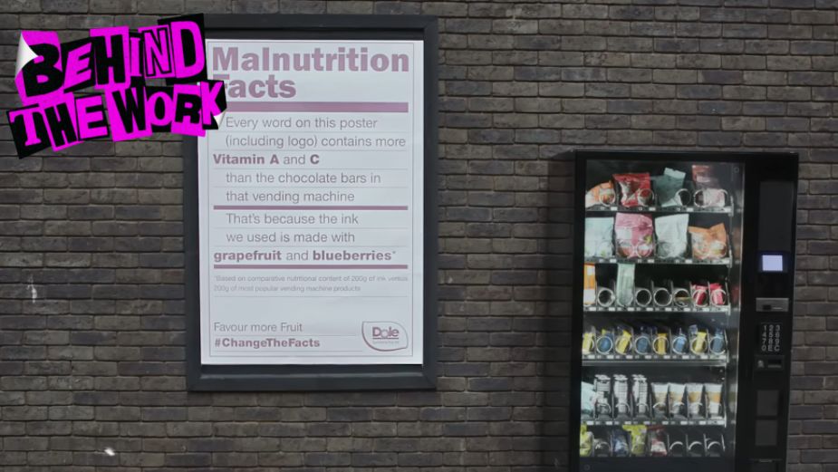
The campaign film starts by telling audiences that in Britain, three million people are affected by malnutrition due to unhealthy diets, and that in the UK, more junk food is eaten than any other country in Europe. “It’s time we paid more attention to what we eat,” the film continues, showing footage of people enjoying a fast (and not very healthy) bite during their lunch. Then, it goes on to show viewers the actual creation process behind Dole’s ‘Nutritional Ink’ - produced by using dye made from blended fruits and vegetables. That same ink is used to create the posters with ‘Malnutrition Facts’, informing observers of the fact that the very poster they’re looking at contains more vitamins than whatever choice of junk food they might have. The posters are then placed at key locations within the city - next to vending machines, corner stores and pop-up junk food places.
Speaking on the start of the collaboration, ECD for St. Luke’s Richard Denney said that Dole Sunshine Company’s belief in delivering impactful work through their advertising is ‘critical’, as well as their commitment to better nutrition and food education for all. “They invited us to create a new iteration of their US-based ‘Malnutrition Facts’ campaign based on fresh insight for the UK, that would pick up the baton and drive awareness around society’s need for better nutrition,” says Richard.
Richard explains that previous campaigns from Dole Sunshine Company centred around the link between malnutrition and food insecurity or food waste, for both of which, the concept focused on subverting nutrition labels and using them to communicate “startling facts about malnutrition in the US and Globally.” The idea for the UK however, was even more ambitious. The Dole team explained that in their brief they wanted to have a clear continuation of the previous two projects, whilst “reaching even further to raise awareness” with this one. The collaboration commenced with high ambition and the goal of stretching the possibilities of communications, “and OOH specifically,” comments Dole.
At the heart of the campaign stands the research and findings, which is also what the agency and brand used to tackle misinformation. Richard says that malnutrition is often perceived as a lack of food, or linked to famine in poverty-stricken countries, but in fact, it is very prominent in countries from the global North - such as the UK. “Malnutrition is of course a lack of sufficient nutrients - and so with research, we uncovered the shocking truth behind poor nutrition in the UK.”
When it came to partnering with Bompas & Parr on the technology, Richard explains that creating an entirely natural fruit-based ink for screen-printing OOH posters “was something of a first.” He continues, “This required a very specialist partner in food innovation, recipe development, and production of the inks themselves. Cue Bompas & Parr. Their reputation precedes them, with unmatched experience in multi-sensory experiential design with food and drink. They worked in close partnership with us throughout the innovation phase - creating a constellation of all-natural ink iterations using a range of different fruits and vegetables to the point that the inks were entirely edible.”
For the Dole team, the posters were the perfect course of action for the project, because they translated what was most important for the brand: good nutrition - available to all ‘like sunshine’ - made possible through education and awareness of healthy diets. “This campaign enabled us to communicate that message in the most arresting, impactful, and memorable way possible, with self-referential posters perfectly suited on sites to place themselves near or next to those bad snacking choices that consumers might be inclined to make at that point,” Dole comments. They continue by saying that as the poster innovation was at the core of the campaign, if other retailers and producers seek to replicate it, “it would be a flattering imitation”.
Richard explained that the posters also needed rigorous testing and refinement throughout the process, so that the inks could work in a screen-printing way, deliver the vibrant colours they were going for, be legible when printed, AND contain high levels of vitamins and minerals. “We enlisted the support of an independent nutritionist to ensure that the inks we were formulating contained sufficient vitamins and nutrients. We also ran tests to ensure that they could withstand the elements to a certain degree, so we explored the use of natural fixatives and laminates to test their durability in rain, wind and sun,” says Richard, “Being all natural, the inks would, of course, be susceptible to running and fading quickly. In print testing, to pack in as much nutritious content as possible, tests of a number of pulls of ink were undertaken, as well as matrices of ink combinations.” Besides that, they had to ensure that the paper stock they were screen printing on could hold the amount of ink the technology was saturating it with.
Once all the testing was done and the recipes for the ink were finalised, as well as the batches produced, St. Luke’s enlisted the printers at K2, “one of London’s leading silk screen printing studios,” who hand-printed each of the posters using a silk screen printing process. Specialist frames were then made, and as many as two people were required per the printing of one poster. “This is where ink is ‘pulled’, using a blade or squeegee, onto the poster in a design as defined by a stencil,” explains Richard. To ensure boldness and vibrancy of the colour, numerous pulls had to be layered, which also allowed the team to experiment with overlaying various inks upon one another, not only to pack more nutrients, but also to explore colour combinations.
Then came the strategic placement. The Dole Sunshine Company team explains that “Commonplace bad snacking choices are so lacking in essential nutritional value, that even a poster next to the point of purchase of such foods can contain higher content than those junk foods.” Placing the posters around key junk food pick-up points allowed the campaign to showcase how easily persuaded people can be to fall into the trap of junk food, and also could serve as a nudge towards reconsideration of that momentary snack attack - both in the moment and for the foreseeable future.
And when it comes to sending a message to the wider industry, Richard explains that due to the fact that malnutrition problems are so widespread but commonly misunderstood, any help is of value. He adds, “Ideas in comms like this one have the potential to drive an unreasonable level of impact: raising awareness and countering misperceptions in a way which can influence real, positive change, using advertising for good.”


