For ‘One Fast Move’, GABHA Studios Delivered a Precise, Documentary-esque Grade

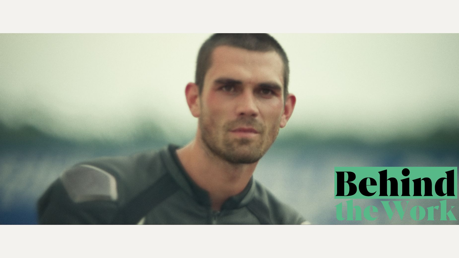
Adventure, literal and emotional, collide in the latest feature ‘One Fast Move’ from Studio MGM/ Amazon, premiering on Amazon Prime on August the 8th. Starring KJ Apa and directed by Kelly Blatz, the film follows Apa’s character as he seeks out to reestablish a relationship with his estranged father while trying to make a lifelong dream come true: becoming a motorcycle racer.
Moody, thrilling, pensive - the film’s aesthetic was carefully crafted by cinematographer Luca Del Puppo and GABHA Studios’ senior colourist Andrew Francis. Eschewing filmic references, Andrew says Luca and he looked to photography books and visited museums to get on the same proverbial page about the film’s look. They agreed that it had to be ‘grounded in reality, almost ‘documentary-like’ in approach, to effectively propel the narrative,” Andrew explains.
The projection had to be at least 20 ft wide to get the grade perfect for a theatrical release, Andrew says. GABHA Studios was more than equipped for the challenge thanks to a recent edition of a brand new grading suite that features a full 7.1 sound system; a Christie CP4420-Xe projector capable of colour accurate 4K DCI projection; a 250 inch Severston perforated projection screen for true colour accuracy; and the capability to switch the room from a colour grading to a VFX review space.
A close relationship was formed between Andrew, cinematographer Luca, and director Kelly and that trust lent itself to a fluid grading process where ideas were exchanged and enacted, with the grade being part of the conversation from the very start.
Below, LBB asked Andrew about the grading process, the creative behind-the-scenes conversations that took place between him, Luca, and Kelly, and how the ideas came to life in GABHA Studios brand new grading suite.
'One Fast Move' trailer
LBB> What was the colour grade brief like from the director and cinematographer?
Andrew> Before the colour grade, myself, Luca Del Puppo (cinematographer), and Kelly Blatz (Director) were able to design the aesthetics of the movie. I feel very fortunate with Luca. Due to our long standing collaborative relationship, we have had the opportunity to artistically conceptualise our film from inception. Visual elements and queues influence the meaning, mood and style of a movie. We are always excited to get these aesthetic considerations established before the camera has even been selected. Luca, Kelly and I flirted with using Super 16mm film initially, and although the medium possibly would have presented logistic challenges for this particularly frenetic narrative, the testing we completed with the film proved essential to what became the ‘look design’.
LBB> Did you pull any references / look to other films for inspiration before the grade?
Andrew> Luca and I don’t necessarily lean on other movies for inspiration - we are fanatical about collecting photography books and visiting museums. For this film Kelly, Luca and myself collectively felt that the characters' world needed to be grounded in reality, almost ‘documentary-like’ in approach, to effectively propel the narrative. To quote Mike Nichols, we wanted to create a ‘version of life’ packed with the myriad complexities.

Christie CP4420-Xe projector
LBB> Why was your new grading suite essential to getting the grade perfect?
Andrew> At GABHA Studios, we designed and built a theatrical colour timing suite that is on par with the very best environments in Hollywood. To complete the finishing and mastering process for a theatrical release, the projection needed to be at least 20 ft wide - to emulate how the audiences will enjoy the film. To illuminate that screen we invested in the very latest 4K projection offering from Christie; the suite is ideal. The suite is obviously colour critical, but we have also installed 7.1 surround sound - which makes the grading experience absolutely subversive, no stone was left unturned.

LBB> Tell us a little bit about the grading process itself - how long did it take? How did you approach it?
Andrew> As we did extensive testing across three camera bodies, we had created a comprehensive ‘look book’ which consisted only of images that Luca and Kelly had made together, that I colour timed. These followed the project to completion. I would review these images every now and again, to faithfully maintain the direction we’d established. Obviously with digital acquisition, there are fewer moments of the kind of serendipity which you often get when shooting film, but when something did happen, we would lean into the result and embellish it. These moments were so rewarding and made for a great experience. We graded for three weeks, and the pre-colour time was about a week on and off.
LBB> How does the grade support the narrative and cinematography of the feature? What do you think it communicates visually to viewers?
Andrew> I previously mentioned that the film's aesthetics further the narrative, this happens in almost every way. However, one needs to also be sensitive to the process - the colour grade needs to compliment the photography as in turn, the photography needs to compliment the narrative. If one of these creative aspects draws too much attention to itself, it will be detrimental to the viewers’ suspension of disbelief. Choices need to be precise and well executed, maintaining integrity with all the project’s elements, as any great film is the sum of its parts.

LBB> How much creative freedom did you have while working on this
Andrew> The guys are very trusting, I feel very lucky! That being said, they are excellent in their respective duties and are a tough room, with high expectations - I enjoy this aspect of our collaborative process. Every session I make sure my preparation is complete, which means when I have them in the suite, the results are fabulous. I have options ready to audition for them, sometimes they make the final grade, sometimes they inspire the filmmakers to take the scene in a direction that works in a way that might not have been discovered without my R&D. It is a lot of fun.

LBB> How closely did you work with the director and cinematographer? What was the feedback process like and did you do it in person or online?
Andrew> Throughout the entire project, from start to finish, we maintained a close relationship with the cinematographer and director, both professionally and personally. This strong bond between the post-production and production teams was essential to ensure the creative direction was consistently maintained and well-structured.
As part of our working structure, we use the software Louper, which enables the director / cinematographer to view our colour feed as we see it at the studio. A perfect picture match, between myself and the team, when a certain colour is adjusted we are sure of the same picture.

LBB> Did you run into any challenges while grading One Fast Move? If so, how did you overcome them?
Andrew> Something necessary to consider when approaching the grade with OFM was the camera flavour and the mixed media nature of it. At GABHA we always work from the OCNs (original camera negatives) so we are as close to the source as possible ensuring that our filmmakers understand there has been zero manipulation of their digital negative, inspiring confidence. However, making a Sony Venice cut beautifully with helicopter and on-board Arri Alexa mini cameras under mixed lighting conditions was approached carefully. One had to use myriad creative grading techniques to ensure the flow of the race sequences was enhanced by the Digital Intermediate grade.
LBB> What was your favourite part of working on this feature? Did you maybe learn anything new?
Andrew> Every project is unique and ‘One Fast Move’ was no exception. One aspect we did discover was that the highly experienced team at GABHA Studios were able to complete a multi-million dollar Hollywood production in Dublin, which was delivered on time and budget - but more importantly to me, the filmmakers were elated with the results. We were all so proud of the movie we made together.


