


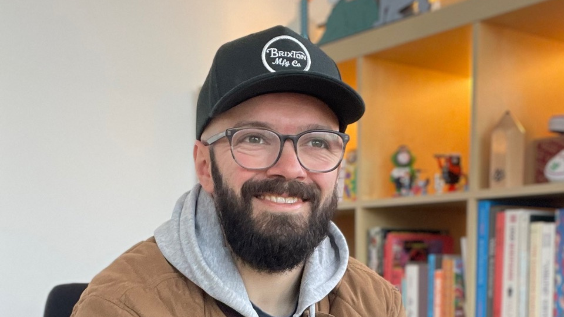
Colourful Characters and Sharing Smiles with Dan Woodger

Dan Woodger grew up watching The Simpsons, and daydreaming about making a living from doing what he loves – drawing and animating.
His client list now proves that’s possible, with the likes of Google, Pepsi, The New York Times, and Netflix having all collaborated with Dan. Projects with McDonald’s and Samsung have seen him travel the globe to Japan and Taiwan respectively. His work has been commissioned by Will Smith and featured alongside Snoop Dogg.
Having developed a recognisable illustration style and a lovable cast of colourful characters, Dan has moved into animation direction, nodding in technique and style to the classic retro feel of his work.
LBB> How would you describe the work that you do?
Dan> My mission statement is to make fun, silly things because fun silly things make the world more fun and silly.
I do this through bold, colourful, character-led illustration and animation work that aims to make people smile.
24 hour news and all the world’s problems constantly available to us through a little window we keep in our pockets all day can feel overwhelming. It’s not to say I’m burying my head in the sand to all the issues that we face, but our brains can’t handle the wealth of bad news.
The thing I’m best at is making people smile, and if I can give people a short break in the clouds for a little sunny silliness that’s what I’ll forever strive to do.

LBB> And do you have a particular style (or styles) that you like to work in? If so, how would you describe that?
Dan> I make bold, colourful, character-led work that I like to think can be defined as an ‘own-able style’. I feel like I’m creating something unique and it certainly feels true to myself.

LBB> How did you gravitate towards the particular medium you work in?
Dan> Very naturally, really. I grew up watching hours and hours of '90s cartoons and those shows taught me how to draw. From there, I essentially kept practicing and refining what I do until I landed on something that felt like an expression of me and the perfect vehicle for carrying my ideas.
LBB> And when you started developing your creative skills and styles, what were you inspirations and influences?
Dan> My main inspirations are '90s cartoons (anything on Nickelodeon and Cartoon Network in the '90s) but most of all 'The Simpsons', 'Where’s Wally' and 'Richard Scarry'. You can kinda see some of that style coming back through entertainment and into advertising now too, which is cool.

LBB> How has your style evolved over time - and can you talk to us about some of the stylistic experiments or avenues you’ve explored over the years?
Dan> My work is constantly evolving and shifting, eyes have changed size, limbs have changed shape, for a time I made things a little more angular, now I’m trying out more rounded, loopy, flow-y.
The colours have shifted around too, I used to work in pale, pastel colours but now favour a brighter bolder palette. However throughout the continued experimentation I think I’ve been able to maintain and clear style that's still recognisably mine.
LBB> And was there any one particular moment or project that really crystallised your understanding of what your style is or should be?If so, can you tell us about it?
Dan> I think it comes down to simply being 100% true to yourself. Make work that you believe in and that you like looking at. That has to be the most important requisite for style. I think if you can do that, you’re on to a winner.
If there was one moment I can pinpoint where I felt much freer sharing my ‘style’, it was in the months after leaving uni. I feel like the art school environment can be a little competitive and in the first few weeks after leaving I was paralysed with fear about what my peers would think about my work when I posted on social media.
However, I distinctly remember this feeling of ‘unlocking’ once I managed to shake that fear and just post my work out into the world anyway. I’ve never looked back.

LBB> What sort of ideas shape your style today?
Dan> I’m trying to loosen up a little bit actually. I usually make such tight work but I want to be a little more loose and messy in 2025. Perhaps opening up the door to a bit more playfulness and abstraction of my mark making.
I think this new approach is stemming from ‘neat and tidy’ fatigue - I get the impression we’ve all grown tired of the overly curated, hyper polished aesthetic. It’s time to loosen up and make some silly mess.
LBB> From NFTs to the metaverse, there are more spaces for your work to show up - what are your thoughts on the impact, challenges and opportunities brought up by these new spaces? And do they influence how you think about your style?
Dan> I’m trying to be a bit more front-facing and show myself to camera a bit more. With the rise of AI I want people to know a bit more about who I am as an artist and how my day to day adventures and experiences impact my creative output.

LBB> Working in the commercial sphere, is it more important for an artist to have a distinct brand or style? What’s the balance having a distinctive voice and being able to accommodate the visual language of the brand/campaign?
Dan> When taking on a commercial collaboration I try to remind myself of the very simple fact that the opportunity is a mutually beneficial one, and that having a distinct style should serve both the brand and myself equally well.
By having a strong identity as an artist, the client knows what they are getting, which is really important, and I get the room to focus on getting creative in translating their messaging and all the fun details around that.
As artists we’ve honed skills to present the unique ways we see the world. In my case, I look for humour in every situation and love the challenge of lending that light-hearted and fun perspective to help solve brand problems.
By working together with plenty of dialogue and mutual respect the outcome of an artist-brand collaboration can be extremely rewarding for all parties.

LBB> Typically, on a commercial project, how do you like to tackle a brief?
Dan> First of all, it’s making sure I’m crystal clear on the objectives of the brief and understanding what the brand is trying to communicate and how. Once I fully understand the tone and have all the important questions answered re. specs, colours, deliverables, etc., it’s on to the making!
My process is very simple really.
First I start scribbling ideas down on my iPad. Usually things come to me right away after reading a brief and I just get them down on paper as quick as possible.
Then once everyone’s happy with the sketch, it’s a couple of rounds of refining, then final line work and colour.
Also, one of the most important little tips I learned through my 14 years of experience doing this is to make sure I understand how ‘in the loop’ clients would like to be throughout the process.
Sometimes clients are happy to just let me go at it. Other times there’s a need for WIP updates throughout.
If this is the case I make special accommodations in my process to factor those things in so I can best manage expectations. This can be such a time saver, especially when it comes to projects like crowd scene work, as those kinds of jobs require a lot of what I like refer to as ‘scaffolding’ before they look anything like the final outcome.
So if the client does require updates on a project like this, I’ll make sure to set time aside to work up a small section into final colour so they get a glimmer of what the final artwork will look like - this avoids panicked phone calls asking if I’m sure I have enough time.
These kinds of things help everything move forward more smoothly.

LBB> What projects have you worked on recently that you feel were a really satisfying marriage between a brand and your own style? What was it about these projects that made them really interesting to work on?
Dan> The first that springs to mind is something I haven’t actually shared before. I worked on a big corporate character design project last year with a beloved e-commerce site.
They have this internal mascot and cultural ambassador - it’s this little orange minion-looking design that they use as a universal communication device in their offices and facilities all across the world - pointing out directions, reminding people to wear safety gear, that sort of thing.
The old design needed a refresh, after many years of use without consistent character guidelines in place, so I was brought in to give it a more contemporary look as well as adding a little personality and charm to a relatively simple and not entirely functional character design.
However, the brand were really keen not to ‘throw the baby out with the bathwater’ on this. They’d justifiably grown quite attached to the character and didn’t want to move too far away from the old design.
This is my favourite kind of challenge as I love looking for the best ways to extract personality and humour out of things. Finding subtle but meaningful ways to tweak the original design into something more modern and interesting whilst injecting my style and sense of humour into the character without losing the essence of the original design was such a fun exercise.
I’m really happy with where we landed with this final design and I can’t wait to see how the refreshed character is integrated across the brand moving forward.


