Behind the Craft: How Aardman Captured Sustainable Origins for Chocapic Trust
Aardman director Magdalena Osinska goes behind the scenes of its recent commercial for Nestlé cereal brand, Chocapic, covering the creative process from character design to sustainability.
Even though the ad is only 20 seconds it was a big undertaking. We did four different language versions for different countries, each of them slightly different, lots of social media assets and a PR film which showed the sustainable approach of our production.
In classic Chocapic style, this commercial was going to be fast paced, a mixture of slapstick, adventure and mouth watering, delicious shots. But we also had an important message about sustainability, so there would be a lot of focus on nature and sustainability – hillside farms, wheat fields, haystacks and animals.
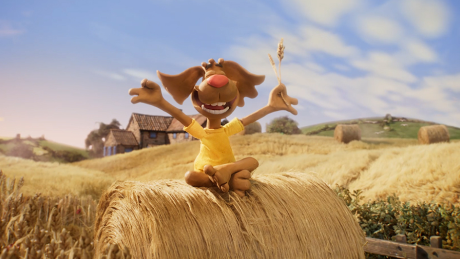
The cereal’s iconic mascot, a rather frenetic dog called Pico that loves chocolate, explains the sustainable origins of Chocapic as we see the wheat and chocolate coming together to create the delicious choco petals.
Pico brings a crazy amount of energy and humour to the story, especially when contrasted with the beautiful and serene farmland scenery. We see the farmer who’s been working in the fields, cows grazing, rabbits, chickens by the farmhouse and a horse-drawn cart carrying barrels of chocolate. It all looks idyllic and peaceful, while Pico chaotically rolls down on a runaway hay-bale.
We started the process by working out the story. We had a lot to say in a 20 second film! We wanted to see a serene landscape with Pico causing havoc, rolling down hills and crashing into a chocolate cart, flying up into the atmosphere and landing back down, creating a field full of delicious Chocapic, all while also introducing no less than ten characters (including my favourite extras such as Ladybird and Madeleine the Snail). We were working very closely with the brilliant McCann Paris agency who knew exactly what they wanted and together with the amazing storyboarding skills of Luis Pueyo we managed to fit everything in.
This film was going to be super fast, with an extremely dynamic pace!

Alongside the story we worked on the character and background design. We were inspired by images of French countryside and farms, personalities and actors. We knew that the client loved the classic Aardman style so it was a great opportunity to work in our house style, but with French influences. I had the huge pleasure to work with James Grant who designed beautiful atmospheric backgrounds of the French countryside.

For the character design we worked with Sylvia Bull and she was absolutely perfect for the job. Sylvia has previously worked on Creature Comforts and Shaun the Sheep, which was the style we were looking for. Working on the characters was lots of fun – most of them were inspired by real people which adds an additional layer to them, making them more real. They all have names, some small background stories and character descriptions. For example Victor the Cockerel – proud, friendly, but always running late – or Gerard the Goat – laid back, but easily spooked!

DESIGNING PICO

The iconic character Pico has been Chocapic’s mascot for 30 years. But he’s always been an animated 2D and CG character so we had the great challenge of turning him into a real stop-motion puppet for the first time. We wanted to keep his original likeness and character, but add a bit of an Aardman touch with the eyes, teeth and mouth. He was probably the most difficult character to design, but we did lots of variations to get the balance just right!
ANIMATING PICO
Now, this was the thing that excited me probably the most. In order to convey the character of Pico from previous animations, we studied the old 2D ads frame-by-frame. Pico’s animation was super dynamic and used some crazy squashes and stretches – which would be difficult to animate in CG or with foam latex puppets – but because we were working with clay we could imitate these extreme movements. I really wanted to push the animation to achieve the same dynamic and fun movement that our viewers would expect of Pico. These frames can look very odd when you pause the film and stare at a single frame, but give a great illusion of movement.
Please see below the examples of 2D ads and our stop motion frames.

Stretches
STOP MOTION AND SUSTAINABILITY
Stop motion has a very unique quality because the sets are handmade and the performances are more human, which makes it feel more tangible, authentic, warm and impressive. There’s a connection between the farmer caressing the wheat, selecting ears of wheat by hand and the way we make our work.
A very important part of this production was sustainability. This was one of the reasons Chocapic decided to work with us. Besides Aardman already having a record of doing sustainable productions there’s a connection between Chocapic and Aardman in our shared care for details, quality and human touch.
Throughout the production we were very mindful about the materials we were using. For the puppets we didn’t use any chemical materials such a foam latex. Latex has ammonia so we decided to use materials that are non toxic and user friendly. The bodies were fully clay, the clothes out of fabric textiles, and the armatures had a wooden core.

In terms of making the sets, we used only FSC wood and recycled wood, water based paints and organic moss. We also used recycled polystyrene, textiles and cardboard.
BUILDING THE SETS
We spent quite a lot of time perfecting the designs with the agency to have a good reference of how to build the set. To create the illusion of rolling hills spreading into the distance, we used several decks of sculpted polystyrene covered with various textiles. I loved coming into the studio and seeing a strange composition of floating decks that only magically come together through the camera lens. Our Art Director Helen Javes has a great skill of arranging these huge anamorphic creations to make a beautiful illusion of a real world. Simon Jacobs, our Director of Photography, used lots of different and extreme lenses (every shot has a different lens) that really helped the action feel dynamic.

CGI ELEMENTS AND COMPOSITING
Besides having a stop motion shoot we had to create quite a few elements in CG. The major CG generated element was the chocolate choco petals and there was a fair amount of compositing on every shot where our CG team added the final, magical touch.
Team of compositors lead by Bram Ttwheam put together some separate elements such as fields and animals, composited in the skies and atmosphere. We also did a special wheat treatment in post as this was one of the elements that was very important for our clients.
ABOUT MAGDALENA OSINSKA
Magda is an award-winning director at Aardman. Over the eight years Magda has been with Aardman, she’s directed stop motion, CGI, 2D and live action commercials. Her most recent work includes a number of DFS adverts; including Wallace & Gromit’s ‘The Great Sofa Caper’, Dammy the Beaver, as well as Share the Orange, an Alzheimer’s Research UK campaign spanning three years, starring Samuel L Jackson, Bryan Cranston and Christopher Eccleston. The film was a PR Week Award Winner and it became the most successful digital campaign in the charity’s history.
Follow Magdalenda on Instagram here.


