Water Brand Montellier Gets Sparkly Smooth in Its Brand Campaign from Juniper Park\TBWA

Montellier Carbonated Natural Spring Water has announced the launch of a new brand campaign focused on communicating its unique and naturally balanced taste. The proudly Canadian owned and operated brand, sourced in Quebec, is conveying how its water is sparkling, yet also smooth, through a beautifully crafted spot, as well as POS, digital, print, and social elements.
The truth about things that work in perfect balance is that they can be unexpected and surprising. But what ultimately matters is that they just work together. Like how the simple things can also be sophisticated, how the calm moments can be invigorating, and laidback time can also be lively. Or in Montellier’s case: sparkling can also be smooth.
To communicate this product truth and how Montellier’s natural balance adds a touch of sparkle to any occasion, the brand worked for the first time with creative agency Juniper Park\TBWA and its design arm, Le Parc Design.
“We are thrilled to announce the launch of this new campaign. The Juniper Park\TBWA team was able to come up with an innovative and creative way to present one of our brand’s key attributes. JP’s team has a strong aesthetic sense and we truly appreciated working with them and the PepsiCo team to turn this idea into a great campaign platform,” says Emilie Coulombe, Sales Director at Montellier.
Montellier is perfectly balanced with its distinct smooth sparkling bubbles. This quality, honed over three generations, is what sets this award-winning sparkling water apart from others.

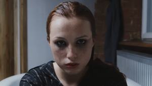
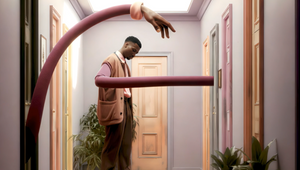
The new spot brings this to life by capturing and celebrating the special moments in life where balance surprisingly exists - a snowball fight, a lakeside hangout, or a dinner with friends - to draw the connection between how natural balance permeates every aspect of Montellier.
“The creative idea and execution really aims to reflect the product itself in a very evocative and sensorial way,” says Jenny Glover, executive creative director at Juniper Park\TBWA.
A unique and distinctive visual identity was developed for the campaign using the brand’s bold-blue colour to highlight its characteristically playful nature. Bubbles are used to illustrate the contrast between sparkling and smooth, an unusual combination that turns out to be harmonious. The empty bubble representing “sparkling,” and the full bubble being “smooth.”


