This Canadian Coffee Brand Put a Donkey on a Motorcycle to Kick-Start Its First North American Campaign

For a humble small town brand from the Canadian Rocky Mountains, breaking into the North American market is a big deal. The competition is fierce as you fight against the pre-existing favourites for a piece of the pie, understanding your audience is a lot bigger than the Canadian demographic you were addressing previously.
So, for a new competitor to make a splash – especially one in the coffee industry, a category with a tried and true approach to marketing, is a big deal… which is exactly what Kicking Horse Coffee did with its latest campaign. Created in partnership with Lifelong Crush, ‘Kickstart Your Heart’ leaned into the brand’s spirit and ethos of being a ‘rebel with a heart of gold’.
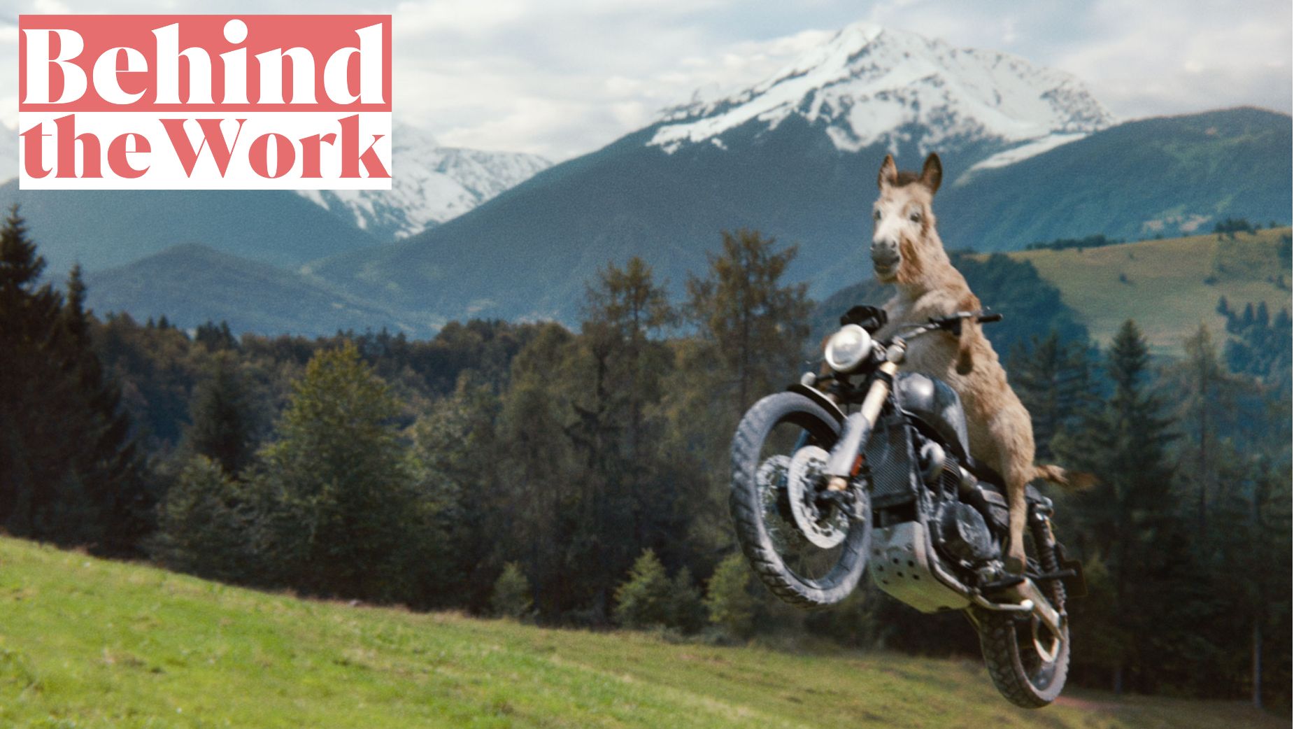
Centred around a 45-second hero spot directed by The Perlorian Brothers, the work depicts a lonely donkey looking wistfully at the other animals on the farm – particularly the horses who freely roam the fields. Well, that is until she finds a cobweb-covered motorcycle in the back of the barn and takes it on a joyride into the fields – all of which is set to an epic rock and roll soundtrack. It all serves to not only create an epic visual experience, but as a reminder of the power good coffee has to make each day exciting, no matter how dull your life might otherwise seem.
To learn more about what it took to bring this ambitious endeavour to life, LBB’s Jordan Won Neufeldt sat down with Lifelong Crush’s chief creative officer Christina Yu, as well as Kicking Horse Coffee’s chief marketing officer, Lori Hatcher-Hillier, for a chat.
LBB> Launching a brand’s first-ever North American campaign is no small task! Can you tell us a bit about the brief, and how this partnership came to life?
Christina> The brief was to bring to life the brand that Kicking Horse Coffee has been lovingly perfecting over the years. Our goal was to introduce a new brand platform that was representative of the brand’s purpose, values, and commitment to making the best coffee, and to do so in a way that would wake up a sleepy coffee industry.
Lori> We were initially impressed with the chemistry and Lifelong Crush’s belief in unconstrained thinking, especially for expected categories, which coffee has historically been. The team really understood the essence of our brand and history, and that showed up in a strong creative strategy and truly nailing the tone of voice immediately.
LBB> And what made now the right time for this new brand platform, as well as expansion into the American market?
Lori> After years of perfecting our craft, we’re ready to share our story with a wider audience.
Our new brand platform ties together everything we stand for – our values, our origins, and our commitment to quality – and brings them to life in a way that matters. This is our way of connecting the dots between our storied past, our bold present, and the exciting future ahead of us. Now just felt like the right time to bring that story to a bigger stage.
LBB> What was the ideation process like? How did you work to build around the brand’s spirit, and how did it lead you to the idea of a donkey on a motorcycle?
Christina> It all started with getting to know the people behind the brand on a deeper level. We wanted to hear what the brand meant to them and understand the current relationship coffee drinkers had with Kicking Horse. Why they picked Kicking Horse off the shelf among a sea of competitors, and how they used the brand in their coffee rituals.
As for the donkey... she (yes, she) has been a core brand asset since inception. The packaging has always featured a donkey despite being called Kicking Horse Coffee, representing the irreverent and tenacious attitude of the brand and the people that work there. We knew we had to bring that spirit to life in a badass way.
LBB> Building on this, what does Kicking Horse represent? What should more North Americans know about the brand?
Lori> At our core, Kicking Horse Coffee is a rebel with a heart of gold. Born in the Rocky Mountains, we proudly embrace our roots – bold, untamed and fiercely independent.
We stand for purpose, quality and doing things the right way, even when it’s the hard way. From day one, we’ve been certified Fairtrade and organic. It’s a fundamental part of our identity. Our beans are rich in flavour and infused with pride – pride in ethical sourcing, pride in delivering bold taste, and pride in never half-assing anything.
We stand by our values unapologetically. Our campaign is a powerful reminder that everything we create is driven by the same bold spirit that has defined us since the beginning.

LBB> From here, what was the writing process like? What did it take to bring the script for this to life?
Christina> We got inside the mind of our donkey. Seriously. We asked ourselves how it would feel to be a rebel with a heart of gold unable to run free like a horse. This helped us stay true to our goal of creating a campaign that felt as energising as Kicking Horse Coffee does. We wanted to leave consumers with the feeling of the brand – an emotional product sample featuring a donkey, if you will.
LBB> Notably, you had The Perlorian Brothers direct this! What made them right for the job, and what was the shoot like?
Christina> I mean, there’s a donkey on a motorcycle. It felt like the perfect Perlorian script – right up their brand of weird. They were the perfect collaborators and storytellers.
The film was shot entirely in camera using a stunt driver. In addition to our hero donkey, we had real horses and pigs, although the pigs, unfortunately, didn’t make the final cut. It turns out, pigs can’t act like chickens can! (Hot tip: if you need a chicken to perform, just wiggle a bag of chips on a stick. Jury’s out on the acting ability of horses, though. They stayed in character a little too well and ended up running off set mid-day).
All in all, the shoot was about as wild as you can imagine, having a donkey as the lead, horses running away, and our stunt donkey crashing the motorcycle and needing a replacement.

LBB> While we’re here, any bonus tips for working with animals on set?
Christina> Another hot tip: we found that the best way to get the donkey to behave was by putting a chicken on the donkey’s mom’s ass. The horses, on the other hand, 0/10, would not recommend working with them again!

LBB> What went into bringing the actual donkey on a motorcycle to life? Was there a costume involved? And if so, how did you ensure it’d be safe?
Christina> The donkey on the motorcycle was done entirely in CGI, so no costume!. On set, our stunt driver was simply wearing a suit so that the CGI donkey driving would feel real and authentic. Our donkey was then 3D-modelled by the very talented people at FABLEfx so that everything would look as accurate as possible. See below!

LBB> And what actually went into bringing this sequence to life? Tell us all about it!
Christina> It was edited (shoutout to Ben Canny at School Editing) just like a typical commercial, since it was all shot in camera, but we had to get used to seeing a man wearing a brown costume, instead of a donkey. From there, the animation began. Like directing humans, we would work closely with our partners to guide exactly how we wanted our donkey to feel, behave, and react. Then, it was over to our friends at Rodeo FX and Alter Ego to do all the beautiful finishing touches.
LBB> Of course, the campaign is supported by other elements, including OOH. What did it take to bring these aspects to life?
Christina> Early on, we wrote headlines that felt like the brand was speaking right to the audience, and allowed those to guide the look and feel for our OOH. We wanted the brand photography to be representative of the energy and tone we were building, and we had a blast working with Kate Ince at Westside to make this happen. She mastered the splash shots in a dynamic way.

LBB> What challenges have you faced during this project? How did you overcome them?
Lori> The biggest challenge was crafting a creative that felt authentically us while resonating with a broader audience for the first time. We had to strike a balance between staying true to our rebellious spirit and ensuring that our messaging was relatable and compelling to new consumers.
Aside from that, CGI is hard! It was a very complex creative process to follow through from idea to execution, but the risk was 100% worth it. We really had to learn the art of trusting the process whilst watching this campaign come to life.
LBB> Do you have any memorable lessons learned from this new campaign?
Christina> Directing talent is always a challenge – particularly when it's non-human talent.
Lori> There were so many Easter eggs we wanted to include in the project, which took a lot of time and thought but made it even more fun to watch. However, the main thing that was important to us (and possibly most challenging) was making sure our audience felt a part of Invermere in the spot, and I think we did a good job at portraying this.
LBB> What has the initial response to the campaign been like?
Christina> The brand launch has been getting lots of love, not just from ad people, but from Kicking Horse Coffee lovers, and real people. We’ve popped up in a lot of awesome publications, but our crowning moment has been being featured in Horse Canada. That’s a proud career-first for all of us!
Lori> The response has been incredible! We’ve always had a fiercely loyal fan base, and we’ve seen an outpouring of love from our community. Fans were excited to see us push boundaries and show the world what makes Kicking Horse kick ass!

LBB> How does this campaign fit into your branding for 2024 and beyond?
Lori> Let’s just say, there’s no stopping where we’ll go next. Stay tuned!
LBB> Finally, is there an element of this campaign you’re most fond of?
Christina> The track still gives us goosebumps every time we watch the spot. But in general, we love the attitude of the whole campaign, from the OOH to the film. Everything captures the personality of the brand that it's always had inside. We’re fond as hell that we got the chance to bring it out and share it with the world. It’s an attitude that the coffee industry was in desperate need of.
Lori> The reaction this campaign is provoking is hands down the best part. It wasn’t expected that a coffee brand would create a campaign with such risk and intent, and we’re really proud with how it turned out.
Of course, the rock music in the ad deserves some appreciation as well – it was perfect!


