


Steven Bonner Answers Our Cries

Following on from the success of Bodyguard, Sunday night viewers were left without a good old BBC binge watch. However, the BBC quite literally answered our cries with The Cry, an eerie and thrilling drama about the abduction of a child in Melbourne. Jelly's very own Steven Bonner was asked to the lettering for the show’s title, and along with motion designer David Beattie, he perfectly captured the creepy and sinister unravelling of the show’s plot. We caught up with Steven to chat about the concept, creation and process of making artwork for the hit show…
Q> Did you have much freedom when creating the lettering for The Cry?
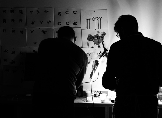
Steven Bonner> Yes, lots. I worked on the title lettering along with David Beattie, a senior motion designer at Glasgow design agency D8, where I’m also a design director. We took the brief from film company Synchronicity and initially came up with a few potential different approaches based on the initial synopsis and information we had access to – different aspects of the series threw up different visual entryways we could look into.
For the route we developed for the final titles, we needed freedom to experiment with different types of ink and liquid until we got the result we were looking for. After that it was a case of trial and error. There were a couple of days where we didn’t get anything we liked as we were not only trying to get the right forms for print, but also motion so we could animate the final titles. Ink and water are unpredictable by their nature so we had to be patient till we got the right effects.
Q> Had you been able to watch any of The Cry before you started creating the artwork for it? If not, how much were you told about the plot of the show?
Steven Bonner> Actually no. They were only half way through shooting when the client approached us. We got to see the art direction mood boards and the cinematographer took some amazing shots on location during the filming in Melbourne. The production team gave us a rough outline of the plot, but we ended up reading the original book by Helen Fitzgerald to get a real feel for the story. We also had the first draft of Lorne Balfe’s opening soundtrack to draw additional mood from which was tremendously inspiring.
Q> With this information about the tone and plot of the show in mind, what was your process when approaching this project?
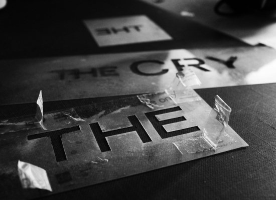
Steven Bonner> We started by pinpointing a variety of plot devices and looking for a visual ‘in’ from those. All were strong but the director and production team felt the idea of using ink and water to convey literal tears and a creeping sense of dread felt right, so we developed a storyboard that took us through a more elaborate title sequence than the one we eventually went with, as when we viewed slow motion footage of Jenna for the first time, that all fell by the wayside and the answer was right in front of us. Sometimes in a project you’ll be lucky enough to get that one image that sets the tone for everything else. Our gift was Jenna Coleman’s face! By that time, we had already decided to go down the liquid typography route and when we saw that footage of her hair floating as if underwater, it all came together relatively effortlessly.
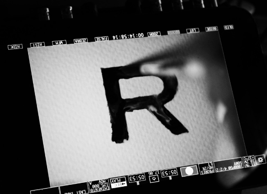
The actual typography was made by hand applying water to paper and allowing ink to flow along the path. Ink was dotted at various times to create a sudden change of direction. We used a small handheld fan to create some turbulence. Finally, the type is destroyed by dripping water onto the surface. In motion, we wanted the type to convey the mood of the story, slowly building tension then reaching a dramatic finish so this transition from a slow, fluid build suddenly reaching breaking point to become something more destructive felt right for the story.
When designing the artist credits, I also looked at how I could convey the idea of this slow build more clearly and in a way that viewers could easily read names on screen in a short space of time. We created a system of incremental increasing word sizes to get across the idea of the tension growing as the series progresses, and of Jenna’s character gradually regaining her identity. It was simple and clean, and offset the more expressive title lettering nicely.
Q> How would you say this project differed from your more commercial projects? Did you enjoy it as much?
Steven Bonner> It was very different. Most commercial projects tend to have much tighter timescales. You typically have much less time to experiment between brief and delivery. Also, in many commercial projects, a lot of the creative decisions may have already been made for you, either by the client or by someone in the chain who has already set guidelines. Also, commercial clients tend to be more risk averse and don’t want to step too far away from category standards.
We were lucky to work directly with someone like the director Glendyn Ivin. He was very hands-on with the title sequence and had a particularly good graphic eye. When you work with somebody like him who clearly cares so much about the project, it’s very motivational for everyone else.
Q> Would you want to do more projects like this again in the future?
Steven Bonner> Of course! It was a lot of fun and fired up the creative juices, and working with David on the motion side was great – it’s something I don’t often get the chance to do but I always really enjoy it when I do. Also, David says his mum finally understands what he does for a living now!
Q> Do you have any exciting new projects coming up?
Steven Bonner> There are loads on just now. Over the past few years being back in Glasgow and working with the folks at D8, I’ve been much more involved in how my work is used in application, which is where my beginnings in the creative industry started, so I feel like I’ve come full circle.
I tend to work really heavily in packaging and I have a number of brands I’m involved in branding/rebranding that I can’t really say too much about right now. I recently rebranded Old Pulteney Single Malt Whisky which has just launched with a new look for the core range, with more to follow in the coming months.
I was also hired by Design Bridge to help repack the Cadbury’s range of chocolate bars – all in all I think I did about two dozen count lines for them. Packaging is one of my favourite things to do. It allows me to bring a lot of disciplines into one project and from one day to the next I can be found lettering logotypes, creating illustrations to support the brand, designing bottle and box shapes and the like. It’s a lot of fun, and full on. Of course, I’m still doing plenty of other work too so I keep my skills as sharp as I can!


