Squarespace and Jeff Koons Make Art More Accessible

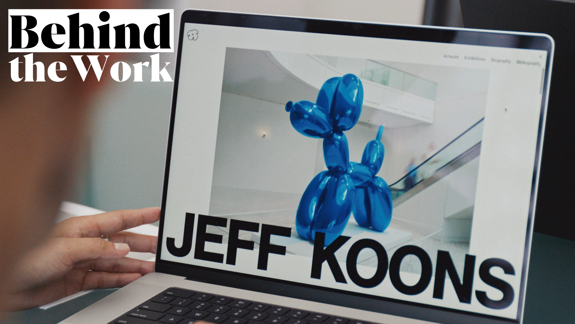
Squarespace Collection is a partnership series in which the website building company teams up with prominent creative minds to develop signature website designs. Following collaborations with Björk, Magnum Photos and Rick Rubin, the series’ fourth iteration has partnered with visual artist Jeff Koons, most well known for his balloon animal-inspired sculptures.
Squarespace helped Jeff revamp his website to showcase a chronological archive of over four decades of work, and created a new custom template inspired by the experience, ‘Reflect’, which all Squarespace customers can use. It’s the first time Jeff’s complete works are available to view online, reflecting the artist’s accessible philosophy.
“I was able to create with Squarespace a site that communicates visually, emotionally, and intellectually the way I see the world,” said Jeff in Squarespace’s announcement of the project. “This custom website design called Reflect will give the user the same power and dynamism to create their own visual story through the use of this template.”
Squarespace’s in-house creative team also produced two short films, shot in Jeff’s New York studio, to accompany the collection. ‘Inflate’ introduces the collaboration and redesigned website, while ‘The Process’ delves into Jeff’s creative approach.
In Squarespace’s announcement, CCO David Lee described Jeff Koons as “one of the most influential visual artists of our time”, and said that Squarespace shares the artist’s ideology around democratising access to design and art. “We hope this Collection inspires other artists and doers to showcase their portfolios and businesses online with Squarespace.”
To find out more about this partnership, LBB’s Ben Conway caught up with Squarespace’s senior creative director, Ben Hodgin, and director of brand design, Satu Pelkonen.
LBB> This is the fourth iteration of Squarespace Collection – why was Jeff Koons the ideal person to join Björk, Magnum Photos and Rick Rubin in the series?
Ben> For the next iteration of Squarespace Collection, we wanted to collaborate with someone who could resonate with artists and designers, a large part of the Squarespace community.
Jeff Koons is one of the most prominent visual artists working today and his work has inspired not only our team here at Squarespace, but people across the globe for decades. Jeff embodies the creative spirit that we look for in our partners – his meticulous approach, impactful body of work, and extensive accomplishments are incredible. We were particularly drawn to his desire to make his art more accessible and his vision to launch his entire collection online for the first time ever.
LBB> How did this series originally start? And how did you get Jeff involved?
Ben> We originally launched the series in 2022 with Björk. We are continually evolving to feature and work with some of the world's most innovative and influential creative minds. When looking for collaborators, we always seek out leading figures in culture and creativity. Sometimes they’re launching a new project and sometimes they’re looking to refresh and rethink their website, like Jeff.
Satu> We had heard early on about Jeff’s interest in revamping his website and that Squarespace was the platform of choice for the new look. We couldn’t help but seize the opportunity to collaborate on the redesign to make it a match for such an iconic artist. Jeff and his team were interested and eager to get started as soon as we presented the opportunity. The chance to provide a wider creative community access to his work and to inspire them with Jeff’s design choices as a starting point for their own work resonated immediately.

LBB> You redesigned Jeff’s website with connection and accessibility in mind – can you tell us a bit about the design process?
Satu> Jeff’s work is so prolific, wide-ranging, and iconic that we sought to create a website that would highlight his many decades of projects, similar to how a gallery or museum would. We were inspired by the philosophy that the art should take centre-stage, without distraction, and created a modern landing page where viewers could quickly experience a curated preview of his pieces.
As you navigate the rest of the pages, we leaned into the experience of traversing through a gallery – with an organisational and navigational system that could categorise his projects logically, lightboxes to show the most impactful views of his artwork, and grid layouts for a disciplined approach to information. While not everyone may be able to travel the world to see his artwork in person, his new site offers them a similar experience with just a few clicks.
LBB> How did Jeff collaborate with you on this process? What were some of his most valuable inputs and insights?
Satu> Jeff was a wonderful, thoughtful, and highly engaged collaborator throughout this project. From our initial design reviews to the final product, there was an extreme level of clarity with this creative collaboration. He had a very good understanding of what he wanted to accomplish for the website, and once we honed in on that vision we were able to iterate and adjust accordingly. The result is a website that is deliberately designed to show the numerous works and information.
Jeff believes the role of an artist is to be generous with the viewer, offering them something to think about. He was generous with us throughout the whole process, sharing his work and insights, and we hope that results in a site that engages and inspires others.
LBB> The website design is accompanied by a new template, ‘Reflect’. Did you have to balance features and design elements that fit with Jeff’s work, and features with a broader appeal?
Satu> The design choices Jeff made for his own site inspired our accompanying website design, ‘Reflect’. The template is one of our boldest; with a boundary-pushing design structure and all the functionality needed to house a modern portfolio, it definitely makes it easier for creative professionals to make a statement from day one.
Reflect offers a unique starting point to showcase your work expressively. For creatives and artists alike, it offers a non-traditional way to showcase work with a bold approach to branding and project thumbnails. It also leans on conventional viewing methods like galleries, gridded text, and accordion blocks for the artworks and additional pages.

LBB> You made two films as part of this campaign – what were some of the focuses for the filmed content? And what was it like to interview Jeff in his own studio?
Ben> With ‘Inflate’, the idea was to take some of Koons’ most iconic works, like Balloon Dog, and bring them to life both literally and metaphorically. The film represents both the creation of these works and all of them coming together to materialise in one place on his new website – which is shown for the very first time in this film.
‘The Process’ was more of an opportunity for us to provide a more detailed look at our collaboration with Jeff. It shows how he thinks about art, especially about presenting it in both physical and virtual spaces, and ultimately what he believes the purpose of art is.
Jeff’s studio is in NYC, and as a New York-based company ourselves, it was a pleasure to be able to shoot in the city we call home and to be welcomed into the creative world that Jeff has built.
LBB> ‘Inflate’ shows Jeff’s famous balloon animals appearing to be inflated in a gallery – what went into creating this visual?
Ben> All of the visuals shown in 'Inflate' were created in 3D with the exception of the final shot, which we captured practically in Jeff Koons' studio. It was actually a very heady process once we got into it, because we quickly realised there wasn't a real world reference we could point to for how these giant steel balloons would inflate. The deeper we got, the more questions we asked. Should they be pre-tied as they inflate? Should the material be light and crinkly like a mylar balloon or heavier like a bouncy castle?
Our partners at ManvsMachine did a ton of experimentation to help us determine the materiality of each piece, which then informed not only how they would inflate but also how they would reflect the 3D gallery space around them. We then referenced images of the actual pieces that were displayed in galleries all over the world to make sure that the colour matched exactly what Koons had intended. None of us had ever put so much thought into a balloon before!

LBB> Can you tell us anything about the next iterations of Squarespace Collection?
Ben> We’re always on the lookout for potential partners, whether that be an individual, brand, or project looking to use design and creativity to inspire others.


