


“So True, So Real and So Raw”: The Creative Vision Behind Crispin’s Rebrand

Steve Denekas thinks the advertising industry is doing itself and its clients a disservice.
The newly appointed chief creative officer of Stagwell’s Crispin – recently rebranded from CPB – believes that bad ideas are being presented in overly beautiful, manicured ways. “You can make a really beautiful deck, but the ideas are shit,” says Steve.
Steve and I aren’t just chatting for the sake of having a rant about advertising in 2024 – in fact, that point was a small snippet in the midst of an engaging deep dive on Crispin’s recent rebrand and how it is an intentional antidote to the issue mentioned above.
The leadership team at Crispin – during the time when it was still CPB – had been kicking around a rebrand for some time when they initially began speaking to Steve about the CCO role. Conveniently Steve, a designer by trade who was CCO at BASIC/DEPT® at the time, went into a meeting with recently promoted CEO Maggie Malek and immediately connected on how the new brand could come to life. Fast forward to March 2024, not much more than one week after he started, and the new look and feel was as good as done.

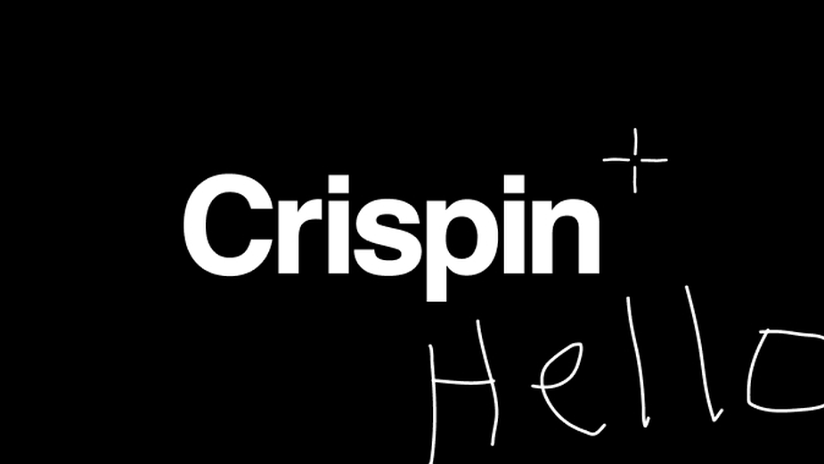
The evolution of the Crispin logo
The speed at which CPB’s switch to Crispin and the new logo and ethos that came with it is a testament to the new brand’s simplicity. The word ‘Crispin’ is written in Helvetica, arguably the least BS font of all time, and the constellation next to it, a nod to the former logos, is hand drawn.
“We wanted to strip away all of the gloss that exists within the industry and get down to the raw, pure ideas,” says Steve. “Creativity is instinct. It's about soul, it's about sketching things quickly on paper, and then just letting that be free to have clients look at. We don't have to have everything so glossy. That was the starting point [of the rebrand]. How do we create something that is so true, so real and so raw that the clients feel like they're part of it? So that we go on the journey together.”
That rawness was apparent in an earlier idea that Steve had for the logo that involved little more than his actual handwriting and the word Crispin. That was a little too close to the mark, but it did lead to fruitful conversations with CEO Maggie around the idea of the agency being serial truth tellers. It immediately led Steve onto Helvetica, one of the “ultimate fonts for the truth” in his eyes.

Steve
“I loved the idea of just using Helvetica – it's a font that has everything and nothing to prove,” he says. “It's just so clean, it's purposeful, and it's no bullshit. I'm a designer, and I've had a love affair with it forever. It's where you start and it's where I ended with this one, because I just wanted to be so clean and simple.”
What’s more, the rebrand is a healthy nod to Crispin’s roots, to the days when it was first launched – as Crispin – in 1965 by Sam Crispin (Chuck Porter and Alex Bogusky joined later). On top of the name, an icon of Crispin’s past has been reintroduced, a pygmy elephant named Hermy who once upon a time, says Steve, represented ‘advertising done differently’. Hermy lives on, not as the centre of attention, but as a symbol of individual creative expression. For example, the agency includes a hand drawn elephant from a different employee in each pitch deck.
“What's beautiful about Crispin is that it has alumni that really believe in it. We wanted to ensure that those folks felt like the path they paved was one that we're still walking on. It's one thing to just dismiss everything that had been done, but it's another to really honour it,” says Steve. “So, we wanted the rebrand to honour all of the folks that contributed to what was probably one of the most provocative and punk rock advertising agencies on the planet.

What’s more, Hermy also offered the opportunity to honour the female-led leadership that is nowadays steering the Crispin ship. “Elephants are matriarchal – the eldest female runs the herd of elephants. We've got an incredible leadership team that is female-led, and I wanted Hermy to also represent that because it shows how we can look forward.”
Overall, the rebrand offered Steve and the wider Crispin a chance to reintroduce themselves. “We wanted to acknowledge the fact that we've tried to put gas in this engine a few times, and we wanted everybody to know that this time was a little bit different,” he says. “We were intentional about honouring Crispin, who started the agency in '65. We wanted to go back to the roots, back to the beginning, back to when it all started. It was about exposing our legacy, and everybody knowing that we're here, we've got something to prove, and we're on a mission as an agency. Our tank is full right now and it's really interesting and fun.”
Steve joined Crispin with a clear brief from CEO Maggie: ‘Reimagine the next 20 years of advertising.’ Despite the forward-thinking scope of that challenge, the move also offered him an opportunity to get back to his creative roots somewhat after years spent within the realms of technology and operating as a specialist in that space.
“I was doing a lot of work on things like the future of AI and how it could make things more efficient. And that’s part of it [the industry]. But not the whole storm,” says Steve. “I spent so many years at BBDO and Wieden+Kennedy, in those more traditional organisations that build energy around ideas. I was really missing that in the more digital agency life. It was very hard to connect the dots between a big idea and a website or something like that. So, this opportunity to come to Crispin – and its DNA for big idea creative, social, storytelling – was a pretty clear choice.

“We don't necessarily think about things in traditional mindsets where we're going to do TV or print,” he adds. “No. We're going to be creative and solve business problems. We're going to understand where people actually give a shit about a brand and then we're going to make for that. It is about finding those opportunities. Sometimes it's technology, sometimes it's a print ad. Whatever it takes to get the message across in the right way.”
Right now, just a short couple of months after Steve began life at Crispin, he says that the agency is a little like wet clay. They’re still forming it, moulding it, still figuring it out. But ultimately, as he’s been keen to say during the course of our interview, it’s about taking the things that really worked in the early days of Crispin and ideating around that.
“That's really where we're at right now,” he says. “That's coming to life in things like presentation decks that look very similar to our website. They're not so refined, they're a little bit messy, they're a little bit hand drawn. I want clients to feel that spark, that energy, that rawness. We make very artful things, and I want people to feel that.
“Do we have it all figured out? Absolutely not. But we're excited about the potential and where it's going.”


