Self Hypnosis App Reveri Launches Major Rebrand

Reveri, the clinically-backed self-hypnosis app, is today rolling out a major rebrand look and feel to mark its entry into the health-tech category.
Co-founded by Dr. David Spiegel, a world-leading psychiatrist at Stanford University with over 45 years experience in clinical hypnosis, and Ariel Poler, a Silicon Valley investor and technology leader, reveri started in the US in 2020. With no proactive marketing efforts, reveri was able to grow its user base organically, to over 300,000 registered users.
To lead the re-brand, reveri approached Shoreditch-based design studio Mother Design with the challenge of developing an aesthetic identity that would successfully communicate the brand proposition, break down the traditional conventions of the wellness industry, and define reveri’s entry into the self-hypnosis category in the UK.
The challenge? To build a distinctive creative brand world which reinforced reveri’s position as a challenger brand in the mental health and wellness space.
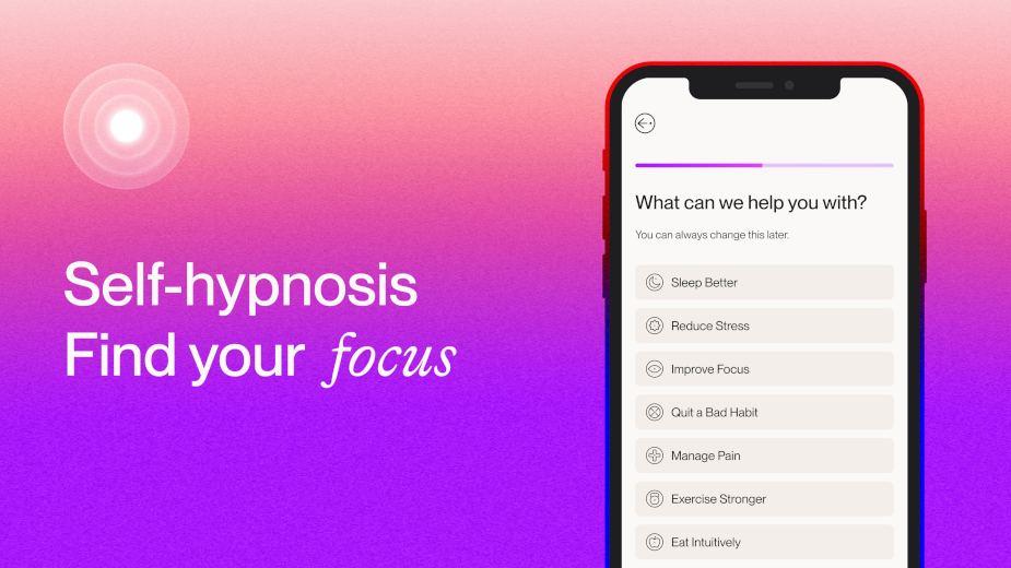
The new visual identity blends the philosophy of reveri as a brand with the functionality of the user interface as a product. The conceptual rigour stemming from the importance of ‘focus’ - both for the practice of hypnosis and for the user experience - is something that has permeated every element of the visual ID, and shaken up all elements of the user experience; from the in-app interface to reveri own channels (including website and social).

Now, with an ever growing community of ambassadors and advocates, reveri has sights set on rapid UK and global growth, to continue its mission of bringing digitised self-hypnosis to the masses. With the brand platform ‘Find Your Focus’, the rebrand is the next step in showing consumers that hypnotherapy doesn’t just have to be a last resort; its improvements on the mind-body connection can benefit you every day.
Louise Troen, chief marketing officer at reveri, says, “As a category, hypnosis is a vastly misconceived, underestimated, and stigmatised concept. The myths perpetuated by popular culture, from stage performances and swinging pendulums to “sunken places”, have led to the practice having negative connotations, which people relate to losing control. Self-hypnosis is in fact the complete opposite of that. It’s about gaining control and enabling the practice to help recalibrate your subconscious thinking patterns - enabling you to quit your vice, manage your stress, or sleep sounder. It’s remarkable how powerful self-hypnosis can be, with no side effects, and often immediate results.”
“At reveri, we’re determined to challenge preconceptions, largely because we know just how instantaneous the benefits of self-hypnosis can be. A vital part in helping people see this for themselves is a considered visual identity that communicates the efficacy, accessibility and immediacy of our self-hypnosis pathways, available via the app. Mother Design took this vision and brought it to life, and we couldn’t be more ready to showcase it to our community - both new and existing - today.”

Harry Edmonds, creative director at Mother Design, adds, “We realised an important part of successfully cutting through the conventions of the wellbeing sector, would come from establishing a visual language that was not only distinctive in the category, but felt new across the broader design landscape, and avoided the tropes of self-help tools. One thing that struck me early on in our creative process with reveri, was the intense focus that underpins self-hypnosis techniques.”
“Hearing Dr. Spiegel explain the metaphor of how hypnosis is similar to zooming in on a picture, and the incredible detail of a very specific area that you’re able to see whilst you become less aware of the surrounding context - this analogy became the key inspiration for the whole art direction.
We carried the concept of ‘focus’ across everything — from the photography that's shot with a long lens and shallow depth of field for clear points of focus between the subjects and their surroundings, which also seek to capture unfiltered moments that convey sincerity and relatability, to the iconography and illustration. And of course the logotype; which resolves to clarity from a blur treatment and is set in lowercase to put emphasis on the ‘tittle’ (the dot above the i). We hope this new visual identity and brand system helps reach many more people to offer them the same relief and control that the growing reveri community is already benefiting from. We're proud to have created something we believe is beautiful, meaningful – and that sits distinctly within the category and wider design landscape.”
On a mission to create a world where everyone, everywhere has access to the immediate benefits of self-hypnosis, reveri offers a range of pathways, from pain management and reducing stress, to improving sleep and quitting bad habits.


