


Ruth Wardell: Finding Colour in Dark Subject Matter

At east London post production and colour grading shop, OKAY STUDIO, company ethos places emphasis on putting their people first. The artist-driven studio is keen to encourage talent across all post production disciplines to pursue passion projects that speak to them on a deeper level. Whether it be a music video, branded content or a long form labour of love, purpose-driven projects are at the heart of what they do. For Ruth Wardell, Harka was the epitome of this.
Documenting the life of Ali, a fictional street vendor making a living in the aftermath of historic anti-government protests of the Arab Spring in the early 2010s, Harka has been exceptionally well received for its grit and guts. The film presents the fallout from the Arab Spring, an uprising which incited protests and demonstrations that started in Tunisia and spread across Libya, Egypt, Bahrain, Syria and Yemen. The tense societal temperature is captured perfectly by Lotfy Nathan’s 90 minute debut film, and as soon as she caught wind of the project, Ruth knew she had to be involved. Jumping aboard to grade the motion picture was a no brainer, and here Ruth tells LBB how colour became one of the main characters, and where her grading inspiration for the film came from.
LBB> Who approached you to work on this project? What were your initial thoughts?
Ruth> The team reached out through DOP Maximillian Pittner’s recommendation. After reviewing the offline I knew instantly that I had to be a part of the project. Lotfy’s art direction and styling coupled with Max’s eye for beauty completely captivated me. To add to that, it was lit to perfection and shot on 35mm. The storyline was incredibly compelling and I was excited to be involved.
LBB> How closely did you work with writer-director Lofty Nathan and DOP Maximilian Pittner on the creative? Have you worked with either before?
Ruth> I worked extremely closely with both, especially Max, who I’ve collaborated with several times before. We only had six days in total to get the film graded due to the Cannes submission process. It put a lot of pressure on the initial four days to achieve a first pass we were both happy with. We then had the added complication of reviewing in a cinema-spec screening room. Thankfully, our wonderful colour assistant Fraser and online artist Faris were on hand to export overnight DCP’s at our studio. As a result, we had to work closely and concisely when setting looks for each of the scenes and then crafting once each review session was complete. In total, we achieved 186 scenes in 6 days including 2 rounds of amends. Any colourist will tell you this is not normal but we were all fully committed.
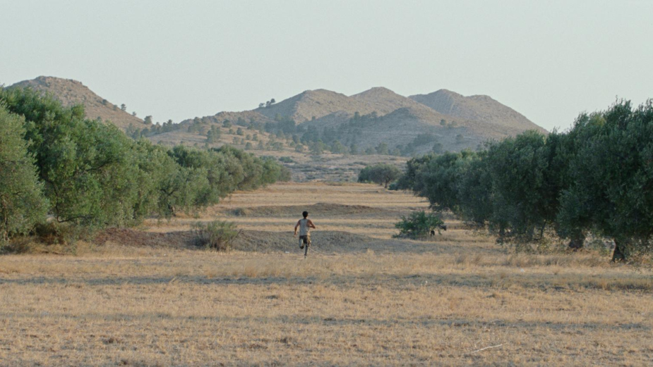
LBB> Harka is a tense slow-burner, and the story plays out amidst the hot, dry desert terrain of Sidi Bouzid. In what ways did the setting influence your grading decisions?
Ruth> Overall we wanted the audience to feel suffocated by the dry arid heat throughout the film, but without creating a wash. The heat takes different forms throughout the film. We frequently used what Lotfy coined ‘the desert look’. We took inspiration from old western films with desaturated deserts and rich skin tones. Taking the essence of these tropes and reimagining this look in a more contemporary setting helps set this film apart.

LBB> ‘Harka’ has two meanings in Tunisian Arabic, one of which is ‘to burn’ – did this translation serve to inform any of your creative choices for the film?
Ruth> There were several moments in the grade where the film's title definitely steered our decision making. The most demonstrative example I can think of is a point in the film where the lead character has an emotional outburst at a government building. To amplify the emotion within this scene we experimented with the exposure, pushing the scene to the edge of clipping, burning the highlights. Having the freedom to break the rules in this way was very liberating.
LBB> What role does colour play in this film? What were your main intentions?
The colour is completely integral to this film from start to finish. We built individual looks for each scene, whilst retaining a sense of consistency throughout. It required a lot of focus during the screening sessions but ultimately we achieved our purpose – to compliment the beauty captured in-camera.
LBB> Do you have any shots that are personal favourites for you? And if so, why?
Ruth> There are too many to pick! If I had to highlight one shot or scene, it would be the moment where Ali, the main character, is talking to his friend who works in a café. I love this scene for many reasons, but the lighting and grade we landed on is one of my favourites – along with the characters in the café who have a real unique and striking look.
LBB> You have graded a number of high profile music promos and commercial films – how does this work differ from previous projects?
Ruth> I think when you grade a music video or commercial, although similar to a feature there is a focus on the narrative and emotion in the grade, there is still room for each individual scene or setup to live in its own world. Grading a feature on the other hand, you are always aiming for the piece to come together as one. Each scene can have its individual beauty, but it’s crucial for them all to flow together and feel like they belong in the same world.
LBB> What was the reception to the film at Cannes?
Ruth> The film was received very well, achieving very positive reviews all round. Most notably, Variety and The Daily Telegraph awarded it 5/5 stars. The film’s lead Adam Bessa also won Best Performance - Un Certain Regard. I believe it is also at 100% on Rotten Tomatoes!

LBB> Do you hope to work on more long form projects in the future?
Ruth> Definitely! I loved the process and the outcome. This project has really piqued my interest in pursuing more long form projects. However, we may need to avoid overnight DCP’s for the sanity of our support team!
LBB> What are you most proud of from working on this project?
Ruth> Working on what I feel will be a timeless and captivating piece of cinema.
LBB> What did you learn during this project and how will you apply these lessons to future work?
Ruth> This project taught me to streamline and simplify my grading. When grading commercials you can really zone in on specific details and products, but we didn’t have the time or ability to do that on this project. This highlighted how, as industry professionals, we often dwell on the smallest details, and, although there is a purpose for this, there is also a beauty in working with broader strokes.


