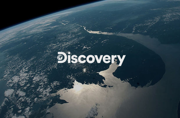
Roger Redesigns Global Brand Identity for Discovery

Television network Discovery recently came to branding and design agency Roger looking to redesign their global brand, beginning with a new logo system, and extending out to a fresh new identity that would cross platforms, languages, and continents, reaching over 220 countries around the world.
As a brand with a rich heritage, Discovery looked to update and modernise the logo while building on the equity of decades of brand recognition. With that, the goal of creating a novel approach to the D + Globe icon began.
In its exploration, Roger found that the negative space created by the continents on a graphic globe was enough to balance the weight of the circle and allow it to read as the stem of the ‘D.’ Uniting the world of Discovery was incredibly important in the process, and with that, they wanted to be sure that the static mark reflected that. After some exploration of both abstract, and more classic map projections of the globe, Roger landed on a traditional map layout, tweaked to live within the circular shape. Paired with bold modern typography, the new wordmark and icon were born.
Discovery brings you stories that make the world feel bigger with characters that bring it close to home. Bringing these stories to the forefront was the focus of the team's content-centric approach.

Roger started with a simple shape, a customized mortise called the D-Frame. Derived from the curvature of the mark, this modular form showcased the versatility of the brand and adapted to serve essential functions across the network.
Using the D-Frame, the team focused and framed footage, and created a diverse set of tools for adding branded elements to Discovery’s compelling visuals.
For print and out-of-home, the D-Frame takes a back seat to show marketing, allowing their custom visuals to be the hero. Using a smaller framing element or earmark, Discovery can make its mark in a more restrained way.

To complement the on-air and out-of-home branding, Roger worked with Discovery’s digital team to extend the new brand into digital, social, and on-demand streaming.
For brand-centric elements, the team gave the iconic ‘D’ its moment in the sun. Using the same language as the icon itself, Roger let aspects of the imagery finish the composition, framing them up with the ‘D’ shape.


