


No Grey Areas: How Colour and Culture Intertwine

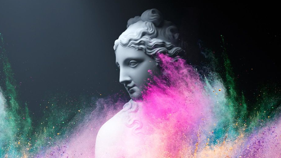
Walking into any museum with an antiquity wing, our eyes are greeted with a sea of white in varying permutations. The pallid shades of milky marble might shift under the light, but the overall effect is other-worldly. For millennia, western culture has internalised the marble-carved statues from ancient Greece and Rome - presented as they have always been in white - as the bastion of class and refinement.
The generalised colour white, or its mistaken association with an absence of colour, has resultantly become the foundational basis of what western culture associates with beauty and elegance. The artist and writer David Batchelor posits that “generalised white - whiteness - is abstract, detached and open to contamination by terms like ‘pure’.”

Above: Burberry’s 2021 ‘Olympia’ campaign tapped into cultural associations of class and elegance in white marble statues.
This vision, the white of the ancient world, is a lie. Though the idea is not new to archaeologists, academics, artists, and critics, it remains unknown to the average viewer. The truth is that the ancient world was a colourful one. Polychromatic traces of black, red, green, blue, orange, and gold leaf have all been found on ancient Greek and Roman statues, meaning that the average sculpture from that period is much more likely to resemble a brightly dressed carnival attendee than a ghostly apparition. What does this mean for us today? That the association between whiteness (and its related shades of beige – a stand in for ‘neutral’), is not only culturally produced but also a fiction. It proves that no one colour has an inherent quality – the meaning is in the eye of the beholder and the eye is influenced by all the things that culture is made up of like history, values, and symbols.
Batchelor traces colour’s denigration through centuries of western culture in his book, Chromophobia, pointing to examples of writing by Plato and Aristotle that privileged line and form over colour. Goethe’s Theory of Colour likewise argued that bright colours were suitable for children and animals, not people with a ‘good’ understanding of the aesthetic. Batchelor terms this attitude ‘chromophobia’, a fear of colour, which “manifests itself in many and varied attempts to purge colour from culture, to devalue colour, to diminish its significance, [and] to deny its complexity.” He likewise points out the myriad of instances where colour is negatively associated with the "feminine, the decadent, the ruinous, and the non-western".
Above: Vinzenz Brinkmann, who has been researching thepolychromy of antique sculptures for 40 years, reveals some of his mostexciting findings with a tour of the ‘God in Colour’ exhibition. Liebieghaus Museum.
But the truth is that colour is - and always has been - fundamental to our understanding of the world. “Colour, like time, is our constant companion. It’s with us from the moment we open our eyes in the morning to the moment we close them at night,” writes the academic James Fox, author of The World According to Colour. It’s also with us from before we start to understand the world with language, with infants responding better to brightly coloured objects than neutral ones. And before the invention of language, primitive humans drew pictures and used pigments available to them to communicate. “We associate colour with life so when you start taking colour out, you remove some of the emotions that we associate with it,” says Nice Shoes’ senior colourist, Sal Malfitano.
Take white. Its association with elegance, purity, and peace, and its prevalence at religious ceremonies or among the wealthy, is only true for some today. In many Asian cultures white is the colour of death, mourning, and bad luck; it’s only donned at funerals. Black is an interesting one as it's closely aligned with death, mourning, and evil across many societies but it’s also the colour of sophistication and luxury. What influences how the colour is perceived is of course context; someone wearing black at a western or middle eastern funeral will be perceived as dressed ‘appropriately’ while wearing black to an evening event or a date will evoke potential associations of elegance and even sexiness. “We use colour to represent beliefs, people, causes, and we know that different colours will mean different things to people. Colour is tied to culture in more ways that we think,” says Lenny Mastrandrea, senior colourist at Nice Shoes. The meaning of the colours around is unstable and culturally produced; being aware of the factors that influence their meaning is then a powerful tool for creativity whether we’re looking to surprise, delight, or persuade.
Evolution of meaning
As we’ve already touched on, the colour associations we hold to be true are rarely universal. Pink is the shade most closely associated with femininity and girlhood today. The director Sofia Coppola, most known for her layered depictions of womanhood, used shades of pink in The Virgin Suicides and in Marie Antoinette to interrogate the hyper-feminine nature of her protagonists, bathing them in rosy hues.

Above: still from the The Virgin Suicides (left); still from Marie Antoinette (right).
Pink’s association with all things feminine, however, is a fairly recent one. The diktat of pink for girls and blue for boys - familiar to anyone who has witnessed ‘gender reveal’ videos - was the opposite only a hundred years ago. In 1927, pink was thought to be the appropriate colour for boys due to its association with strength (and the complementary associations to its parent colour, red) while blue was thought to be daintier, prettier, more suited to little girls. The historian Jo B. Paoletti thought that the invention of prenatal testing solidified this trend from the 1980s onwards. When parents learnt the sex of their baby, they could ‘emphasize’ it with the colours of the products they purchased before the baby’s birth. This demonstrates that there’s nothing essentially ‘feminine’ or ‘masculine’ about either blue or pink, and that in another hundred years the trend may be reversed again or done away with all together.
These associations between colour and meaning shift through time and also across cultures. “What we associate with different colours in the United States won’t be the same as in China or the UK,” Malfitano points out. He adds: “In China, red is associated with happiness and prosperity, in the US it can be associated with anger and rage.” It’s worth pointing out that in China, red is the colour of the ruling Communist party while in the US, red is used by the Republican party while blue is for Democrats.
The trend is reversed in much of Europe and Asia where red stands in for progressive ideas and blue for conservative ones. Of course, even this belief is culturally produced and subject to change. In American politics, it wasn’t until the year 2000 that common usage of blue and red political affiliations solidified their meaning. Red was anathema to conservatives, starting with the first ‘Red Scare’ in 1917 through to the collapse of the Soviet Union. Prior to 2000, TV networks randomly switched red and blue states; “When ABC produced its first large electronic [election] map in 1980, it used red for Republicans and blue for Democrats, while CBS did the reverse.”
But what about something that feels more fundamental, more instinctual, like light and dark? For many of us, the dark is one of our first fears, characterised by an inability to see what may be lurking out there. When speaking, we casually associate darkness with negative concepts; we don’t like to be ‘kept in the dark’ and feel relief when something is ‘brought to light’. It’s no wonder that so many horror films are set in the dark and make ample use of our deeply held beliefs about the scariness of darkness and the goodness of light.

Above: still from Midsommar, where unthinkable horror takes place amid lush greenery and bright, flooding light.
The horror director Ari Aster’s 2019 film, Midsommer, shocked audiences with its plot. Set during the Swedish midsummer festival, the film leverages colour to lure viewers into a false sense of security with luscious landscapes, brightly contrasting natural hues - blue sky, green grass, jewel-toned flowers - that feel more like a holiday resort than a setting for a horror plot. The horror does come, but the night (or the dark) never does. In Midsommar, the usual safety of light doesn’t offer the expected safety or respite from fears. Instead, they’re illuminated at all times. “It was marvellous to see a film abandon convention in that way - I was captivated with just how bright and open the landscape was from a colour standpoint. There was buzz in the industry regarding the distinctive approach to the horror genre. The simple act of disregarding that which is perceived as the norm can be considerably effective,” says Mastrandrea. “Creativity can really flow when going against the grain of mimicking life, culture, and what we ‘know’,” Malfitano adds.
Eskil Vogt, the Nordic director of 2021’s horror, The Innocents, likewise makes use of daylight, setting his film in the near perpetually bright Norwegian summer. “In Oslo, the sun doesn’t set until 10pm and it only stays down for a few hours. So we didn’t have the fear of the dark to play with, which is a really big deal in horror movies. It’s such a primal thing,” he said in The Guardian. Here we see how culture conditions us to associate the dark with horror and the light with safety though by playing with these conventions, filmmakers can create work that challenges in surprises in different ways.

Above: still from The Innocents; the light and colours play on our expectations of what 'horror looks like.
Specificity and universality
In film, when colour is used well it works to convey sensorial messages, expand on any given scene, create a mood. Batchelor notes that he’s “wary of films that don’t use colour to try and make themselves seem more serious, have more gravitas.” We have seen in recent years a trend for darker, moodier films. This has been notable in the superhero genre, where writers have sought to pair comic book characters with more ‘adult’ themes. Typically, more violent and aimed at older audiences, those films suspend viewers in low light and washed-out shades - not an absence of colour but rather a subjugation of it. “Colour is thought to be just colouring, that it’s feminine and emotional. It’s such a crude binary, but it has been a very powerful one over the years,” Batchelor adds. In his book, he expands one the idea, writing: “Colour is relegated to the realm of the superficial, the supplementary, the inessential or the cosmetic. In one, colour is regarded as alien and therefore dangerous; in the other, it is perceived merely as a secondary quality of experience, and thus unworthy of serious consideration. Colour is dangerous, or it is trivial, or it is both.”

Above: the titular Joker drenched in "green, almost sickly tones"
2019’s Joker, directed by Todd Phillips, subverts this and is singled out by Mastrandrea for its use of “green, almost sickly tones throughout much of the film. It’s drab, it’s not a lush, beautiful, or happy green. In my eyes, this conveys unease.” The figure of the Joker has become revered by certain online subcultures in recent years, yet this iteration challenges that idea with the colours reinforcing the image of the Joker as an unwell, unglamorous figure. “The colours are almost horror-like for large parts of the film. The viewer is made to feel that something is going awry,” adds Mastrandrea.
Above: stills showcase how in Emanuel colour is used to reconstruct the life of the victims lost in the terrorist attack.
At a different end of the spectrum, the documentary Emanuel tells the tragic story of a church shooting that took place in Charleston, South Carolina, killing nine African Americans. It speaks to cultural and racial tensions in the US, both historical and modern-day, through interviews with survivors and the families of the victims. Phil Choe, a Nice Shoes colourist who worked on the film explained: “Due to the difficult nature of the stories about losing loved ones, we made sure the mood and feel of the film was stark and serious. You can almost feel the heavy emotion in the grade.” The documentary makes use of colour scenes - the church, police and news footage, people’s homes - and black and white images depicting violence against African Americans; the duality of colour and monochrome produces a highly emotional effect. “One thing colour does, in films and in photography, is make everything seem much more local, much more specific,” says Batchelor.
In Emanuel, the parts that are in colour ground viewers in the community affected by the act of terror, they show us the inside of people’s homes and the colour of lives that were abruptly ended. The black and white images interwoven into the filmic footage are a stark contrast, depicting historical events from the community but also hinting at something beyond: the violence suffered by African Americans throughout the history of the US. In black and white, stripped of the colourful specificity of one church, town, and state, the images are instead of events in any and every church, town, and state in a country where racism is still part of many people's daily lives.

Above: black and white photograph showing the historic racism perpetrated against African Americans in the US.
Culture is about our collective history, and the habits, beliefs, and characteristics that define us. It's precisely those elements that colour helps to heighten on our screens and in media. For creatives, understanding the relationship between colour and culture is then vital in order to produce work that effectively communicates with viewers. “Everyone has a stake in colour because everyone sees it,” says Batchelor. Finally, we turn to Fox, who writes “Colour […] isn’t simply surface decoration. […] It might even be our most powerful bearer of meaning, because it speaks to us in such a direct and vivid voice. […] Oscillating between nature and culture, experience and understanding, it mediates our relationship with the world.”


