Making the Grade: Toby Tomkins

Toby Tomkins is CHEAT’s founder and a senior colourist.
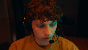
Over a decade of experience has earned him high-profile commercial clients and notable film credits as well as a significant role in award-winning TV shows like the hugely successful BAFTA winning, Emmy nominated Netflix/Channel 4 series ‘The End of the F***ing World’, and 2020 Netflix US Original series ‘I Am Not Okay With This’.
Toby has recently rebranded the studio to outwardly reflect their commitments, values and aspirations. CHEAT is a post production studio run by creators for creators. They use the magic of craft to create exceptional, award-winning work that feels real and connects with audiences in radical new ways, while supporting their team, clients, community and the planet.
What was your first experience with the world of colour grading – and when did you decide that being a colourist was a role that you wanted to pursue?
During my 2nd year at film school (Arts University College Bournemouth, now Arts University Bournemouth Film School) I settled on post production as my calling. I loved the creative input I had as an editor on story and emotion, but was also enthralled by the magic of VFX. When I discovered colour grading was a thing, I fell in love with it. For me it was the perfect balance of creative input on emotion and story, but with the mystique and magic of VFX. As I progressed, I really appreciated working directly with the director and DOP and having an immediate connection in real time to what we were doing.
What was the project that you felt really changed your career?
This is a tie between early music videos for N-Dubz that first propelled me into paid work grading music videos as they climbed up the charts, and, The End Of The F***ing World which became a cult classic and went on to win the BAFTA for best drama! Without both projects, I wouldn’t be where I am today. I am eternally grateful to George Burt, Justin Brown and Jonathan Entwistle for believing in me and trusting me with these projects. Trust is so important in any creative relationship and that's something we're always mindful of at Cheat.
How/where did you hone your craft and did you have any particular mentors?
I’ve never worked full time at another post house. I was the first generation of ‘bedroom colourists’ a decade ago and had to beg, borrow and steal information on how to grade from books, the internet and by closely analyzing other colourists’ and photographers’ work. I often wished I had a mentor but by figuring it all out myself I developed a deep understanding of it and developed my own style. Ultimately, it’s fed into the rebellious, innovative way we work at Cheat… and that’s good enough for me!
Tell us more about your creative process?
For me it’s all about story and emotion within the context of the material. The more I can find out about what we are trying to achieve with story and emotion, be that from a treatment or a conversation with the creatives, the more I can add to the project. It’s all in service of the work. Having said that, I’m a firm believer that there is only so far you can push material in the grade, so sometimes I need to balance photographic realism with creative intent and find a way to get the most out of the material while fulfilling the emotional and story-telling goals of the project. I always say - a grade should be felt but never noticed.
I also like creating a ‘world’ for the project when it comes to the look, something that ties together the whole piece. I think it’s important to establish an overall feeling and then let the differences between scenes compliment and contrast each other if needed but be grounded in the same ‘world’.
From experience, we’ve found that colourists often love art and photography - when you’re out of the studio, what inspires you?
I’m a huge fan of bold images that feel ‘authentic’, so I’m very inspired by photochemical processes of the past and present across film and photography. I have a very eclectic source of inspiration here (you should see who I follow on Instagram, it probably looks very random) but I like to draw on different sources depending on the project. I’m very open to external inspiration and really love getting reference images for inspiration from creatives. Sometimes I will expand on their inspiration with my own references that compliment theirs. Celluloid is something very close to my heart though, so if I can find references shot on film that work for the project I do so. Having said that, I love creating very natural and clean images and leaning into a more ‘digital’ aesthetic if right for the project.
Colour grading is largely a digital affair, but there’s also been a resurgence of film over the past few years in commercials and music videos. What are your thoughts about working on film versus digital formats like 4K? And what are your favourite techniques for capturing a vintage or tactile feel?
This is a huge question for me. Ultimately I believe that we are at a stage now where the acquisition format is becoming less of a factor on the final look. I’m a huge fan of Steve Yedlin’s viewpoint that we need to separate ‘the look’ from ‘the format’ as he describes here and here. Having said that, I still believe if you want a truly organic film look you should shoot film! I love working with film so much, I find it easier and faster to get beautiful images with the starting point of film because there’s so much character and cinematic familiarity with the look to begin with that it lets us really hone in the details and focus on the bigger picture more, the emotion and story.
When working in commercials, what role can colour and a grade play in enhancing a brand’s assets and what sort of conversations do you have with creatives and clients about that?
I’m really glad you asked this! Finding new ways to deepen the emotive impact of work is a massive part of what we do at Cheat, which is why I’m working with Orlando Wood (author of Lemon – How the Advertising Brain Turned Sour, a fantastic read for anyone in advertising!) and System1 to dive deep into this question by using market research to investigate the power of colour grading on emotional response, engagement and brand recognition. We haven’t finished yet, but the initial results show a clear and statistically significant correlation between different grades and different emotional responses. It’s clearly important and it’s looking like it has a huge impact on many factors, so may be one of the best value ways for brands to elevate their work and have the right impact for their video work.
How do you ensure that each colourist-director partnership is a success?
It’s all about communication; getting to the core of what we are trying to achieve, and getting on the same page early on. Colour is SO subjective and it’s very hard to communicate in language, so for me if we can talk about feelings and tone and look at visual references, I can leverage my experience and history to translate that into something everyone is happy with. The more experienced I become, the better translator I can be between emotion and colour.
What advice would you give to budding colourist?
Keep going. Keep it simple. Stay inspired.
In your opinion, what’s difference between a good grade and a great grade?
Harmony between the project’s requirements for emotion and story and working within the context of what was shot, and also synergy with the other departments from production design to costume and music. If it all works together in harmony, nothing can beat that in my opinion.
How is the craft and trade of colour grading changing?
It’s become rapidly democratised. It used to be a dark art with colourists and technicians in dark rooms with extremely expensive hardware. Now anyone with a laptop and a bit of software can become a colourist. This is a great thing and there is a tidal wave of talent being formed from a wider range of backgrounds. I can’t wait to see that talent emerge and I hope to see some of them at Cheat in the future!
Tilda - Rise and Shine
Aviva - Pet Shop
World Gold Council
Women's Aid - Respite
Cadbury x Age UK - The Originals
BMW M Series


