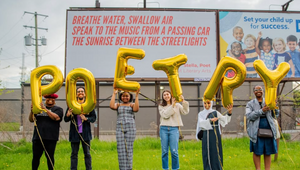
Lafayette American Leaves the Door Open for Magic

Meg Jannott is head of design and a founding partner at Lafayette American. She also leads Scorpion Rose Studio, the brand design studio within the agency. Prior to Lafayette American, she was a senior brand designer at Shinola and helped to launch the brand in 2012. There, she worked on a multitude of projects ranging from branding, print, advertising, and packaging design to product and retail design. Her work has been featured in and awarded by the Cannes Lion Festival, D&AD, The One Show, Graphis Design Annual, AIGA, Communication Arts, The One Show, Vogue, and Elle.
Since helping launch Detroit’s Lafayette American in 2018, her team has won 40+ design awards, and clients span across various industries. Recent clients include Netflix, The Four Seasons, iHeartMedia, Ford, Action Network, Detroit Opera, and The Toledo Museum of Art.
LBB> Tell us about your current role and design specialism(s)?
Meg> I’m the head of design, and a founding partner at Lafayette American and our brand design practice within the agency, Scorpion Rose Studio. We’re based in Detroit, MI. Our design ethos is that brands should embrace the art of romance to connect to their audiences emotionally and authentically. I lead the design team on a range of projects, with our primary focus being brand design.
LBB> What drew you to design in the first place and how has your design career evolved?
Meg> I was always creative from a young age. My mom is very artistic and I got that from her. I initially thought I wanted to be a photographer working in fashion. Through my obsession with fashion photography (Richard Avedon and Irving Penn) and collecting vintage fashion magazines, I became drawn to the layouts, typography, and grid systems – particularly work from Cipe Pineles and Alexey Brodovitch. That’s how I ultimately found my way to graphic design.
I studied both photography and graphic design at the College for Creative Studies in Detroit. During school I had jobs and internships across various studios (both graphic design and photography), and I joined Shinola after graduating just before the brand officially launched.
Being a part of such an intimate team working passionately to launch this new brand was an incredible experience. It’s a feeling you want to bottle up and keep forever. Working with a small, in-house design team I was able to wear a lot of hats and learned very quickly how to be resourceful. I ultimately became a lead brand designer at Shinola and was there for about six years working on everything from packaging design, retail design, digital and web design, publication design, art direction, and product design.
I loved working in-house at Shinola with an incredible team, but I couldn’t pass up the opportunity to join Lafayette American as head of design and build a department from the ground up. Since 2018, we’ve collaborated with incredible brands, making sure our work is created on these principles: Be curious. Be generous. Be rigorous. Dig deeper. And leave a door open for the magic.
Our design studio has been an integral part of the agency from the beginning, and on Valentine’s Day 2024, we officially reintroduced it to the world as Scorpion Rose Studio – a brand studio by Lafayette American that combines the strategic precision of a scorpion, with the captivating elegance of a rose, delivering striking design systems that leave a lasting impact.
LBB> What aspects of design do you get really nerdy about personally?
Meg> A lot! Essentially, I’m very interested in strategic design rationale tied to a brand’s DNA, and holistic brand systems. I also love legacy and heritage brands. There’s power in unlocking how a heritage brand moves into the future through design and strategy.
A great example of this is Filson, which was founded in 1897. Recently a friend shared some photos of her late grandfather's collection of Filson luggage. She loved the enduring quality as well as all the memories associated with the luggage, expressing a desire that her children would inherit them one day. So, at the same moment she was taking me to the past, she was also showing me the future. She was pointing at luggage, the Filson that was just sitting there, but what she was really pointing at was a time machine. What any brand wants is more time with a customer. This is the secret weapon that heritage brands have over all others.
This is the edge heritage brands possess. They push against time, extending time, past and present. In doing so, they are claiming more than their fair share of real estate in a customer’s mind. They are gaining an unfair advantage.
Think about that, about the things in your life that you want to hold onto, as time rushes by. In an age of fast fashion and disposable everything, what do we want to keep?
Filson’s rich history itself is proof of something. Because it has endured, we assume quality. We assume an eye to detail. A heritage brand, done right, carries these attributes with it. It is not old, it is wise.
LBB> Accessible design is an increasingly prominent topic – from your experience what are the most challenging facets of accessible design? And what does best practice in accessible design in your particular design specialism look like?
Meg> The key isn’t just compliance—it’s making accessibility seamless, not a design compromise.
While it always depends on the project, at the heart of it, best practice means designing for everyone without losing aesthetics with functionality. High-contrast palettes, legible typography, and scalable graphics ensure impact at any size. Digital assets should be intuitive, screen reader-friendly, and easy to navigate. Authentic representation matters. The best accessible branding isn’t just inclusive - it’s smarter, more thoughtful, and makes you feel something.
LBB> What are some of your favourite examples of creative design solutions that inspire you?
Meg> In addition to brand and systems design, I am completely obsessed with editorial design – books, magazines, and catalogues… I also love ephemera. I have a drawer filled with collected vintage pieces – post cards, receipts printed with typewriters, telegrams, greeting cards, playing cards, business cards, letterhead, diner menus, the list goes on. Having these pieces on hand is also so wonderful because you can appreciate the printing techniques (letterpress, offset, thermography… ), handwritten elements, paper stocks, and imperfections.
While yes, I think it’s fabulous to be inspired by the Are.na’s of the world and appreciate how designers are pushing boundaries, I think it’s also crucial to gather unique source inspiration from out in the world. That’s the exciting part for me: seeing what small finding will serve as the catalyst for design.
One of my favourite places to explore is John K King Books in Detroit. They are ‘America's Largest Used and Rare Bookstore, with over 1 million books in stock’. It really is one of the most inspirational places to visit as a designer. You just need to make sure you have at least four plus hours set aside.

Additionally, as for specific brand design examples, the first two that come to mind are both Olympics-related. First, the Mexico City 1968 Olympics identity, designed by Lance Wyman, Pedro Ramirez Vázquez, and Eduardo Terrazas. More than just a striking visual system, it extended across everything (signage, uniforms, tickets, merchandise, the list goes on...) while its innovative iconography system set a new standard for global events. Beyond aesthetics, it told an authentic cultural story.
The next one is close to my heart (probably because I have two long-haired dachshunds). The 1972 Munich Olympics introduced Waldi, the first official Olympic mascot, designed by Otl Aicher and Elena Winschermann. The designers ensured he wasn’t just a cute souvenir but truly an integral part of the overall design system. It’s a great reminder of how even the most playful elements can have real design impact.
LBB> Which design projects throughout your career have been the most satisfying to work on and why?
Meg> Such a hard choice!
So many come to mind but I think I’d have to say our rebrand for the Toledo Museum of Art. This project was beautiful on every level. The shared passion and collaboration between the working team and client team was a dream. Our client team was incredibly involved and dedicated throughout the entire process, which I believe made the work that much stronger. In addition to our internal design team, we collaborated with incredible partners to bring the rebrand to life (Semi:Formal and Madhouse).
The Toledo Museum of Art (TMA) has one of the richest collections of art in the world. TMA came to us with a clear request: A desire to transform while honoring its legacy. We answered with a rebrand including strategy and a holistic design system, that will help TMA continue to become a model museum – one that has its doors open to all. We grounded the rebrand on a strategic platform: The transformative power of art for all of Toledo.
All design elements are inspired by transformation, with a dynamic logo, an adaptive color palette, and symbolic pride for the Toledo community. The logo is a multifaceted icon drawn from the campus footprint — which was initially inspired by a historic reference found in the TMA archives. It transforms to portray the reframing of the history of art, evoking the dynamism of emerging futures for art and the museum. To honor Toledo’s history as "The Glass City," visual elements inspired by glass were beautifully incorporated into the system. This rebrand embodies TMA's bold confidence — moving out into the community, revealing new perspectives, and shaping the future of where museums go next.
I’m so incredibly proud of this work and the entire team that brought it to life.
LBB> Who are your design heroes and why?
Meg> First, my mentors and colleagues throughout my career. I’ve learned so much from each of them.
Then, Cipe Pineles and Alexey Brodovitch, as I mentioned earlier. Cipe Pineles was an art director for various magazines including Charm, Seventeen, Glamour, Vanity Fair and Vogue. She was one of the first female art directors to work at a major magazine. Alexey Brodovitch is known for his art direction for Harper’s Bazaar. Through their work, I became interested in how typography, photography and illustration come together to create dynamic compositions.
Additionally, I’ve always been incredibly inspired by Herb Lubalin. Specifically his typography design, typographic approaches within compositions and his way of nestling in subtle, beautiful design details.
I continue to be endlessly inspired by my team, collaborators, and friends.
LBB> Thinking of people at the beginning of their career, what advice would you give them for navigating this constantly changing field?
Meg> Ask questions. Try new things. Make mistakes and learn from them. Find what brings you joy. Be collaborative. Be curious. Stay inspired. Be kind. Go for it.
I also encourage students and those just starting out to do passion projects, especially if they feel like certain skills aren’t represented in their portfolio because there hasn’t been a chance to exercise them yet.
Embrace what makes you unique. And always leave the door open for magic.


