


How MPC Homed in on its Power to Move for New Global Rebrand

Today marks a new era for MPC as the global visual effects company, one of the world's biggest and best, unveils its new brand identity.
MPC is putting its full name - the Moving Picture Company - to a place of prominence with the new logo. Manuel Sepulveda, who headed up the internal design team responsible for the identity, homed in on the ambiguity of the word 'moving' during development. The 'Moving' Picture Company is capable of creating moving images but also to move audiences emotionally.
"When you have a good word in your name, why not use it?" Manuel tells us. "'Moving' has two main definitions, to do with motion and emotion. 'Moving picture' gives a richer meaning compared to, say, 'motion picture'. We are creating images that emotionally move the viewer. The design elements focus on the motion aspects whilst examples of our work does the rest. Having an identity that literally moves helps reinforce these ideas."

When starting out on this venture over one year ago, Manuel says that he and the MPC team wanted to maintain a connection with the former MPC brand, but make a clearer statement about what the company is and can do today. "We were aware that not everyone knew what MPC stood for, both literally in terms of the acronym and figuratively in terms of our company's work," Manuel says.
MPC was keen to install a cleaner, more simple aesthetic to the brand - one that offered a greater sense of flexibility when compared to its predecessor. Manuel and his team looked deeply into trends around adaptive signage - old school cinema frontages, modern day coffee shop menus or pre-digital, flickering train station boards. "[This] felt like a perfect way to express our company's flexibility and ability to tackle a wide variety of projects," he says.

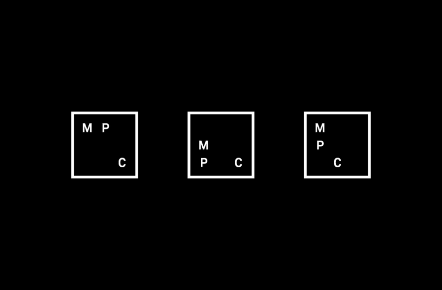
The result is a clean, square frame that hosts a grid and the MPC abbreviation. The grid can be scaled up or down to suit the company's needs, creating a moving, fluid identity - and a nod to its name. Manuel says that the framing idea came about after an original use of a fixed grid wouldn't allow for the mobility that MPC wanted. "Initially we were just using a 3x3 grid which gave us the structure for our movement. We realised that by framing the grid it not only felt more iconic as a logo but it also grounded this sense of movement and possibility.

"Aside from the moving aspects, we wanted something that was very pure and minimal, that didn't fight against our imagery, that wasn't unnecessarily decorative," he adds. "We stripped away the colours we were previously using and created a black and white brand language. The cleaner way we now treat typography helps make our message clearer."
Going into the project, Manuel admits that he was a little anxious that a case of too many cooks could unfold, as he juggled the complexities of a large company and the range of opinions that brings. Thankfully, it turned out to be less challenging than he'd feared. "Even from the earliest stages we got a lot of supportive feedback. Of course things changed and developed along the way, but having the luxury of time allowed us to incorporate feedback and fine-tune the graphic elements we needed."

And in hindsight Manuel is pumped as to how many people actually were involved in the entire project - more than he'd originally envisaged. It wasn't just designers and animators weighing in, but colleagues from production, engineering and marketing were, he says, on hand to help get everything ready, from signage and merchandise to stationery to hospitality.
"If nothing else, the rebrand has been a great way to bring different parts of the company together in ways that a lot of projects don’t often get to do."


