How McDonald’s Put That Logo on Everyone’s Face to Use

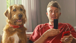
How had they not done it before? It seems so obvious now that we’ve seen ‘Raise Your Arches’, the exuberant and totally relatable romp of a commercial for McDonald’s. Directed by Edgar Wright, the film could be a scene from one of his big-screen hits like ‘Hot Fuzz’ or ‘Baby Driver’ – telling a story using physical comedy, perfectly choreographed to a fun soundtrack, without a line of dialogue. It’s what he does.
But McDonald’s didn’t just bankroll the director’s latest short film. In bringing to life Leo Burnett UK’s script, he’s made them an ad that takes a human behaviour we all know – the cheeky eyebrow raise to suggest a lunchtime treat – and turned that into the universal sign language for “let’s get McDonald’s”. It’s devastatingly powerful branding.
Gareth Butters, senior creative at Leo Burnett, told LBB’s Alex Reeves about his moment of realisation that human eyebrows look like McDonald’s arches and how that led to the most talked-about British ad in months.
LBB> What was the brief at the very start of your thinking about this campaign?
Gareth> It followed some extensive research conducted by our masterful strategy team and insight agency The Outsiders. Multiple groups of McDonald’s customers mentioned ‘the look’ – when you’re able to signal going for a cheeky McDonald’s without uttering a word. So, the brief was essentially about defining that look and encouraging people to participate.
LBB> We've all done the eyebrow raise to suggest a Maccies at some point. How did this insight make its way into the creative?
Gareth> It started by going through physical ways; knowing looks, head nods, winks etc. until I landed on the double eyebrow raise. That, as luck would have it, struck a resemblance to the famous golden arches and the rest, as they say, is history.
LBB> Strategically, what are the reasons this was perfect?
Gareth> Everyone that saw the idea, from our leadership team to our creative directors Andy and James all the way through to business director Jay Perry and the account team, all talked about how it was a ‘sticky’ behaviour, as a physical manifestation of the ‘Fancy a McDonald’s?’ platform. It just made it all feel so wonderfully ideal.
To unapologetically steal something from a post I read recently about the ad on Linkedin: ‘There’s not many brands with a logo that features on everybody’s face’.
LBB> It's a bold move, with no feature of the food or a restaurant. What were the conversations around taking that plunge?
Gareth> It was discussed, but with such great clients who understand the power of brand over product, in this instance it was not so much of a plunge but a ‘team paddle’.
LBB> How did that form a script? What were the big decisions in writing it?
Gareth> We animated the arches to look like the double-brow as a branding device, and to create a mnemonic wanted a track to match the timing. ‘Oh Yeah’ by Yello was the first one that came to me (perhaps partly down to having seen Ferris Bueller 42 times). This soundtrack informed the script in terms of dialogue, or lack of.
The script itself was always two office girls that start this pied piper-esque mass departure to McDonald’s. But it started off way more extreme; the finance department abseiling down the side of the building. I had some good chats with creative directors, Andy and James, and thankfully they talked me off that ledge (quite literally).
LBB> Why was Edgar Wright so perfect for this?
Gareth> It had all the elements that made it perfect for a director like Edgar: an 80s banger, a fun premise, and great characters. Plus y’know… it’s Edgar Wright, right?
LBB> And what did he bring to the spot?
Gareth> He brought what he deftly applies to his feature films – impeccable comedic timing, a unique use of choreography and a charming visual style, plus he was just thoroughly passionate and utterly ego-free. He loves film and music, and thankfully he loved the track that we had chosen.
LBB> What will you remember most about the shoot?
Gareth> I think just the general buzz about what we were making. The whole team, clients, crew and the large cast – everyone was on a high despite being in an abandoned office during some of the hottest days of the year with ‘Oh yeah!’ being blasted on repeat at least 700 times. Humans are bloody wonderful.
LBB> Beyond the main film, can you tell us about the other parts of the campaign that you're excited about?
Gareth> The Instagram and Snapchat filters that raise people’s eyebrows in time with the music (if they want to or not). My niece and nephew will be using them to make our family members and myself look ridiculous. And what’s not to like about that? Chick-a-chickaaa!


