How Innocean Berlin Rebranded from Ad Agency to Healer

Let’s get one thing straight. This isn’t another rebrand, a trendy new font, or a mission statement no one believes. What you’re looking at is a full-blown transformation of the soul, the body, and, yes, even the wardrobe. A new positioning, backed by a whole new visual identity. Because let’s face it: brands are in pain. Some have minor aches; some are in critical condition and some on social CPR.
That’s where Innocean Berlin steps in, not as another ad agency, but as the industry’s first healer. We don’t just diagnose the problem; we prescribe the cure with the right dosage of strategy, media and creative. Side effects? Likely. That’s how you know it’s working.
Look at our track record: first German agency to snag a Cannes Lions Grand Prix for Good, addressing the global assault on free press. We know pain. More importantly, we know how to turn it into glory.
We’ve got the minds, the hands, the instincts. With all departments, plus GLORIA, our cultural insights and social oracle, we approach brand healing like a team of surgeons, cutting what’s broken, saving what matters and keeping the pulse alive.
Which brings us to the painkiller, our new logo and the most iconic expression of what we do. And who are the healers? 90 people, 35 nationalities, each with a unique cultural remedy in hand. From cultural acupuncture to strategic surgery, we treat with precision and intuition.
HOW WE DID IT
The Concept: Innocean Berlin as a pharmacy for brands. The entire visual identity takes inspiration from pharmaceuticals, painkillers, first-aid kits, and prescriptions.
The Rollout: The rebrand touched everything stationery, signage, digital, tone of voice, even our office doors. Every element was redesigned to match the new positioning.
The Merch: Not just for the team, but a full pharma-inspired merchandise line, now available to the public through an online store. Because effective remedies shouldn’t be a secret.

The Execution: A cohesive, intentional look blending Berlin’s speculative design aesthetic with the precision of medical branding.
The Core Principles: The rebrand is structural too. Five core principles now guide everything we do, ensuring we stay true to our mission.

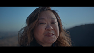
With a hero film, sleek website, revamped social media, and a fully immersive brand experience, Innocean Berlin is ready to heal the industry.
Gabriel Mattar, ECCO, Innocean Berlin about the rebrand, "Agencies love to say they ‘solve problems,’ but let’s be real, most just dress up the pain and hope no one notices. We wanted something deeper. We’re not here to make brands look good for a season; we’re here to make them work long-term. Strategy, media, creativity - it all comes together like a well-written prescription."

Ricardo Wolff, ECD, Innocean Berlin about the rebrand, "If we’re going to call ourselves healers, we better make sure the work actually heals. That meant throwing out the old playbook. Every detail, from the typeface to the merch, had to feel like it does something. It’s all intentional, all built to function. Because good design isn’t just about looking pretty. It’s about working so well; you forget the pain was ever there."


