How Anak Reimagined Love, Bonito’s Devotion to Women

A devotion to remaining true to one's values is incredibly important within this industry. It’s what grows trust, and what drives loyalty.
Without it, brands lose a sense of authenticity. Love, Bonito was created by Asian women for Asian women and it is in the celebration of that fact that makes the brand unique.
Reimaging a brand that houses high values such as those at Love, Bonito, is never an easy feat. There needs to be a foundation of trust between agency and brand, a strong vision, and a willingness to take risks.
Kit Chua, creative director at Anak, spoke with LBB’s Casey Martin about capturing the freedom of everyday women and celebrating them as they are, rather than adding to the burden of the need to be perfect.
LBB> Kit, why was this project important to you?
Kit> The Love, Bonito rebrand was significant to us because it’s a homegrown brand loved and run by Asian women. We were also attracted by the enormous potential we saw: there isn’t another brand like Love, Bonito on a global, much less regional or national, level. One that is designing clothes from their lens – with so much care and attention devoted to Asian women, in particular – and at their accessible price point. We felt that there was still so much left to be said, and we were very excited to be the ones with the opportunity to help them say it.
LBB> When re-designing a brand, what is the first thing you ask in order to understand the essence of the brand itself?
Kit> In the case of Love, Bonito, it was really clear to us that we had to start with Asian women; who they are, and what they want in life. So it was quite a bit of soul-searching at the beginning of the process, where we had moodboards covering everyone from Michelle Yeoh to Rina Sawayama to Maitreyi Ramakrishnan to Mulan. It was really powerful to take stock of the range of Asian women with so many diverse strengths; that really inspired our creative process.
LBB> This campaign inspires confidence, how did you ensure this message was portrayed to audiences?
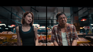
Kit> Our strategy team’s research helped us understand that the thing that so many women struggle with globally is the burden of having to be perfect. And Asian women perhaps even more so, because of the traditional expectations of our culture. So what we really wanted to show was the opposite: women who have the freedom to just be. Imperfect. In progress. Both we and the client team felt strongly that the raw reality of women’s lives is something we should be proud of, something to celebrate. Having a brand world that is comfortable enough to embrace all of women’s multifaceted lives – good bits, messy bits and all – is probably what inspires confidence.

LBB> What was something you’ve learnt during the creation process of this campaign?
Kit> It constantly surprised us how much we as Asian women actually just put up with. Because we accept that’s just the way things are. Things like taking your new clothes to the tailor because you can’t get the style you want, in your size, off the rack. We think that’s so ‘normal’, but why? The fashion industry is happy to ride on the power of Asian women as consumers, but there isn’t much that is truly built specifically for the Asian woman, through the lens of deep understanding and sympathy for her reality.
LBB> The design for the brand is striking and simple, talk us through the decision- making process behind this choice.
Kit> Between ‘fashion rebrand’, ‘Asian brand’ and ‘female-focused brand’, there are a lot of cheesy design tropes that go with those territories. So we were quite aware we didn’t want to fall into those. But at the same time, you can’t create through a process of elimination, and after a point you have to be blind to what’s being done ‘out there’. We wanted something quite timeless, clean, and sophisticated. Beautiful but not necessarily in a stereotypically feminine way. Balanced with a deeper sense of power and strength. Because that best represents Asian femininity to us. It took a lot of careful nuancing, iterating, and collaborating as a team to get there.
LBB> What was the issue faced by the market and how do you aim to overcome it with this campaign?
Kit> In this case, the issue faced by the audience was that no mass market womenswear brand was really speaking to the daily realities and desires of Asian women. Either womenswear is really practical, like sportswear or basics, or it’s super-trendy, chic, and not very practical. So we wanted all the elements of the brand to bridge that middle ground. We wanted the brand to feel stylish, modern, and all those things you aspire to be, while still being really rooted in the realities of being a woman today. And maybe also make you feel good about it all and laugh a bit, too.

LBB> What were the challenges that were faced during the creation process, and how did you overcome them?
Kit> A lot of care went into various aspects of the brand. One thing that was perhaps surprisingly challenging was developing the brand’s technical iconography. The goal was to use visual icons to capture the deep thinking that goes into the design of Love, Bonito’s signature pieces. And express it in a way that still felt playful and on-brand. The challenge was finding symbols that would feel fresh, yet on some level, intuitive and familiar.
Adding a layer of complexity was that we were very mindful of how the icons would speak to women. For instance, the icon for “Holds you in” is a pair of circles, hugging a heart. We could easily have made it a typical hourglass or something like that, but that felt not only reductive, but also not the right message for a brand that aims to celebrate and uplift women. A lot of exploration went into nailing an icon that not only communicates the effectiveness of the product in a fairly straightforward way, but also keeps it fun and feel-good, as the clothes are meant to be.


