Does Auckland Have A Type?

The considered art of typography is making a crafted comeback in much of today’s global advertising campaigns. LBB sits in with celebrated typographer Catherine Griffiths, the lady behind TypeSHED11, New Zealand’s first-ever international typography symposium, to get a bird’s eye view of the scene in Auckland.
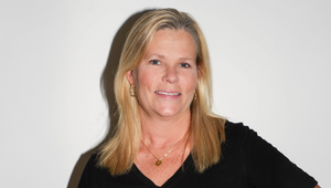
An independent designer and typographer, Catherine Griffiths lives and works in Auckland and Paris. Her portfolio is a mix of corporate communication design, self-publishing, typographic installations in public and private spaces and writing on design. She collaborates with artists, architects and designers, scientists and engineers, teaches, gives lectures and works with students. In 2009, with Italy-based Simone Wolf, she conceived, curated and organised TypeSHED11.
LBB> What is the typography scene like in Auckland – is there much support from the city arts industry in terms of education, exhibitions and artist collaboration projects?
CG> From my perspective, there isn’t any real scene or formal support for 'typography' here. The educational institutions produce graduates with a basic concept of typography as part of their media design skill-set simply because there isn’t the specialist teaching. Typography has become very fashionable, yet there is this weird gap between typography as perceived and typography as practiced, resulting more in 'stylists' who reference, than typographers who have an understanding of the craft and its history from which to leap if they choose.
That some of us happen to make typography-based work from public installation to artist book is not because typography is supported, but that typography happens to be part of the language we work with, and at a certain depth of intellect and engagement.
Only then, does the city art industry as you describe, perhaps become aware of typography as a thing, a discipline, or a tool for expression. Over time, maybe we will see a shift towards a more formal acknowledgement, and overarching support? Right now, I don’t think we are there yet.

(Rug from the ‘Club de Conversation’ Keyhole Series #2)
In my work, I’ve experienced zero to generous support from the arts community across New Zealand, not only Auckland — my text-based works including the vowel series have had the support of individuals, galleries, educational institutions and city councils, as did the symposium TypeSHED11 (a studio-initiated project mentioned below) which also attracted significant funding from Creative New Zealand, the government arts funding body here, plus international funding to match — and not after a whole lot of hard work (I became a sponsorship pro!).
At the other end of the scale, we’ve had to self-publish — Bruce Connew’s photobooks, ‘I Saw You’, ‘I Must Behave’ and next up, ‘I Drive You Crazy, to the Moon’ to complete the ‘I’ trilogy, but perhaps not before his newest and pivotal ‘Body of Work’ (horses procreating) which may induce a Kickstarter campaign (incidentally, all happen to have typographic covers) — and finance projects alone (or, put them aside!) after failing to get any support, whether applying for arts funding, or making competitive submissions. It’s a challenge when you are independent and not part of an institution with the backing of resource. While much of my work happens to be typographic, it is the idea and context that is being recognised, not so much the discipline.

(A+W•NZ Awards, 2014 Awards book and poster for Architecture + Women, New Zealand)
LBB> Are there any local Auckland based events for typographers to get involved in?
CG> I figure typographers can benefit from any discipline outside of their own — literature, film, music, fashion, photography, architecture, sciences, philosophy …as far as I’m aware, the events noted here are all cross-disciplinary, with the exception of typ gr ph c:
Semi-Permanent
Creative Mornings AKL
Seasonal talks and workshops hosted by Design Assembly
Designers Speak series (which I initiated back in 2005, in Wellington) by DINZ
LBB> Do you believe Auckland based typographers have a good handle on promoting their work internationally?
CG> Having made the shift north four years ago after 30 years in Wellington (where TypeSHED11, NZ’s first and only, to date, international typography symposium was held — that I also curated and co-organised), I’ve got to know other designers and typographers who are connected internationally and are active in their participation in award competitions, conferences, online talks, and art/book fairs.
As far as promoting work, aren’t we all global now? And doesn’t this occur by way of social networking? I can name others around the country who are particularly active in this way. Wellington-based type designer Kris Sowersby is the stand-out. Recently, Japan’s BRAIN magazine had me design a cover for one of their issues (pictured below), after friend and designer Masayoshi Kodaira made the suggestion to them. My international connections started back in the 80s, so I come out of a pre-internet system of connecting (read, write, travel and meet) with a fairly well established network that has expanded through social media.

LBB> Does Auckland have unique fonts?
CG> As in any city or place, there are designers with particular styles that can dominate, and become what might be thought of as a local or regional style, but to suggest Auckland had anything notably unique, I’m less sure. Perhaps it is more obvious at a distance?
I see the work of one or two who have given a distinctive look to the visual and performing arts culture, and fashion sector of Auckland—notably Shabnam Shiwan (see Best Awards) who until recently was Creative Director at Saatchi & Saatchi Design Worldwide. She was at Alt Group for almost a decade prior, leaving her indelible mark there. The cultural makeup of Auckland (European, Polynesian, Asian, Maori and others) is evident for example in Shabnam’s own language of typography, which is in response to the nature of her clientele. Apart from NZ craft beers and soft-drink packaging, I would say Auckland is fairly global-looking?
Speaking from my own point of view and practice, much of my commissioned text-based work (and we’ll focus on Auckland) has been site-specific, from domestic with ‘Fifth Movement’ (the third in the vowel series, a floor-based work with an upright ‘U’ at Takapuna Beach House designed by Athfield Architects), to public, ‘The Trestle Leg Series’ (prose and poetry beneath the Auckland Harbour Bridge, as part of a restoration project by landscape architects Boffa Miskell, pictured below). A large mirror-faced, brass-backed ‘O’ is awaiting agreement by building owners to be suspended above O’Connell Street in the central city, and the letter ‘i’ has been proposed for a small pocket-sized park that I have also designed (selected by the Council’s Public Art Team after their call for artist-led submissions), although the comment holding this beauty in the air is that it is seen as “too urban for a community that is suburban”! I’m hoping this will change.

Poet, writer and artist, Gregory O’Brien writes of my work in a feature for Art New Zealand magazine (150th Issue, Winter 2014) that, “the eloquence and refinement of Griffiths’ works belies a process which is very much about connecting, intuitively as well as intellectually, with the energy and character of a location as well as with her materials. Tellingly, in this regard, her text-based landscape works are, as she says, ‘an extension of my body, my mind, somehow.’”
The work that I am doing is not something that occurs everyday, or that there is a demand, instead it is a zig-zag path with my reference points and sights set worldwide/open-eyed ever since I started out as a nascent graphic designer heading to London in the 1980s.

(‘36°50′25.50″S 174°44′23.53″E / 50 Volcanoes / Auckland’ - poster for the 2015 Fête du Graphisme, Paris, commissioned by Alliance Française, Auckland)
LBB> Do freelance typographers work much with local agencies?
CG> I’m aware of hand-lettering work by Wellington-based Sarah Maxey, and again the unmistakable touch of Kris Sowersby in corporate branding where logotypes and fonts are concerned. Aucklander (once a Wellingtonian) Phil Kelly recently collaborated with Rangi Kipa, Karl Wixon and Kris on a refresh of the 100% Pure campaign for Tourism New Zealand with Pure Pākati, but this is less Auckland than nationwide, and isn’t what I would call freelance.
LBB> What types of clients do you predominately work with?
CG> Over the years, corporate — both large and small — educational institutions, local Council bodies and Government ministries, and more recently with the Auckland Council, architects, artists with little or no budget, and not-for-profit groups, here and overseas.
www.catherinegriffiths.co.nz


