Creating an Illusion of Chaos for Valspar Paint
In a bold move that they hope will cause a stir in the interior decoration category, Valspar and Dentsu Creative UK have teamed up to launch the ‘Shake It Up’ campaign, a nod to the brand’s heritage as a trailblazer in paint innovation. This campaign isn’t just about a new line of colours; it heralds a revolution in the way we perceive and select paint.
While it is based on the fact that Valspar paint is mixed the way James Bond likes his martinis, ‘Shake It Up’ is more than a slogan – it’s the essence of the brand’s philosophy, mirroring the dynamic action that brings a can of paint to life. It’s this very action that symbolises the brand’s commitment to offering consumers a spectrum of choice, from a curated selection of 2,000 shades to a pioneering colour-matching technology that boasts an impressive 2.2 million possibilities.
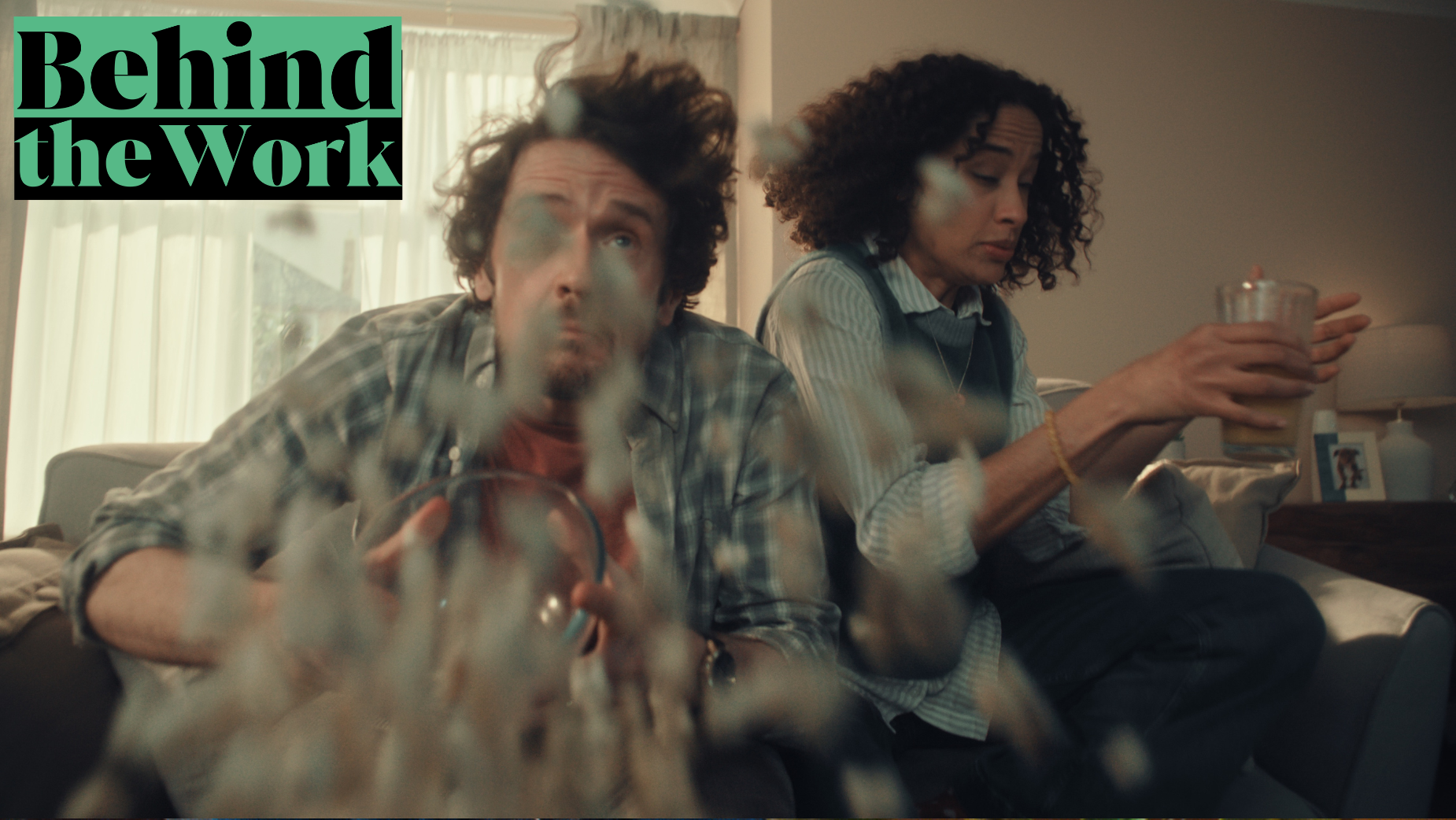
The campaign’s centrepiece, a 30-second spot directed by Sye Allen in his first outing as part of the KODE roster, takes us into the all-too-familiar territory of a beige, uninspired living room. But as the narrative unfolds, the room – and its young family – find themselves at the heart of a chromatic awakening. The walls, once dull, begin to dance, pulsating with life and gradually blooming into a rich, vibrant teal. It’s a visual feast that captures the transformative power of colour and the essence of Valspar’s promise: to infuse our homes with individuality and zest, turning the mundane into the extraordinary.
To find out how they did it, LBB’s Alex Reeves catches up with creative director Neil Walker and director Sye Allen.
LBB> How did you begin to shake things up with this one?
Neil> The client wanted us to come up with a campaign that went beyond just a TV ad.
Sold exclusively through B&Q, Valspar isn’t just a paint. It allows you to choose practically any colour and have it mixed on the spot, in-store. Even though paint mixing is the retail norm in the US, in the UK, there are still many who will go for the off-the-shelf, pre-mixed brands. The client’s challenge to us was to make Valspar, and in particular paint mixing, meaningful - but in a provocative way. To be brave and make people sit up and take notice. That’s kind of the dream brief right?
When it comes to paint, it’s easy to default to just celebrating colour, which quickly drags you into a wind tunnel of category generic routes that more traditional brands end up in.
So, it started by looking at the mixing process itself. Once you choose your chip, or have an item colour matched (yes, you can totally do this by the way – take something like a purple shoe in-store and they’ll scan and mix paint in that exact shade!) that colour is then entered into a machine which injects precise quantities of pigment to a base. That’s then put in what we lovingly referred to as the ‘shakey machine’. This is the bit people always enjoy watching, as the tin is vigorously shaken to mix the contents. Once done, pop the lid and ta-dah, colour is born!
Now, in everyday terms, to give something a shake is to wake it up, give it some life, or do things differently. And that’s the power of ‘shake it up’ as a brand line. It’s a product truth, inherent in the purchase experience of paint mixing. But it allows Valspar to stand up proudly and ask questions of an industry, as a nation. Why settle for a small amount of pre-mixed colour options? By doing things differently, this paint brand offers you so much more. 2.2 million more options actually. And ultimately, that means you can shake up your home. Whatever colour pallet or style you’re into, you can achieve it by shaking things up with Valspar.
LBB> How did that seed of an idea grow into the script for the film?
Neil> It really wasn’t that tough, in this case, to come up with the concept for the film. We knew we wanted to shake a room to re-energise it with colour. It was just deciding what room and whose room. In the end, it made sense it would be somewhere in the middle ground. It was decided early on though that we didn’t want to be invited into someone’s home. It needed to feel more assertive and confident. Less, “Excuse me, would you like to brighten up your home a bit with us?” More, barging in with a bit of attitude whilst entreating the viewer with a bit of chaos. Naturally, the teenager doesn’t so much as blink as she scrolled through her socials. A truly typical, modern family.
LBB> When it came to choosing a director and production company to bring it to life, what were your priorities?
Neil> Honestly? Energy. Everyone we spoke to got the concept and what we wanted to achieve tonally. But Sye’s enthusiasm and energy shone from the first call. You always want someone that’s as invested in the project as you. To bring new ideas and create something great. Sye had that quirky kitsch style that didn’t take itself too seriously but doesn’t trip over that fine line of humour into cheese.
LBB> Sye, what did you think when you first saw the script?
Sye> The Dentsu team were really open to interpretation at pitch stage, and coupled with the fact I knew colour would be a key consideration, I was confident it would turn into my first outing with KODE!
LBB> What did you know were going to be the biggest production challenges from the start? And how did you work out ways to overcome those?
Sye> First there was the issue of transforming and painting the set in a day. We decided to create two architecturally identical sets, dressed/painted them differently, and then shifted the lighting rig between the two. Then there was the shake. We used a panavision prototype image shaker in Beta stage which allowed us to shift the image in front of the lens on the X and Y, controlling the intensity and amplitude.
LBB> Were there any surprise challenges on top of those?
Sye> No surprises, but I always try to get as much in camera as possible. We used inflatables underneath the chairs with hand operated wobble boards and vibrating plates underneath the tables. We had the practical lighting on a flicker setting with the desk-op to give the shake a bit more life… and we threw in a wind machine for good measure! Even more than just giving the right look, it created a really playful shooting environment which certainly shows in the final film.
LBB> What is a moment from the shoot that you'll never forget?
Sye> We landed a great cast working with Emma Garrett, and I’m really happy with the tone and the quality of their performances. Especially Wiley, our canine cast member.
We had numerous crew members on set operating rigging. They were all delicately hidden from camera to create the choreographed moments that had to land together… It was immensely satisfying to see all the departments in harmony to create the illusion of chaos.
LBB> Are there any details or moments in the finished work that you're particularly satisfied with?
Sye> It’s an exciting 30-second spot, and ultimately I hope people are entertained by it. It was certainly very entertaining bringing the idea to life!
LBB> How do you hope people will respond to this ad?
Neil> I honestly think this is an ad that commands you to pay attention. The music, the shake, the rotating reveal, the snappy end sequence, and even the voiceover (we physically shook her in the sound booth by the way to get the effect) are all there to keep you engaged, remember and hopefully go try the product. And every time you watch it, you’ll notice something else. The goal from the start for us was simple. Make people sit up and take notice – and from thereon in, when anyone sees Valspar, they think ‘Oh yeah, that’s the paint that shakes, right!?’


