The Growing Importance of Great Colourists

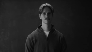
Connor Bailey is a colourist and co-founder of House Post in Los Angeles. Known for his filmic approach and deep commitment to storytelling. With a keen eye for cinematic detail, he crafts distinctive looks across features and commercials, always shaping the image to serve the vision. He continues to refine and elevate his work, collaborating with top directors, agencies, and brands.
LBB> What was your first experience with the world of colour grading – and when did you decide that being a colourist was a role that you wanted to pursue?
Connor> My first experience with colour grading was in high school, when I made my first short film. At this time, I didn’t know exactly what I wanted to do, just that I wanted to make films.
This was also when that flat, almost LOG [logarithmic profile], look had the indie film industry in its grip –right around 2014. I tried to find any info I could on how to achieve it and this eventually led me to some YouTube tutorials on colour grading. I downloaded the free version of Resolve 11 and the rest was history.
LBB> What was the project that you felt really changed your career?
Connor> There were two. The first was a documentary pilot that streamed on Amazon, called 'Passion Projects'. This was early on in my freelance career and it gave me confidence to take my freelance colour work seriously. At the time, I was still an assistant colourist at a big shop and was just doing freelance work on the side as a way to stay sharp and make money.
The second project was the first music video I graded for Kevin Clark. It was a super small, run-and-gun 16mm music video that they had shot for Between Friends, entitled 'Lonely'. Kevin and I connected on the look immediately, and it ended up getting shortlisted at the UK Music Video Awards. It is still one of my favourite projects I’ve worked on to this day.
It was also the catalyst for Kevin and I starting House Post.
LBB> How/where did you hone your craft and did you have any particular mentors?
Connor> I’ve never had a proper mentor. I worked as an assistant colourist at Company 3 for several years, where I was able to watch some of their senior colourists work, but I mainly honed my craft through freelance work. My time as an assistant colourist taught me how to organise my workflow and solve problems in a pinch.
I’ve been fortunate enough to have a solid network of friends working in production since I graduated college in 2018, and we’ve gotten to grow alongside each other as we all navigate this industry.
LBB> Tell us more about your creative process.
Connor> When I start working on a project, I need to understand the vision of the filmmakers before I do anything.
I’ll start by looking at their references prior to our first call, but I’ll try to find my own references as well. I usually try to start with a shorter look-set session, since it allows me to really dive in and discuss the look with the filmmakers.
From there, I’ll take the look(s) we’ve created and apply them across the project. Sometimes the look will be adjusted during this part of the process, which is natural. The look isn’t ever fully locked until the project is delivered.
LBB> From experience, we’ve found that colourists often love art and photography – when you’re out of the studio, what inspires you?
Connor> My inspiration comes from many different things. I love photography and have been interested in Ansel Adams since I was a kid. (His zone system is a great guide for exposure.) I also love watching movies. I take a lot of inspiration from other filmmakers. Salomon Ligthelm is a director whose work I’ve been following for the past few years. He always achieves such a rich and characteristic tone in his work.
LBB> Colour grading is largely a digital affair, but there’s also been a resurgence of film over the past few years in commercials and music videos. What are your thoughts about working on film versus digital formats like 4K? And what are your favourite techniques for capturing a vintage or tactile feel?
Connor> At the risk of sounding preachy, these are just capture formats. Both film and digital can be treated to look close to identical.
That being said, I love working with film. Whenever I grade digital footage, I usually try to include some sort of element of film emulation. The biggest difference really comes from the lived-in feel of film. It’s never exactly consistent. Digital emulation can get fairly close, but it will never have the organic feel that film has.
My processes for creating vintage and tactile looks are fairly similar.
If the creative direction leans towards a more on the nose vintage look, I will use a good amount of effects that degrade the image in a tasteful way. Frequency separation, chromatic aberration, halation and grain are key to achieving a vintage feel. Colour-wise, I always use a matrix to set my general colour palette.
From there I’ll adjust hues individually. If I’m going for something more vintage, I might try to emulate something like three-strip film or cross-processing. My process for creating a tactile look is pretty much the same. I’ll use effects like chromatic aberration and halation a little more sparingly.
LBB> When working in commercials, what role can colour and a grade play in enhancing a brand’s assets and what sort of conversations do you have with creatives and clients about that?
Connor> I think it would surprise most people that colour grading is extremely important in modern commercial workflows, especially since colour is such a niche part of the filmmaking process. Oftentimes, clients will want to comb through each shot and work on very specific elements. Colour grading gives us the precise control needed to be able to keep a product not only looking consistent from shot to shot, but it also allows us to enhance the products for a desired effect.
I don’t think that creating a strategic look for a brand is a bad idea. I work on a lot of docu-style commercials that aren’t necessarily product-focused. For these kinds of projects, we usually create a look that helps enhance the tone of the project. As long as it’s tasteful, it will work.
LBB> How do you ensure that each colourist-director partnership is a success?
Connor> Creating a solid partnership is all about communication.
As a colourist, I need to be able to understand what the filmmakers are looking for. This happens through conversation about the project, about inspirations, about the filmmakers’ personal tastes. If I can understand where a director is coming from, creatively, I can empathise with their intentions a little more.
Filmmakers want to work with people that they get along with, so, ultimately, colourists also need to be personable. Sessions can be long, so it’s important to be able to get along socially. This isn’t something that can always be controlled, you just need to be open.
LBB> What advice would you give to budding colourist?
Connor> Learn the technical side of colour grading – working as an assistant colourist is a great way to do this. You get to experience how colour fits into the post process, at a higher level. Early on, I made a lot of mistakes technically and learned a lot of important lessons because of that. Becoming technically sound has set me free, creatively.
Also, consume as much art as possible. Having taste is key to being an artist, and inspiration can come from anywhere!
LBB> In your opinion, what’s the difference between a good grade and a great grade?
Connor> A good grade looks good. A great grade helps to serve the tone of the project.
LBB> How is the craft and trade of colour grading changing?
Connor> Colour grading is becoming more accessible and more popular, which I think that it’s great and this is the way it should be. I do think that because of this, in order to stand out, colourists need to have their own styles. Colourists are starting to become creative leads, whereas it used to be a mostly technical role.


