


Behind the Bold Lithuanian ‘Troll Farm’ Series Identity

IAMIDEA, Ukrainian creative agency has recently presented the identity and PR campaign for the Lithuanian series ‘Troll Farm’, freshly off the Berlinale Series Market in Germany. The series and its supportive PR products were selected among hundreds of others from around the world at the Berlinale Series Market, held as part of the Berlinale - Berlin International Film Festival 2023. It was also presented at Content London and Série Series Summit in France.
Dansu FIlms, the Lithuanian production company behind the drama TV show named ‘Troll Farm’ shot the project, which consists of five one-hour episodes, entirely in Vilnius. In the show we get to know corporate diva Ana, who is unjustifiably fired and embarks on the journey of ‘clearing her name’. However, in the process, the dark side of revenge swallows Ava up and puts her through some peculiar adventures.
IAMIDEA was tasked with creating the visual identity of the show prior to even being able to see it. To the team there, it was paramount to come up with a bold and expressive, but at the same time comprehensive and clear campaign. The ‘dramedy’ genre had to run through all assets, including OOH and online posters, utilising the contradictory nature of the main heroine and plot of the show.
LBB’s Zoe Antonov spoke to the IAMIDEA team behind the project to find out more about Ukrainian creativity staying exhilarating even during the war, the process of getting to grips with the visual identity and more.
LBB> Tell us a little about ‘Troll Farm’, what it’s about, and how you began your collaboration with Dansu Films.
IAMIDEA> The Lithuanian production company Dansu Films shot the dramatic TV show ‘Troll Farm’ in Vilnius produced by Gabija Siurbyte and directed by Ernestas Jankauskas. It consists of five one-hour episodes.
“After being unjustifiably fired, corporate diva Ana tries to clear her name. But in the process, she slowly turns to the dark side of revenge - and becomes the monster she fights” is a brief description of the plot, which gave the start to the work.
LBB> What was their brief for the visual identity, and what were the first ideas you presented?
Iryna> The IAMIDEA team started developing the visual identity of the series at the stage of production. The most challenging part in creating this campaign was that the team had not seen the series itself, we were guided only by the brief and the series treatment.
It was important for us to convey the main idea and genre of the series (dramedy), using identity and visual materials. Therefore, the main point of the creative brief was to produce the most befitting, clear and stylish identity with the help of symbolism, which would ‘work’ without any additional explanations.
This project was the agency's first experience working on a TV show, it became the driver of creative ideas. In the first stages, we agreed with Dansu Films to make one version of the advertising poster, but the agency team was so inspired by the project that they developed three posters instead of one, which all were eventually approved for use.
LBB> Could you tell us more about the process of creating an identity for the show from scratch? What were the most important details for you?
IAMIDEA> When working on the identity and visual materials for the series, it is important to clearly understand which images and metaphors will reflect the main idea of the show. Identity must be clear to the audience even when the series has not yet begun its production process. Precisely with the help of symbols and metaphors used in the visual materials you can ‘talk’ to the viewer, and convey to him the main idea and general mood of the show.
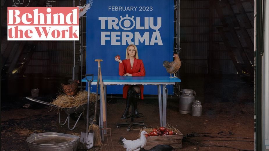
Here’s an example. One of the campaign posters was an image of the main character - Ana - in a hangar with chickens. A chicken is an easily understandable image of an animal that is bred in villages. Ana's image is a metaphor for a metropolis, a corporation. By combining two such incompatible images, we create a visual paradox that perfectly conveys the features of the dramedy genre.
Another example is a poster where the main character of the series is holding a shovel. According to the plot of the series, Ana wants to destroy the career of the boss who framed her. Therefore, for the poster, we chose a clear and understandable revenge metaphor - burying. In this case - burying the boss.
It is important to note that there is no such film frame in the series, we invented it exclusively for the advertising campaign, but it fully conveys the plot and mood of the show. This is the main purpose of the identity: not to duplicate actual footage, but to reflect the main idea of the series.

LBB> Tell us more about the colours you chose for the visual identity and why you decided on them.
IAMIDEA> The main colour underlying the visual identity is pink. We didn’t choose it by chance - the main character often appears in pink Louboutins, which quite successfully emphasises her image of a corporate diva.
LBB> How did you come up with the eye symbol and what is its meaning?
IAMIDEA> The task before us was to create a logo that would graphically demonstrate the image of the main character Anna – scandalous, strong, beautiful, vengeful and creative. That's why we chose the Paytone One font for the logo - it's a sans-serif typeface, has interesting graphics and playful elements in the letters, which perfectly conveys the personality of the main character, since the series has a comedic side to it. Also, this font supports 60 languages, which is very important for the distribution of the series to foreign markets.
As requested by the brief, the logo had to be bold and expressive, but at the same time simple and clear. Therefore, to strengthen the image, a playful, but still dangerous sign was created – an eye, which like a ‘troll’ spies on everyone, is placed in the very centre. Just like the main heroine, who created a special troll farm, with the help of which she imperceptibly penetrates the life of the antagonist in order to discredit him. In the static, the eye looks directly at us, which gives us a feeling of discomfort and a strong presence of it in our lives – exactly the emotion we were trying to achieve through the logo. Because the eye is a universal symbol, absolutely all people in different parts of the planet understand its symbolic meaning. The peculiarity of this solution is the insight that instead of the words ‘look’ we use the image of a pair of eyes.
This solution gives the opportunity to effortlessly communicate with the use of only copywriting materials, without any additional visuals, which is very convenient for announcing the series on various platforms, not using the posters of the series.
LBB> Could you tell us more about the print campaign photos, the art direction behind them and what you were aiming for?
IAMIDEA> While working on the print campaign, just as on the digital one, it was important for us to show that the plot of the series is built around the image of the main character and indicate who is exactly the main character in the show. We managed to do so also using simple and clear metaphors and images.
Regarding the implementation of the print campaign, I would like to note several nuances. First of all, it is impossible to use bright neon colours, because they wouldn’t be printed as bright as they are supposed to look – the design idea will not work. Secondly, only horizontal fonts can be used in a print campaign. If in digital we can "play" with the location of fonts, formats and animation, then in an offline campaign it will not work: the text must be easy and readable.

LBB> Why was Audreus Solominas the perfect photographer for the campaign?
IAMIDEA> We spent a long time choosing photographers for cooperation and decided to pick Audreus Solominas based on the recommendation from our Lithuanian colleagues. An important factor for us was Audreus' talent for taking portraits. And during our cooperation on the identity of the series, we quickly found a common ground, managed to work in synergy and meet all of the deadlines.
LBB> What were the biggest challenges while working on the project? What about the most fun parts?
IAMIDEA> ‘Troll Farm’ became the first project of the agency's work with the series, and Dansu Films – the first European client who approached us during the full-scale war in Ukraine. Therefore, our priority was to make the highest-level campaign. It was a challenge for us to stop the creative flow on time and make a decision with which ideas to move forward.
LBB> Any final thoughts?
IAMIDEA> The fact that the ‘Troll Farm’ series along with all its products (visual identity and other visual materials) was selected for the Berlinale Market Series shows that the Ukrainian creative industry is constantly developing even during the war. And the trust of European companies that turn to us is an indicator of the high level of our work. We are grateful for the opportunity to cooperate with Dansu Film and for the opportunity to present the quality of the Ukrainian agency's services on the European stage.


