Behind the "All-American" Filmic Look of Netflix’s ‘I Am Not Okay with This’

This week saw Netflix further bolster its growing catalogue of angsty teen dramas with ‘I Am Not Okay with This’, a series from the producers of ‘Stranger Things’ that tackles coming-of-age themes including high-school awkwardness, romance and super powers.
To achieve the show’s vintage, celluloid-influenced Americana look, CHEAT founder and colourist Toby Tomkins has teamed up once again with director Jonathan Entwistle and cinematographer Justin Brown, a trio that has worked together repeatedly, most prominently on the Emmy-nominated Netflix series ‘The End of the F***ing World’. LBB’s Alex Reeves caught up with Toby to hear about how the show’s aesthetic was developed.
LBB> When it came to the grade, what were the biggest similarities and differences between The End of the F***ing World and I Am Not Okay With This?
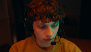
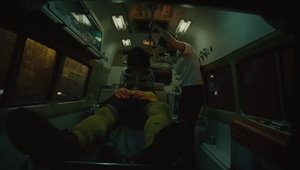
Toby> When I reunited with Jon and Justin for the project, we knew we wanted something similar to The End of the F***ing World. The cinematic Americana style is definitely something they both gravitate towards – it’s very photochemical but natural, maybe with a slight flair.
I did some tests with Justin during preproduction to establish a grade similar to The End of the F***ing World – but also creating one unique to this story. There was a lot of playing around in the beginning and we had some film references to work from but really, just like The End of the F***ing World, the key brief was simply to make it look as good as possible... as you'd imagine.
For me there was a certain level of pressure with this project after the success of The End of the F***ing World. We had to do a bit more world building for that – and then it became such a big hit before season two started. With I Am Not Okay With This we were following that success so it had a lot to live up to.
I think the main difference is that, unlike The End of the F***ing World, this show is actually set in America. It’s all-American, baby!*
*...except for me, as the only person working on the project outside of the USA
LBB> You mentioned that you brought an American aesthetic to TEOTFW's British setting. What was it like to apply that to actual American locations and scenes?
Toby> It was great. It was really just about establishing that timeless world truthfully, working to enhance these midwestern, Pittsburgh locations.
In America you do have slightly different lighting and scenery, so that was certainly something we had to consider, and we did work to enhance some key ‘American’ colours in the grade, making the reds pop a bit more.
LBB> Can you talk about the technical feat of creating a celluloid film look on digital footage? How did you build on what you'd already been doing in this area?
Toby> When I graded the first season of The End of the F***ing World, I created film emulation tools to truly capture the rich, cinematic feel. When season two was commissioned, we were asked to recreate this same style but, instead of in SDR like with the first season, it had to be done in HDR.
You can’t really use SDR grading techniques with HDR technology, so we had to break down the fundamentals and recreate the tools from scratch – engineering my original techniques for HDR Dolby Vision.
We did the same for I Am Not Okay With This. Film is inherently SDR – you never really have the bright highlights of HDR and everything has a lovely soft rolloff. We had to find a balance between taking advantage of the HDR for more texture in the practicals and highlights but keeping it filmic – we were always walking that line.
We just really worked on honouring that photochemical process. We weren’t trying to get something that was perfectly consistent like a commercial would be – we didn’t want it overly graded. It was a little bit looser than that. As long as nothing bumped or stood out, we embraced what was shot and didn’t fight any minor changes. We didn’t over polish it and left little nuanced irregularities in there, just so it felt like maybe you were looking at a print.
LBB> More generally, what do you think is particularly interesting about the show?
Toby> I think the writing really brings a unique twist to the teen-angst stories we've seen before, somewhat subverting expectations with the characters and their storylines. It's no mean feat considering the short length of the episodes.
LBB> What have you taken away from the process of working on this series?
Toby> I think it’s given me an even greater appreciation for shooting on film – or at least emulating that look. I think everything benefits from being in that filmic world: we’ve got an emotional connection to that type of colour. When we’re forming our emotional relationship to images on the screen, for most of us – or for my generation at least – everything always used to be shot on film. That’s what we see cinema as, and how we feel when we see colours like that. It’s a world and a story and you’re meant to be absorbed by it – it comes back to escapism and those themes of cinema. I think colour is part of that emotional response.


