An Illustrated History of London’s Beavertown Brewery
There must have been dozens of small groups of friends experimenting with homebrewing in London when the nucleus of the Beavertown first formed (around seven to 10 years ago, depending on who you ask), but there are none that have left quite the same kind of lasting impression on the craft beer world.
The London brewery’s beers can be found in supermarkets around the UK now, Heineken owns a minority stake in the business and they’ve been able to scale up to the point where they’re even the official craft beer of Tottenham Hotspur F.C., with a taproom and microbrewery inside the Tottenham Hotspur Stadium - the first of its kind. It's even the sponsor of the clearest explanation of the UK's 'roadmap' out of Covid-19 - the One Way Road to Beer.
Nick Dwyer, who at the time of Beavertown’s founding was fresh out of art school, waiting tables and pushing for as many freelance illustration gigs as he could, was one of the particles floating around at the time that would eventually form that nucleus of the brand along with founder Logan Plant.
The fledgling brewery, which had begun out of a 50 litre rice pan as a hot liquor tank, a camping cool box as a mash tun and a tea urn as a kettle, had recently moved to the kitchen of a BBQ restaurant, Duke’s Brew and Que - a slightly bigger operation, relatively speaking, based in De Beauvoir town (sometimes given the Cockney nickname Beavertown). A friend of Nick’s from art school, James Rylance, put him forward as a local artist who could bring his aesthetic to the new beers’ labels. He was also a waiter, so neatly fitted the double role of front-of-house staff at Duke’s and contributing illustrator for the brewery. Keen to get away from the silver service and black shoes of where he was working at the time, Nick snapped up the chance to work at Duke’s.

“It was really really good fun and obviously it meant that I was a lot closer to Logan and hanging out with James way more, which was a win-win,” says Nick. From the start he saw the opportunity to work his visions into the centre of the emerging beer brand and he had a craft strategy. “I would bring in sketchbooks that were pretty much finished sketchbooks, but make it look like they were work-in-progress sketchbooks, so whenever Logan was around he would peer over my shoulder and be like, “oh that’s cool!”

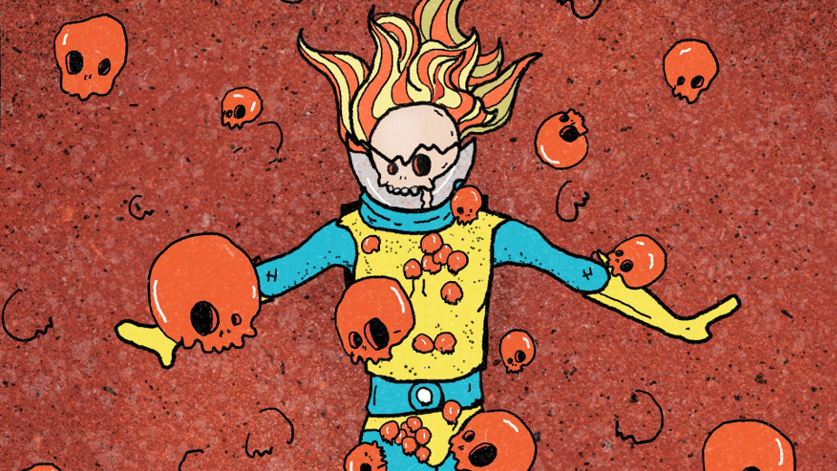
In that process, Nick designed the first label for Black Betty Black IPA and ended up drawing some spacemen firing lasers and being attacked by UFOS, he even came up with the name Gamma Ray alongside this image - one of the brewery’s first beers and a central product to this day.

Sketch by sketch, Nick embedded himself in the workings of Beavertown. “I just kind of wedged my way in so no one else got a look in on the labels.” Eventually he was effectively the creative director of the new brand, not just one of many artists working on the labels.

Within the space of a couple of weeks of Nick getting more involved Logan formulated a plan to move from bottles to cans. He also went to America, and saw how much more of an impact the branding had on craft beer there. “The branding on the American cans and bottles was crazier than in the UK, and I think it all clicked into place. He kind of came back and I went into work one day and he wrapped a Gamma Ray label around a Coke can,” says Nick. “We’re going to rebrand everything. We're going to make the core range of five beers, we're going to have five prints on cans, and you're gonna design them.”
By this point the brewery was in Hackney Wick. Nick remembers his workstation on a mezzanine above the steamy brew house. “I was legitimately sitting on a chaise lounge we found in a skip using some kegs as a table with my little 11-inch MacBook Air, dying on fire with Illustrator and Photoshop on it everyday.” Logan sat behind him giving constant feedback on his designs for about two or three months until they had the labels for the whole new can range.

The look of Beavertown as we know it today was largely hammered out at this stage through Nick’s visual style, which he describes as “filling Moleskines with as much linework as possible” At university he’d seen it as a point of pride to have filled notebooks to the brim with sketches. “Imagine indie music in 2007 but as a drawing,” he jokes.
Paired with Nick’s need to impress “like a puppy dog”, he riffed on the shared interests he had with Logan, from Star Wars to Aubrey Beardsley. “In the very beginning it was genuinely just I want people to think I'm cool, I want people to think this beer is cool, I want people to think Beavertown is cool.”
For a long time, the cans themselves were Beavertown’s main marketing channel. “We never did any advertising or media or even sponsored stuff,” says Nick. “We didn't have a social media account for a really long time as Beavertown. It was more that people were spotting it on the shelf and thinking ‘what's that?’ If you knew what it was you’d search it out and gravitate towards it. If you didn't know what it was, you'd be intrigued. And we just tried to make every single can do that.”

Most of the feedback they had on their brand for years was through people at the bars and restaurants they knew. Nick remembers it was “a real slap in the face” when they first did consumer insight research and they found out the brewery’s sketchy, space-age design was actually making some feel alienated, thinking it was “too cool”. They’d never considered that, but then again the beer had never been sold in supermarkets. “We'd only really ever focused on people who liked us.”
Nick admits that when he first started, he would have loved to have heard that. “I would have been like ‘Fucking right! We are too cool for them! But as it's gone on, the onus has definitely moved on to working at and seeing the results in being inclusive and having people be like, ‘I love this and my grandmother and my daughter loves it and my uncle loves it.’

Maybe it’s that foundation of marketing ignorance that makes Beavertown a brand that’s so easy to love. “A lot of what makes it unique, I think, is the fact that I've never taken a marketing course or advertising course,” says Nick. “I did focus on the practical side of art at university, so it's kind of a warts and all approach. But I think a big part of that thing is that I do make a hell of a lot of mistakes and spell things wrong all the time.”
On the flipside there’s Logan, who Nick says is “a really, really safe person. He doesn't take risks, everything's calculated”. Additionally, Beavertown has had a dedicated marketing director in the form of Tom Rainsford (formerly of giffgaff) since 2019, to take Nick and Logan’s vision in a more strategic direction.
Once beloved of the most elitist craft beer snobs of Britain, Beavertown’s mass appeal hasn’t been great news for 100% of its fans over the years and Nick’s more than familiar with the ‘sellout’ label. “The negative stuff online is really hard to overlook, but you always should because it's a drop in the ocean compared to the people who are still undecided.” But he thinks there’s a healthy balance of perspectives in the company to ward off the worst corporatisation that a growing brand is prone to. “I think that it's a mix of people like me within the company being quite disruptive and arguing with consumer research. It's just one voice, it's not the be-all-and-end-all tick-box exercise when you have a room full of people who've applied to be part of a research group, but aren't always going to be the voice of a generation.”

The success of the brand isn’t just its now formidable footprint across the UK. Anyone who regularly buys craft beer will agree with Nick when he says, “now I think our influence on the craft beer fridge is apparent.”
That fact emboldens Nick when he’s coming up with exciting new ideas for the brand. He sees Beavertown as “not really wanting to be ahead of the pack but on a totally different racetrack, at all times.”
One example of Beavertown setting itself apart like that came with the switch to cans. While most beers just wrap labels round a plain can with silver showing at the top and bottom, Nick and Logan wanted their labels to cover the entire can. “We got so excited about the fact that it's going to match to the top, we didn't think about whether or not people were going to like it, or whether it was going to make sense. But now that's being emulated and we're kind of trying to take that a bit further and do things like that.”

Another of Nick’s favourite creative outlets has been whenever Beavertown does a new set of glassware. “It's amazing because people have this really weird collector thing with glasses. I think there's this inherent thing because it’s limited edition because they smash and you're probably not going to keep making the same thing over. So historically they're kind of cool.”
He’s also never going to forget his work as creative director for the Tottenham Hotspur Stadium taproom, which was built in tandem with the club’s new stadium a few years back (after Beavertown moved to their current brewery in the northeast London neighbourhood in 2014). Pandemic connotations aside, he loves the brand “being a virus that kind of spreads to places and sets up shop.” Working within the confines of the football club was an interesting challenge - red was pretty much out of the question, for example, and smashable objects were to be avoided. Nick remembers saying to Logan: “I don't think it should just be like a Sistine Chapel style, with all our illustrations all over the walls in vinyl.” He wanted to do something new that references the brand more subtly. “It’s actually quite dark and quite simple compared to our cans, but it has this kind of shrine-y vibe. There's a couple of neons - one that says ‘skulls, skull, skulls’ on it like ‘girls, girls, girls’, the landscapes run around the corner, then there are these cubes in our brand colours, and then the tanks are directly behind the bar. The whole thing is obviously us but it’s very much its own place.”
Not being a “football guy”, Nick wasn’t sure what would come of their partnership with Tottenham, but the kind of loyalty that comes with anything associated with a Premier League club has been huge for the brewery. “It was kind of eye opening.”

Beavertown’s brand has been built up organically over a series of small creative acts. “We've never done really big campaigns, it's just all been kind of like little mini snipes here and there that have had a big impact,” says Nick.
2021 sees one of those bigger ‘snipes’ though, verging on a campaign. With the first three months of 2021 being pretty bleak, the brewery’s well aware that Brits have spent Saturday nights on Zoom calls with friends, making plans to meet at the pub garden as soon as possible. With restaurants, bars and pubs planning on opening their doors on Monday, April 12th, some sense of normality will be restored and people will be making plans to see friends after such a long time. Enter: the limited edition Beavertown 2021, 9-month calendar.
Looking forward to the rest of the year, Beavertown’s 9-month calendar starts from April, ready for you to pencil in months of fun. Each page dons a bright, Beavertown style piece of artwork designed by Nick, to help inspire and motivate people through the fun portion of 2021. For long-time fans of the brand who want to get their hands on the psychedelic artwork, the nine-month calendar will be available on Beavertown’s website for just £7.50.

“Everybody needs a little bit of motivation,” says Nick. “People are really taking stock of what's making them happy. So just to be able to kind of play with the idea of one of those really corporate gift calendars.” He hopes that as Beavertown’s marketing grows, it genuinely feels like the fun brand he’s been a part of for all these years. “I think we've got this awesome team who are really funny and up for a pint and we want to try to exude that from what we do. It's a huge part of the brand ethics, and you can smell it a mile off when brands do it and they're not being genuine. But we do want people to know that we're down for a laugh, for lack of a less shit term!"
Right now, Beavertown's leaning into Britain's deep desire to get back to the pubs (which open their gardens for the first time this year on April 12th). And you can be sure many pints of Neck Oil, Gamma Ray and the rest will be quaffed next week across the country. But apart from the delicious beers themselves, what's been the key to the brand's unique look? Nick is confident in his explanation: “I think people always want a really deep explanation of their concepts and kind of philosophy of drawing and things like that. But, I keep coming back to it - I just want it to look really cool.”
All illustrations by Nick Dwyer.


