


A Bold, Brave and Flexible New Brand Identity Launches for Global Insurance Group Howden

The Howden brand has evolved. Reimagined to stand out in a sector known for sticking to tradition and playing it safe when it comes to branding, the new visual identity is bold, confident and ready to go places.
Bringing the corporate and consumer sides of the business together for the first time, the new identity is reflective of Howden’s dynamism, team spirit and future aspirations.
Working alongside Howden’s in-house brand and marketing team, creative studio North has created a brand that can morph to work within different environments and subject matters, on both a global and local level.

And with Howden introducing its brand to a consumer retail audience for the first time via the offer of consultancy and advice to the public, Oskar Illustration’s role was to develop an illustrative world that brings the needs of their audience to life.
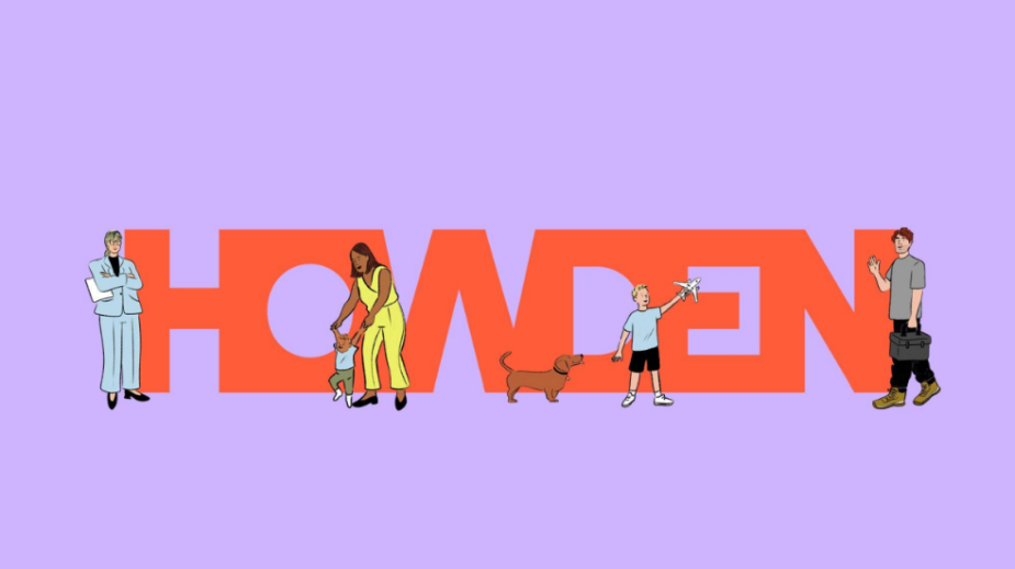
If the main logo mark portrays collective power and a sense of innovation in the industry, the beauty of Haley Tippmann’s work is that it marries this with a more relatable, human quality, designed to draw an emotional response from the consumer audience.
Working within a fun and modern colour palette that provided plenty of flexibility, Haley was in her element when it came to creating this warm and friendly set of characters, depicted in everyday scenarios spanning areas from health and travel to home insurance.

The response to the project so far has been overwhelmingly positive, with North remarking about Haley’s work:
“When exploring how Howden’s consumer expression could feel different to corporate, we knew illustration would be a powerful means of creating a new tone of voice for that audience. Haley’s style, with its warm colour and soft line work, both complemented and contrasted the solidity of the Howden wordmark. And, while working with her own unique palette, Haley also brought the Howden consumer colours into the illustrations so that each would feel linked to the identity”.

Kate Pennell, group head of brand and marketing at Howden, commented: “As the Howden name expanded onto the high street for the first time, we required a creative solution for our 120-branch network to ensure our customers knew they would be getting the same friendly and approachable service as they always have. Haley Tippmann’s sketches, depicting various scenes to suit health, travel and home insurance, combined with the warm human colour palette does just that.”

Haley said of the project: “It was really fun to collaborate on the project with North and Howden and to be a part of a big rebrand. I was excited to see such a fresh and modern colour palette when we got started - I think it brings a warmth and realness to the different insurance topics.
The new logo, typeface, use of colour and illustration really breathes life into what might be viewed as a fairly dry subject matter, instead feeling approachable and positive. I look forward to sharing further illustrations I'm working on as part of the brand rollout in local communities”
To see Haley's portfolio, visit here.


