Why the Case for Accessible Design Has Never Been Stronger

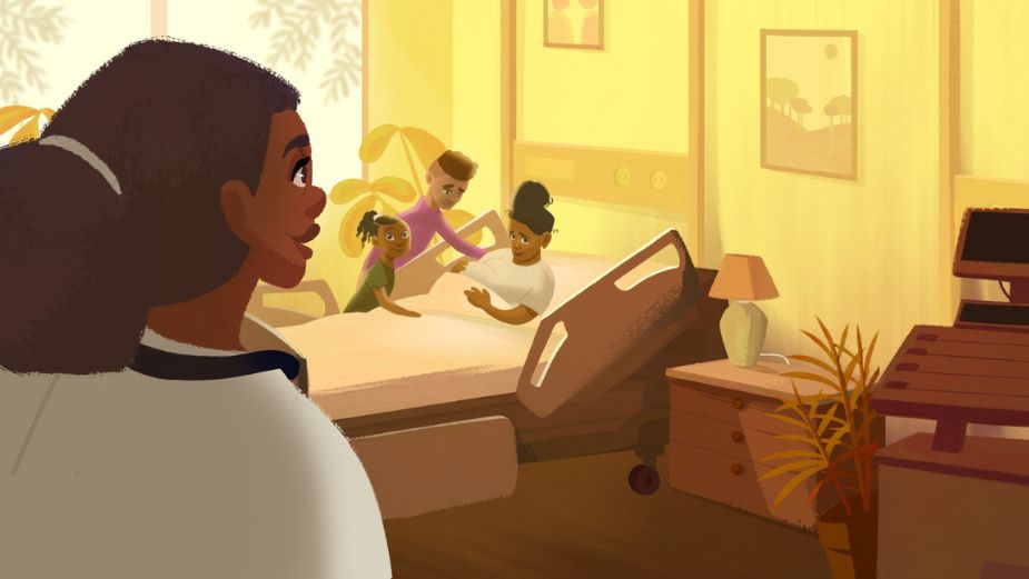
Above: still from 'Let Me Tell You a Story' for The Health Collective in collaboration with The Health Collective, BIEN, and IDEO; designed with subtitling, visual impairment, colour blindness in mind (while using the client's colour palette).
The World Health Organisation (WHO) estimates that 1.3 billion people globally have some form of disability. That's 16% of the planet’s population.
So more than one in ten of us is living with a disability. Where does that leave issues of accessibility? We know that many brands are falling far behind when it comes to making their products and services accessible; in the process they’re short changing their potential customers and their profits too. After all, why make an ad or a product that can’t be experienced by the largest swathe of the population?
Let’s rewind for a second. Think of how many times a day we send texts; for many of us, texting has replaced speaking on the phone completely. Texting was developed, in part, to help deaf people use mobile phones and now it’s an essential part of our everyday lives. And it doesn’t stop there. Love using touchscreens? They were originally developed for people with carpal tunnel syndrome.
In 1990, the Americans with Disabilities Act was passed and the concept of access became enshrined in law. Soon after, buildings and streets began to be fitted with ramps to allow wheelchair users ease of movement. Today, the availability of ramps means that wheeling a pram or a large suitcase is a relatively smooth activity while it’s also safer for older people to cross the road without stepping off a curb. There are countless other examples of accessible design making better products and services for everyone.
Put simply: accessible design is better design.
Hung Le, co-founder and creative director at BIEN, an LA-based motion design studio that practises inclusive design, says that focusing on inclusive design is a way to “reach a wider audience and increase the size of your addressable market. Inclusive design principles are fundamental and foundational because, at its core, good design is only good when it serves the audience and delivers positive social impact.”
Kyle Wheeler, group creative director at R/GA, draws attention to the social model of disability and how it uproots ‘traditional’ and dated approaches to the way disability is addressed. “The social model of disability says that disability is caused by the way society is organised, rather than by a person’s impairment or difference. It looks at ways of removing barriers that restrict life choices for disabled people. If we acknowledge that we disable by design, for example adding steps to a building with no ramp, or not providing alt-tags to images excluding low vision users relying on screen readers or closed captions to video for users with hearing difficulties, simple decisions that result in real barriers to experience.”
But is accessible design, alongside being a social good, also good for business? Consider that the disabled community represents $8 trillion a year in disposable income. That’s a lot of untapped monetary potential for brands. But if the products and services sold aren’t designed with accessibility in mind, that disposable income will continue to remain so.
Creative possibilities, not constraints
“Design has always been about pushing the limits within a set of constraints. We have to shift our mindset from seeing accessibility as a constraint to a force for good. Then, we can push the creative possibilities knowing that we are now truly serving our audience,” says Hung, demonstrating how a change in attitude can lead to better design for all.
On June 28th 2025, the European Accessibility Act will compel brands to ensure greater accessibility of their digital products, services and experiences. But instead of waiting for a legal directive, many brands are already redesigning their products for a more accessible world. The ‘dark mode’ options offered by different apps and websites is one such example, as is the ability to change the font size with ease. For Kyle, it’s the brands that are “thinking of accessibility as innovation and not a box ticking exercise who are getting accessibility right.”
Season four of ‘Stranger Things’ delivered all the ‘80s nostalgia, high drama, and terrifying monsters that its audience wanted. It also delivered a fresh and creative approach to subtitling, with descriptions like “[Tentacles undulating moistly], [wet footsteps squelch], [eldritch gurgling], [intricate, macabre music playing],” to give just a few examples, as reported in Variety. Such descriptions improved the accessibility of an already-hit show while providing hard-of-hearing people a more immersive experience that conveyed with a higher degree of authenticity the tones and textures of each scene. Netflix has recently made a push to make more of its shows accessible by empowering creative writers to best transmute the on-screen action into closed captions.
The hearing loss charity RNID estimates that one in five people in the UK live with hearing loss, yet only around 20% of content is subtitled. In the US, the figure for people experiencing hearing difficulty stands at around 13% of all adults aged 18 and older. With these figures in mind, and when billions are spent on ads and content annually, it makes all-round sense to ensure that the end product is as accessible to all as possible. Take Christmas campaigns with their liberal use of red and green colour schemes. “Red-green colour-blindness is the most common type of colour-blindness,” says Hung. He’s right, and this particular colour-blindness affects 8% of men (one in 12) and 0.5% of women (one in 200). “The best Christmas campaigns are then the ones that make sure all people can join in by designing with that specific colour blindness in mind.” And beyond effective Christmas campaign messaging, it’s worrying to consider that red and green are the internationally accepted safety signals.
IKEA's democratic design efforts
‘Democratic Design’ is at the heart of IKEA’s business model with an aim to deliver on five pillars: function, form, quality, sustainability and low price. When all the pillars have been addressed, IKEA considers the design to be democratic. “When IKEA launched ‘Thisables’ — open-source accessible add-ons for furniture available to 3D print for free in store (or for anyone anywhere with access to a 3D printer) they really delivered on their promise to democratise design for everyone”, notes Kyle. “The add-ons were things like optimised handles for closets, leg extenders for sofas for easier ascent or button enlargements for lamps. It not only made their furniture accessible in terms of design but also accessible in terms of cost. This wasn’t an exercise in compliance, this was a creative strategy that harnessed the power of technology to transform lives. This is what true accessible design should be about.”
So how can everyone be more inclusive and accessibility minded when it comes to design? Hung references the “design with, not for” school of thought, the central tenet of which couldn’t be easier to implement: having people from different communities in the room when creating anything. “Only when we are intentional about prioritising accessibility in our work, by practising and working with people with disabilities, can we turn intention into action, and action into impact. Representation behind the scenes is crucial in the push to make the work better, more diverse, and relatable to modern audiences,” Hung plainly states.
Kyle is likewise clear that retrofitting design with accessibility features isn’t going to bring about the right kind of innovation fast enough. “We need to stop thinking about accessibility as a burden of compliance and instead embrace it as a higher standard of design. Accessible design doesn’t end with AA web standards, it's an inclusive approach to creativity that is important for every designer to consider. For if a design isn’t inclusive at the start, it will undoubtedly exclude at the end.”
Bong Joon-ho, the director of Oscar-winning ‘Parasite’ (a Korean film that premiered in English-speaking countries with subtitles) famously said, “Once you overcome the one-inch tall barrier of subtitles, you will be introduced to so many more amazing films.” What other amazing things might we all be introduced to when we embrace truly accessible design?


