Why Dan French and Impossible Studios Depicted a World Where Humans are Nothing More than Numbers
Within the corporate world, sometimes, it’s hard to feel like more than just a number. Sure, by all accounts you’re a unique person with your own backstory and profound personal history, but when you’re dealing with any institution that works with a large number of clients, that generally doesn’t matter. At best you’re probably just a name on a file, and by the time you’re done communicating, they’re already thinking about the next person in line.
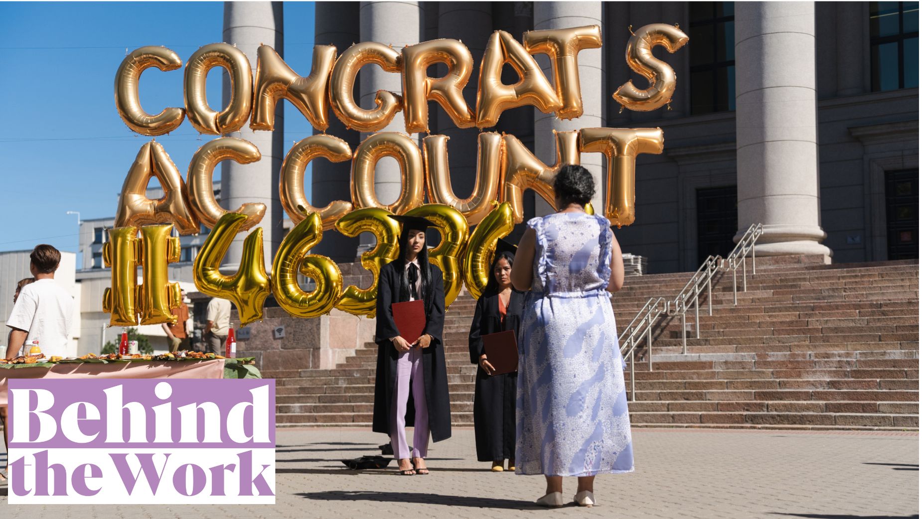
Of course, nothing is ever absolute. Some companies - even large ones - like Meridian Credit Union want the people they work with to feel, well, like people. And to this end, they go out of their way to showcase why this is so important to them. Case in point, Meridian recently teamed up with director Dan French and Impossible Studios to produce a fun, visually-striking spot that explores an exaggerated reality where people really are reduced to nothing but numbers. Shot in Lithuania, everything from birthday parties to graduations to even wedding proposals are focused on the numbers, with people’s names being replaced by these defining sequences every which way. It’s dystopian, it’s funny, and, as a bonus, it’s also packed full of clever Easter eggs for viewers to search for – all in all creating an ad with strong rewatchability and which, most importantly, encourages the viewer to step out of their own worlds in which they’re naught but numbers.
To learn more about just what it took to bring this to life, LBB’s Jordan Won Neufeldt sat down with Dan for a chat.
LBB> What was the brief for this project, and why was this something you were keen to be involved in?
Dan> The initial one-liner was great: ‘we want to create a world where everyone is treated like a number and show how our bank is different’. However, what really grabbed my attention was the world building I could immediately imagine. I love being able to run with a concept and imagine how the universe of the film can be built around the central theme, so this numbers idea got me very excited and I wanted to do something different with it. I wanted to create a stylised world of monotony, but not the classic devoid of colour space – instead using patterns and textures to create the sad and repetitive world.
LBB> Let’s talk about the storyboarding process. How did you bring the vision of this world to life?
Dan> I wanted the overall look and feel to match this world of numbers. Everyone in this space was faceless in a way, only known by their account number, so the coverage should match. To this end, I was very restrained with the way we moved the camera, and treated this like cinematic coverage more than anything, working out what the most interesting angles would be to tell our story but the also fun ways we could keep revealing number gags to maintain the excitement of the visual language.
One of my favourites is the close-up of a wedding ring box in hand that turns into a wide shot of the sad proposal environment. I generally tried to not move the camera or change the shot type unless it was totally necessary, and once again, here, we accomplished this by moving the character and not the camera. This constriction really helped develop the world we were building, and I feel made some of the reveals less forced. It was always a fine line however, as I still wanted the visuals to be interesting and engaging, which is where the framing and art direction helped.

LBB> Speaking of worlds, what made Lithuania the right place to shoot? And what was the location scouting process like?
Dan> We actually were trying to decide between a few places, but the amazing architecture in Lithuania is what really caught my attention. Even the preliminary location deck that was sent over during the bid process had some amazing spots like the checkerboard-floored office space. So really, what we ended up with in terms of locations weren’t far off what was sent over in the first batch.
The trickiest location was finding a modern coffee shop that was overly-simplistic, like some of the new third-wave places we have popping up. What we actually ended up doing was using an older diner-style location and dressing it with this white, minimalist coffee branding. It ended up being one of my favourite locations and I loved the contrast between old and new.
LBB> From here, how did pre-production go? How did it all come together in the lead up?
Dan> I had such a strong vision of the kinds of locations I wanted and really put it all on the line to try to get that across. Thankfully, both the client and agency were amazingly trusting throughout this job and after a small presentation I cobbled together, we had sign off on Lithuania.
One of the most sketchy moments was two days before the shoot where I decided to pitch an idea for an entirely new ending – something the agency and I had previously spitballed (the blue door to an alternate universe) in which we are no longer known by our account numbers. Originally the ending took place in the Meridian bank, but it was always something that I felt clashed with the stylised, symbolic world we created. So, after some mock-ups in blender, everyone was sold and we had to put the wheels in motion to find a concrete wall and fabricate a door in two days (I have to say a big thanks to the art team for pulling that off)! From there, it was truly a breeze, with only the usual problems needing some clever solutions.
LBB> What was the casting process like? How did you find the right people to bring this account number world to life?
Dan> The casting process was a dream, with some amazing talent coming from Lithuania mixed with Canadians flying over for some of the speaking roles. We did tapes at first and then had callbacks where we really had a lot of fun, ad-libbing scenes and playing with the characters. This was invaluable and informed a lot of the performances we ended up with on camera. Honestly, it really was so much fun to cast, even with some late sessions on Canadian time from the UK.

LBB> Let’s talk about the shoot itself – the visuals and colour palettes of each location are amazing! What was the set creation like? How did you create such intricate, visually captivating locations?
Dan> Honestly, so much of it was already there in these locations. The brief was colour clashing, repeating patterns and a vintage aesthetic. However, it still needed to feel like the present day, so we mixed in modern technology.
The first location that set the tone was the office with the repeating checkerboard floor. It worked very nicely to build this world of monotony. I wanted to hide as many number gags as possible, from the text of the screens in the office making a number shape, to the optometrist glasses logo being made from zeros and sevens. There’s so many hidden Easter eggs, and I love that level of detail.
One of the big things we wanted to avoid was the classic dystopia – a grey and boring place that’s totally devoid of colour. Instead, the focus was on patterns and colour being receptive and, in that sense, mundane. This initially came about with the design of the opening scene where I referenced a Petra Collins shoot where the dresses were the same texture as the bedcovers. I wanted to do something similar with the pattern, using a floral print for almost everything in the scene – creating this repeating theme like the feeling of numbers in a sea of accounts (there’s even numbers hidden in the floral pattern if you look very closely).

LBB> And as a whole, how did the process go? Do you have any anecdotes from the experience?
Dan> Overall, the shoot was fairly smooth. However, one of the main things we had to deal with was the extreme heat during our exterior day, which, when you are shooting a concrete door on a concrete floor with the sun beating down, I can tell you, is pretty hellish. I have to say a big thanks to the extras who I made wear uncomfortable winter clothing in 34 degree heat. For a reason I will say (and not just to be mean), I wanted everyone to feel uncomfortable and stiff which meant formal or layered clothing. It was tough but everyone pulled together and had a real excitement about the job.
As if that wasn’t enough though, we later lost the sun and a thunderstorm hit, midway through the coverage on the final door sequence. This meant rescheduling on the fly so we could shoot some exteriors and come back the next day to shoot the final angles on the door. So, the next day we woke up to cloud cover and thought the worst, but just as we turned up, the sun popped out and we got the scene. It really felt like the shoot gods were on our side for this one.
LBB> What sort of equipment did you use to film, and what inspired that decision?
Dan> Most of this was track and dolly, apart from one jib shot above the crowd and a fun one where we rigged the airport trolley to the dolly for the POV shot. The cinematic language was about being controlled and static unless the action motivated movement from the camera.

LBB> One of the most standout sequences is the plane flying by with the account number banner. How did this sequence come to life?
Dan> I loved this scene and it was one of the hardest to get across the line. I was obsessed with the idea of it taking place in what could've been a nice location, but just wasn't. So, we found this lovely rooftop bar on the scout which happened to have a load of buildings all around it, and I knew immediately it was perfect. It was just the right level of making sense as a place someone would get proposed to, but the worst version of it, with the view ruined by cranes and horrible clanking tools. This somehow made everything more funny as we zoomed past this crane to see the elaborate display of affection, but also with a depressing twist: instead of a name on the proposal, it's the account number. Her reaction was incredible too, and while the blocking of the sun with her hand wasn't planned, it proved absolutely perfect (and entirely necessary due to the hot day). Overall, it ended up being my favourite bit, somehow making the whole thing more ridiculous.

LBB> You’ve mentioned it a few times, but the final sequence where they walk out of the world is awesome! How did you set this up practically?
Dan> This one was actually very simple, but as I mentioned earlier, had a ridiculous time pressure to create it which in turn made it more tricky. We built the door for real and attached it to the wall with struts that we painted out later. For the top shot, we shot multiple plates as when the door was against the wall, the actors couldn't walk through it. So, we also shot the door further away from the wall and comped the wall back over the top. This was super simple, but I think that's what makes it very sleek in the end. Side by side with the 3D render that I used to sell the idea – this end result was nearly identical, which was amazing to see.


LBB> The music is also a standout element. How did you find the right soundtrack for the job?
Dan> I have to take my hat off to the editor, Monica Remba from School Editing, on this one. She popped that song on the first cut and immediately everyone fell in love with it. The strange instrumentation and wailing vocal perfectly matched the off-key visuals without overdoing it. It felt like such a fit and every time we tried something else, we just kept coming back. After watching it so many times, I had a bit of a wobble and started to think maybe it was wrong, but once we got into sound design, I heard it again in a whole new light and I'm very glad it stayed. It can sometimes be tricky being so close to a project. I always wish I could wipe my memory and watch it completely fresh by the end of post.
LBB> Speaking of this, what was the post process like? Did you have a hand in bringing the final edit to life?
Dan> It was tricky, to be honest. I was in the UK and it was happening remotely in Canada, which, with the time difference, meant at the end of my work day, the edit was starting.
Beyond this, I had such a specific vision for the timing and the pacing. I felt the rhythm, especially with the track and the comedic beats, needed to have just the right amount of frames before they became laboured. So, the first cut was a real collaboration, but it was streamlined from then on.
I've always been a very hands-on director, having cut all my own stuff for years, so sometimes I can be a bit picky – but I think we got a great cut in the end and I'm glad everyone put up with my specificity.
LBB> What challenges did you face, and how did you overcome them?
Dan> I guess this is the classic answer most people face in commercials nowadays, but budget and time. Our art department budget was tight and we needed to make these elaborate, stylised spaces. It ended up being about clever use of props and people to fill spaces. In the office, I wanted everything exactly the same, but finding 20 perfectly-matching monitors proved hard, so we used the cubicles to hide certain elements. On the wide, some of the desks in the deep background aren't even dressed.
A similar thing took place with the top shot of the crowd. I was planning a huge, busy street, with our lead pushing past an oncoming crowd like a fish going upstream. We just didn't have the extras. So instead, we pivoted on set for something way more stylised, with each person walking in a grid formation and our lead threading through the centre. In the end it was actually better, and it’s a prime example of how sometimes limitations can be beneficial to creating something unexpected.


LBB> You mentioned a few of them, but are there any cool bonus Easter eggs you can tell us about?
Dan> There really are so many. Some never even made it on camera, but I loved walking around on set and spotting them. All the paperwork in the office was created with written numbers, and when viewed from afar, created the shape of a larger number. The ring inside the ring box had a hashtag denoting a number. We even created our own coffee brand whose logo was a hashtag, and each coffee had a simple number. (Pretty sure this would get absolutely eaten up in East London, so I might have to make it for real)!
There was also a ‘24/7 T4P5’ (24/7 Taps) logo for the plumber that is so tiny on his shirt, but it's there. Also the optometrist’s name was ‘Lisa Sevenhill’, and her door has a seven and a hill underneath. Also, if you look closely, the eye test was made of numbers, not letters. The list is kind of endless. So much fun!
LBB> Finally, are there any elements of the project you’re particularly proud of? And why?
Dan> I absolutely love the coffee shop – mainly because absolutely no one believed in it but me, haha. It was the oldest diner ever and I had this vision of creating an Arabica coffee-style store. I loved the idea that someone took a place with loads of history and beauty and turned it into a third-wave, sterile coffee brand. It summarised perfectly the minimalist monotony of the numbers world, highlighting how even a place with loads of character was stripped back to a white and black brand. Thank god everyone blindly trusted me, because when we walked on set we were all obsessed. My production designer understood the assignment and nailed all the little details too. It really was one of those moments where what you had in your head ended up on screen.


