The Art (and Science) of Mouth-Watering Animated Food

Great creativity has always leaned into the senses. It’s easy to activate sight and sound on-screen, but what about taste and smell? That’s an especially important question when it comes to bringing food to life.
For brands looking to make their food look as irresistible as possible, animation has often provided a solution. Over the course of his career so far, Tonic DNA’s motion designer and art director Fabien Fulchiron has provided that solution for culinary brands such as Rice Krispies, McDonald’s, Campbell’s, Dairy Farmers of Canada, and Caramilk amongst others.
So what’s the secret to achieving delicious and enticing on-screen cuisine? To find out - as well as pick through some of his most drool-worthy animated work thus far - LBB caught up with Fabien…
LBB> When you’re working with food, are you always trying to get it looking as ‘real’ as possible, or do you look to go beyond realism?
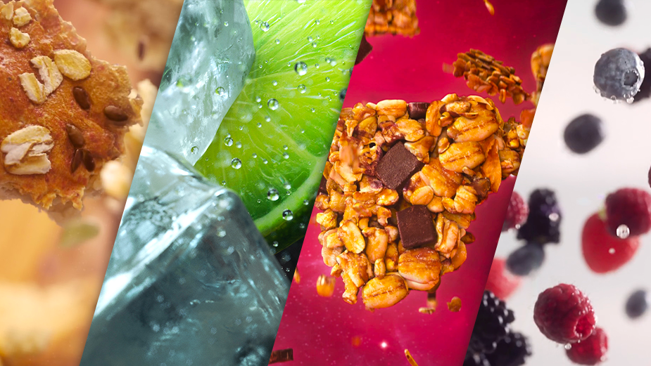
Fabien> It’s possible to get absolutely photo-real with animated food, and a lot of the time that’s what we aim for. However, it's true that sometimes surrealism is the goal. While we’ll always get food looking incredibly clean and real, the environments can lean into the original and surreal. An example which comes to mind is a commercial we did for KIND bar, where we created these super-realistic peanuts and almonds floating in outer space. So that is realistic, but it creates this otherworldly sense.
Above: For KIND’s fruit and nut bars, Fabien was tasked with animating extraterrestrial ingredients in outer space.
LBB> But it still must be an artistic process, even when it’s hyper-real. What steps do you go through to ensure you’re hitting that realism aspect when it comes to food?
Fabien> Yes, it’s really an art and a science at the same time. That’s because, at the outset of a project, there’s a tonne of research where we find as many references as we can. This starts with Google and often leads us to store shelves, where we buy the real product to bring home, take close-up pictures, study it and, I suppose, eventually eat it. That first step of capturing the details is the first step towards creating something.
We’re looking for factors like how light shines off an object, how much light might go through it, how it flows if it’s a liquid, all its imperfections. Imperfection is what makes something real - if something looks perfect on-screen, you immediately know it isn’t real. That’s where the artistic side comes into play.
LBB> So with all that in mind, what’s the secret to getting food looking as appetising as possible?
Fabien> I suppose if there is a ‘secret’, it’s experience. Having built up many years of expertise working on CG food projects, we’ve built our own tool in-house which really helps us to create beautiful and realistic CG food. Second to that, it’s just about hard work. You can’t avoid that!
The best end results are always a culmination of every layer that’s gone into a project. You need a highly-detailed model as a base, and then you need good textures, lighting, composition, and framing of the camera. So there isn’t really a ‘secret’ so to speak - success can be found in all the details.
LBB> As a result of your work, would you say that you’re more food-focused than the average person in your day to day life?
Fabien> No, I wouldn’t say that I am. My first food project came as a result of some experience I had in creating photo-real objects beforehand, and it simply grew from there. I enjoy the challenge of bringing things to life by making them seem real and tangible. That applies to food in just the same way it does to anything I animate.
LBB> But has your work changed your relationship with food at all? Maybe if you see an almond now, you can imagine a wire-frame model inside it, for example…
Fabien> Haha, yes but I do that with everything I see! That’s the curse of the CG artist, perhaps. Sometimes I see things moving in the real world and immediately think ‘oh that would be fun to make in CG’, or something like that. But that’s part of the process - it’s inspiration.
LBB> Are there certain types of food which are easier or more rewarding to animate than others?
Fabien> Not certain types of food, but certain types of concepts. For example, animating a lime on-screen in CG is about as straightforward as it gets. But slicing one open is a different story entirely!
There was one particular project - for Boulange des Campagnards, a brand of bread - where the client wanted us to reverse-explode one of their products. That was a fantastic challenge, and I love watching it back. You had to be mindful of how each fragment and ingredient would behave as it flew through the air and bounced off other objects. That was immensely satisfying.
Above: One of Fabien’s biggest challenges to-date was mapping out how a particular kind of bread would explode for Boulange des Campagnards.
LBB> Would you say that’s the most satisfying food-based campaign you’ve worked on?
Fabien> It’s certainly up there. The other one I would mention is actually a brand video we put together for Tonic DNA ourselves.
We played with the concept of ‘gin and tonic’, and animating liquids is obviously a completely different challenge which we really enjoyed throwing ourselves into. You have the liquid flowing into a glass, and then ice cubes bouncing around and hitting the drink itself. Watching that one back is always very satisfying.
Above: Fabien brought to life a ‘Gin & Tonic DNA’ to highlight the studio’s animation chops.
LBB> If you could give one piece of advice to a brand before they started a campaign featuring CG food, what would it be?
Fabien> There are two things I would say! Firstly, think outside the box - simply because there is so much you can do with CG in a creative sense - and secondly to bring your CG artists into a project as early as possible. This is because we can lean on our experience to see the potential for new ideas which can really make a campaign sing. It’s all about pursuing the best possible results.
LBB> We’ve spoken in the past with animators from Tonic DNA who’ve mentioned the unique culture you guys have as a company. Can you speak to that at all, and does it have an impact on the way you work?
Fabien> When you’re working on a project, you have two important priorities: to achieve the best possible creative outcome, and to have fun. Working at Tonic ensures that you can hit both of those targets! There’s a great mentality here, and everyone comes to work wanting to make something great and to be happy doing it. That culture means you have the liberty to take some creative risks, and you have the freedom to express yourself in pursuit of an artistic goal. For any artist, that’s immensely important.
LBB> Finally, if you had to eat one item of food which you’ve animated for the rest of your life, which would it be and why?
Fabien> I like that question, but I wish I had animated some cheese! Okay, perhaps I will say the bread, because I can always pair different cheeses with that to make it taste different. We did a great job making that look delicious, so I’m happy to stick with that one.


