


Putting Bounce into Birell’s Non-alcoholic World for Rebrand Launch

Purple Creative have recently evolved and modernised the brand world for Birell, the best-selling non-alcoholic beer (NAB) in the Czech Republic.
Having led the NAB category for more than 30 years, Birell’s success was coming under threat from cheaper, new-to-market competitors.
Purple set about refreshing and modernising the visual identity, creating a suite of clear and coherent brand DBAs that were full of fun and vitality but still retained the brand’s premium credentials.
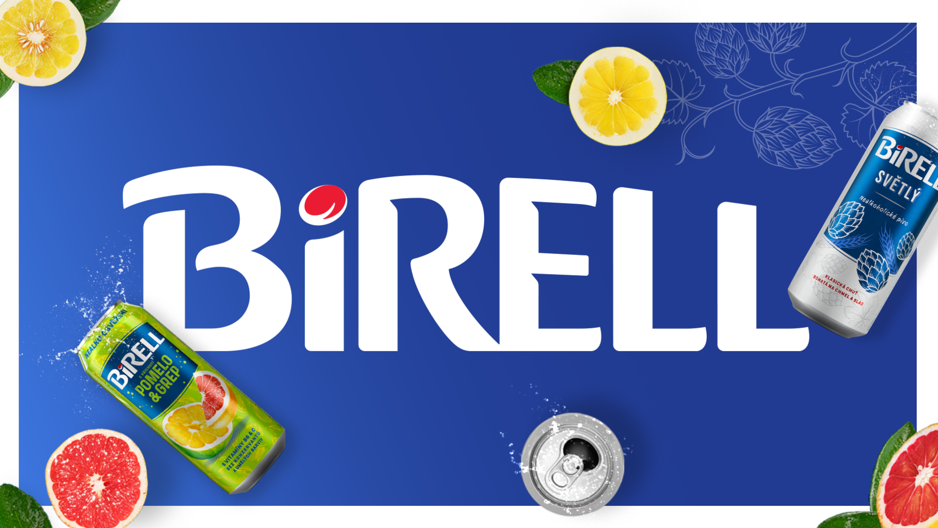
Springboarding from a new ‘open-minded’ brand purpose, Birell wanted to both stand-out and stand for something deeper, connecting with drinkers on a more emotional level. A new logo was created which freed itself from its traditional enclosure but mirrored the original shape. The wordmark was given added bounce with crafted letterforms that captured the personality of the brand. A new flexible design system was created to amplify the positivity of the arc shape.

"Our aim was to create more of an emotional connection with our Birell audience – to capture the open-mindedness of our purpose and showcase the fun and connectivity at the heart of non-alcoholic beer. For too long, we’d had a colder, more corporate logo that didn’t match our personality, portfolio or flavour combinations but Purple helped us change all that – we now have a brand world that matches our DNA. This also helped to unify our different ranges, which we innovated organically over the last few years, allowing them to stay separate but look part of a consistent Birell family through key brand assets.” said Oliver Jachymovsky, Birell senior brand manager.
Alongside the logo elements, a rich blue was used in a more dominant way to signpost the NAB category, interwoven into everyday lifestyle moments and used graphically in POS and digital. The brand’s sense of everyday joy was also highlighted by a range of lifestyle imagery and typographic executions.

"For such a well-established brand, it was interesting that the Birell name was the brand’s only real and ownable design DBA. So, during the refresh, we had to tread carefully – creating something new, dynamic and relevant but without losing any established brand equity and consumer recognition along the way. The result is a brand world with more depth, joyfulness and personality.” said Gwyn Edwards, Purple creative director.
The new Birell brand world was launched in Q2 2024.


